All Prompts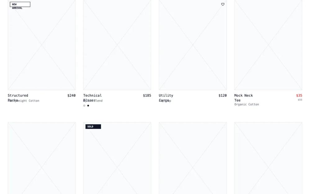 All Prompts
shopifyecommercelayoutcollection page
Collection Page- Curated Collection Feed
Макет страницы коллекции с товарами и статьями. Группирует товары с контекстом для lifestyle-брендов, премиум-коллекций и сезонных дропов.
by Shirley LouLive Preview
Prompt
# Collection Page- Curated Collection Feed

{
  "summary": "A sophisticated wireframe-inspired design system for e-commerce, utilizing 'JetBrains Mono' for a technical feel, a strict grayscale palette, and structural elements like diagonal placeholder crosses and 1px borders. It emphasizes content architecture over photography, perfect for avant-garde or technical brands.",
  "style": {
    "description": "Technical minimalist theme using 'JetBrains Mono' (monospace) across all elements. The color palette is strictly monochrome (White #FFFFFF, Gray-200 #E5E7EB, Gray-500 #6B7280, Black #000000). Animation is subtle, focusing on opacity shifts and width-based transitions.",
    "prompt": "Apply a brutalist wireframe aesthetic using 'JetBrains Mono', monospace as the primary font family. Colors: Background #FFFFFF, primary text #111827 (Gray-900), secondary text #6B7280 (Gray-500), borders #E5E7EB (Gray-200). Use a standard border-width of 1px. Headlines should use tracking-tighter and bold weights (700), while labels use uppercase tracking-widest at small sizes (10px-12px). Interactive elements should feature a 1px underline on hover with a 4px offset. Implement a 'wireframe-x' background for image placeholders using two 1px diagonal linear-gradients crossing at the center. Use a striped repeating-linear-gradient (45deg, #E5E7EB to #F3F4F6) for loading states."
  },
  "layout_and_structure": {
    "description": "A clean, full-width container layout (max-width 1600px) with sticky navigation and filter bars. The content follows a modular grid that adapts from 2 columns on mobile to 4 columns on desktop.",
    "prompts": [
      {
        "part": "Navigation",
        "prompt": "Sticky top-0 header, height 64px, background #FFFFFF with 95% opacity and blur(4px). Left side contains a bold logo 'STRUCTURE.WF' (WF in #9CA3AF) and 14px text links with underline-offset-4 on hover. Right side includes search, account, and cart icons (20px size) with bracketed counters like '[0]'."
      },
      {
        "part": "Hero Header",
        "prompt": "Top padding 80px, bottom 48px. Includes breadcrumbs in 12px uppercase gray text. Main title in 60px font-size, font-weight 700, tracking-tighter. Right-aligned product counter showing '142' in 36px bold text above a small uppercase 'Products Found' label."
      },
      {
        "part": "Sticky Filter Bar",
        "prompt": "Secondary sticky bar at top-64px. Border-y 1px #E5E7EB. Left: Horizontal scrollable group of filter buttons (Size, Price, Color) with chevron-down icons. Right: Sort dropdown and layout toggle buttons (grid-2x2 vs grid-3x3) enclosed in a 1px border container."
      },
      {
        "part": "Product Grid",
        "prompt": "Grid layout with 32px horizontal gap and 64px vertical gap. Product cards consist of a 3:4 aspect ratio placeholder with a 1px border. Hover state: border color changes to #111827 and reveals a 'Quick Add' size bar or 'IMG_REF' technical text. Typography for name is 14px medium; price is 14px regular."
      },
      {
        "part": "Footer",
        "prompt": "Border-top 1px #E5E7EB, padding-y 48px. 4-column layout on desktop. Includes a newsletter signup with a 1px border input and a solid black 'Join' button. Use 12px uppercase bold headers for footer sections. Bottom copyright text in #D1D5DB."
      }
    ]
  },
  "special_ui_components": [
    {
      "component": "Wireframe Image Placeholder",
      "description": "A structural placeholder used instead of images to maintain the blueprint aesthetic.",
      "prompt": "Create a div with a 3:4 aspect ratio, background #F9FAFB, and 1px border #E5E7EB. Inside, use CSS linear-gradients to create two 1px lines running from top-left to bottom-right and top-right to bottom-left. On hover, the border darkens to #111827 and reveals a small technical ID label like '[IMG_REF_001]' in the bottom right."
    },
    {
      "component": "Striped Progress Loader",
      "description": "An animated technical loading bar.",
      "prompt": "A 4px height container with #E5E7EB border. The inner bar uses a repeating-linear-gradient at 45 degrees with #E5E7EB and #F3F4F6 (10px intervals). Animate the 'background-position' from 0% to 100% over 2s linearly and infinitely."
    },
    {
      "component": "Size Quick-Add",
      "description": "A hover-triggered interaction for selecting sizes directly from the grid.",
      "prompt": "An overflow-hidden container that expands from 0px to auto height on parent hover. Contains square 24px buttons with 1px #E5E7EB borders. Each button transitions to black background and white text on hover."
    }
  ]
}