All Prompts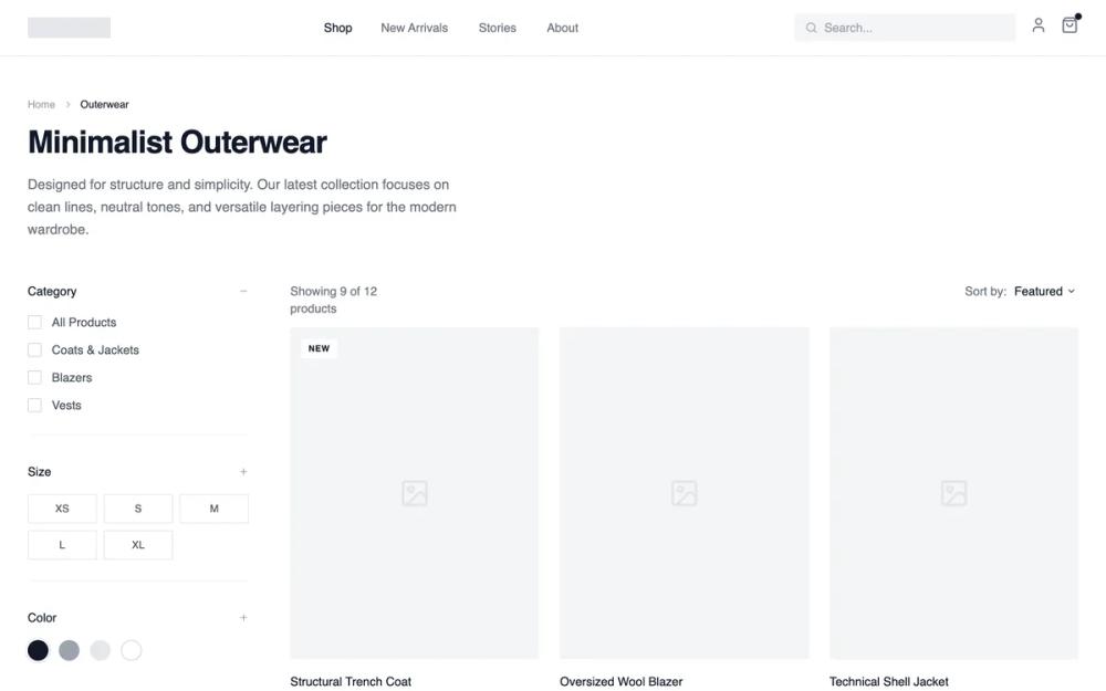 All Prompts
shopifycollection pageecommercelayout
Collection Page- Filtered Product Grid
Сетка товаров с фильтрами для каталога. Эффективный просмотр, выбор и сравнение товаров. Идеально для маркетплейсов и больших магазинов.
by Shirley LouLive Preview
Prompt
# Collection Page- Filtered Product Grid

{
  "summary": "A sophisticated monochrome wireframe design system for e-commerce, focusing on clean structure, neutral gray scales, and precise typography to showcase product collections without visual noise.",
  "style": {
    "description": "The style is defined by a high-contrast grayscale palette and a 'General Sans' sans-serif typeface. It utilizes wide gutters, subtle borders (#E5E7EB), and micro-interactions like text-decoration transitions. The aesthetic prioritizes negative space and structural clarity over decorative elements.",
    "prompt": "Apply a minimalist monochrome design system. Typography: Use 'General Sans' or a similar clean sans-serif. Headings: 36px (text-4xl) with font-weight 600 and -0.025em letter-spacing. Body: 14px (text-sm) font-weight 400. Color Palette: Primary Background #FFFFFF, Primary Text #111827, Secondary Text #6B7280, Border/Dividers #E5E7EB, Light Backgrounds #F9FAFB. Spacing: Base unit 4px; use 32px (8 units) for section gaps and 48px (12 units) for collection headers. Animations: Use 'cubic-bezier(0.4, 0, 0.2, 1)' for hover transitions. Borders: 1px solid throughout. Shadows: None; use borders for definition."
  },
  "layout_and_structure": {
    "description": "A classic e-commerce collection layout with a sticky header, a wide sidebar for desktop filtering, and a flexible grid system that transitions from 1 column (mobile) to 3 columns (desktop).",
    "prompts": [
      {
        "part": "Header",
        "prompt": "Create a 64px height sticky header with #FFFFFF background and 95% opacity backdrop-blur. Include a 24x6 logo placeholder, a centered desktop nav with 32px spacing (text-sm, medium weight), and a right-aligned icon group (search, user, shopping bag). Search bar should be a 256px wide rounded-sm box in #F3F4F6."
      },
      {
        "part": "Collection Header",
        "prompt": "Position a breadcrumb trail at the top using 12px text. Below, place a 36px (text-4xl) font-weight 600 title. Follow with a description paragraph (max-width 512px) in #6B7280 with 1.625 line-height. Add 48px bottom margin before the main content grid."
      },
      {
        "part": "Sidebar Filters",
        "prompt": "Desktop-only 256px sidebar. Structure into sections: 1. Category (Checkboxes with 16px squares and #E5E7EB borders), 2. Size (3-column grid of 40px squares with centered 12px text), 3. Color (24px circles with 2px ring-offsets). Use 1px borders for group dividers."
      },
      {
        "part": "Product Grid",
        "prompt": "Main grid area with 3-column layout (xl screens) and 24px column gaps. Each card features a 3:4 aspect ratio image placeholder in #F3F4F6. Product title below image in 14px medium weight text, price in #6B7280. Include a hover state: product title gains 'underline decoration-1 underline-offset-4'."
      },
      {
        "part": "Pagination",
        "prompt": "Bottom pagination section with a top-border in #F3F4F6. Include 'Previous' and 'Next' text buttons with arrow icons. Center a numeric list where the active page is a 32px #111827 square with white text, and inactive pages are 32px squares with #6B7280 text."
      }
    ]
  },
  "special_ui_components": [
    {
      "component": "Product Status Badge",
      "description": "Small informational labels positioned over product images.",
      "prompt": "Create a 10px font-size badge with bold tracking-wider uppercase text. New Arrivals: #FFFFFF background with 1px #E5E7EB border. Sold Out: #111827 background with #FFFFFF text. Position absolute at top-3 left-3 with 4px/8px padding."
    },
    {
      "component": "Size Selector Grid",
      "description": "Interactive grid for quick size selection.",
      "prompt": "A grid of 1x1 aspect ratio boxes. Default state: 1px border #E5E7EB, #6B7280 text. Hover state: 1px border #111827. Transition duration 150ms."
    }
  ],
  "special_notes": "Must-do: Maintain exact 3:4 aspect ratio for all product image containers to preserve the editorial feel. Must-do: Use #F3F4F6 for all placeholder elements to distinguish from white background. Must-not: Use any shadows or rounded corners larger than 2px. Must-not: Use saturated colors; even the 'Color' filters should remain neutral unless specific brand colors are required."
}