All Prompts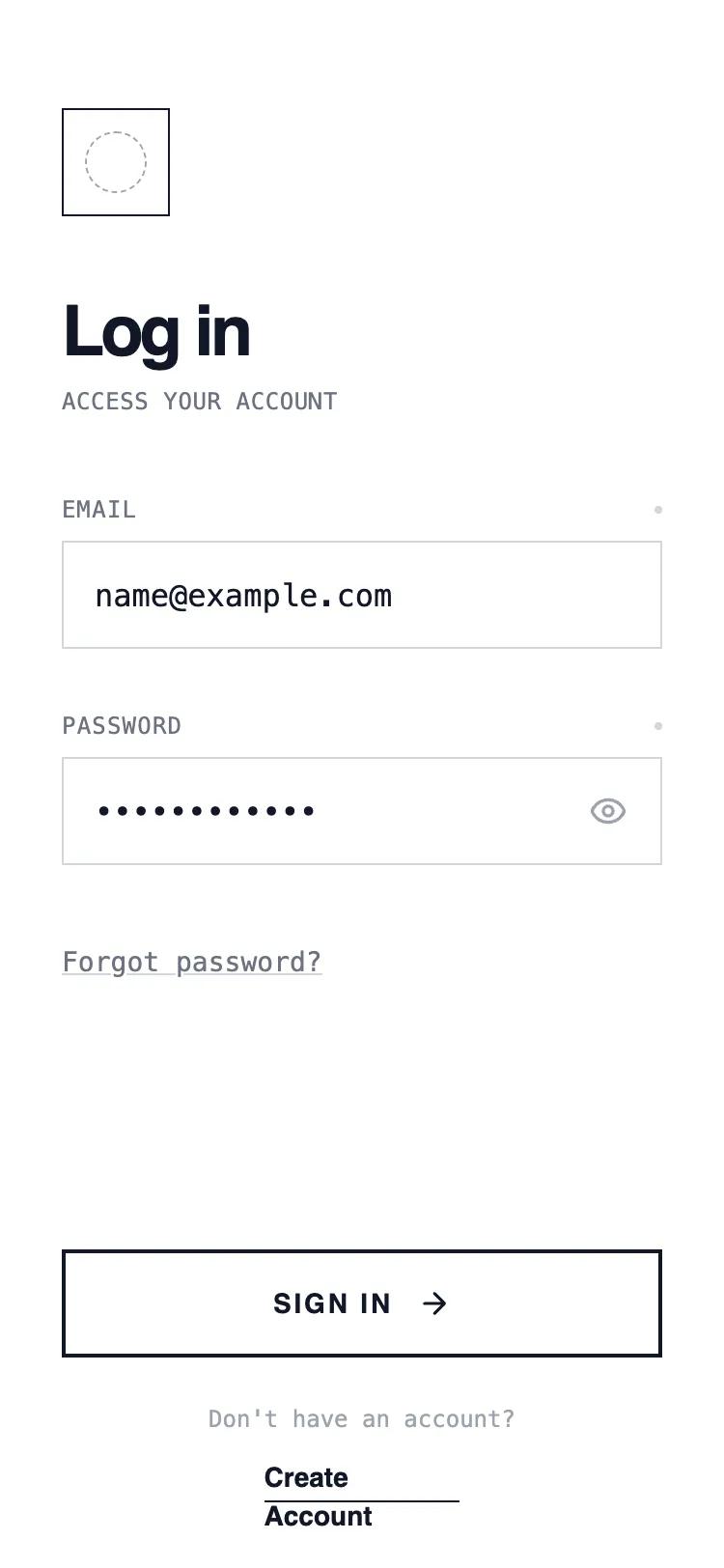 All Prompts
mobile appauthloginlayout
Column Authentication
Классический UI шаблон авторизации в одну колонку. Вертикально расположенные поля ввода и кнопки. Оптимизирован для быстрой аутентификации в мобильных приложениях.
by Shirley LouLive Preview
Prompt
# Column Authentication

{
  "summary": "A minimalist wireframe UI style utilizing a white background, sharp black borders, and high-contrast typography. It combines Satoshi for headlines with JetBrains Mono for utility text, creating a clean, technical, and structured user experience without shadows or rounded corners.",
  "style": {
    "description": "The style is defined by a 'Draft' or 'Technical Blueprint' aesthetic. It uses a strict monochrome color palette (#FFFFFF, #111827, #6B7280). Typography uses Satoshi for bold headings and JetBrains Mono for metadata and inputs. All components feature rounded-none (0px) corners and 1px or 2px solid borders. Hover states focus on inversion and translation rather than depth.",
    "prompt": "Create a design with a pure white background (#FFFFFF) and high-contrast elements in Gray-900 (#111827). \n- Typography: Primary font 'Satoshi' (Weight 700 for headings, 400/500 for main text). Secondary font 'JetBrains Mono' (Weight 400, 12px, uppercase with tracking-wider) for labels and technical data. \n- Borders: Use 1px solid Gray-300 (#D1D5DB) for inactive states and 2px solid Gray-900 (#111827) for active or primary actions. No border-radius (0px). \n- Focus States: Use 2px dashed #000 with a 2px outline-offset for accessibility. \n- Micro-interactions: Buttons should scale (99%) on click and invert colors (Black BG, White Text) on hover. Input labels include a status indicator dot that changes color from #D1D5DB to black on focus."
  },
  "layout_and_structure": {
    "description": "A vertically stacked mobile-first layout with fixed 'Safe Area' headers and footers and a scrollable central content section.",
    "prompts": [
      {
        "part": "Header",
        "prompt": "Top-aligned section (padding-top: 56px, horizontal-padding: 32px). Contains a 56x56px square logo container with a 1px solid black border. Inside the logo, place a dashed circular placeholder (#9CA3AF)."
      },
      {
        "part": "Main Content",
        "prompt": "Scrollable central area with a 40px margin-top. Features a Title Group: h1 (text-4xl, tracking-tighter, font-bold) followed by a monospace subtitle (text-xs, uppercase, tracking-wide, Gray-500)."
      },
      {
        "part": "Form Section",
        "prompt": "Inputs are 56px high with no rounding. Labels sit above inputs in monospace font, featuring a small 4x4px circular 'status' dot at the far right. Placeholders use Gray-300. Password inputs include a 56x56px square button on the right for 'show/hide' functionality."
      },
      {
        "part": "Footer",
        "prompt": "Fixed at bottom with a transparent-to-white gradient mask for scroll blending. Contains a primary CTA button (56px height, 2px border, uppercase, tracking-widest). Below the button, a centered secondary link group with an underline-offset-4 decoration on links."
      }
    ]
  },
  "special_ui_components": [
    {
      "component": "Brutalist Primary Button",
      "description": "A high-contrast button that inverts on hover.",
      "prompt": "Height: 56px; Width: 100%; Border: 2px solid #111827; Background: #FFFFFF; Text: #111827 (font-bold, uppercase, tracking-widest, text-sm). Interaction: On hover, change background to #111827 and text to #FFFFFF. Include a right-arrow icon that translates 4px to the right on hover. Active state: scale(0.99)."
    },
    {
      "component": "Status-Indicator Label",
      "description": "Technical label with focus state visualization.",
      "prompt": "Font: JetBrains Mono; Size: 12px; Case: Uppercase; Color: #6B7280. Layout: Flex-row with justify-between. Includes a 4x4px circular span at the right with background #D1D5DB. When the associated input is focused, the dot background-color transitions to #000000."
    }
  ],
  "special_notes": "DO: Use sharp 0px corners for all UI elements. DO: Use monospace for any utility text or labels. DO: Use high-contrast borders (2px) for primary buttons. DON'T: Use any box-shadows or drop-shadows. DON'T: Use color except for standard black/gray/white. DON'T: Use rounded corners on inputs or buttons."
}