All Prompts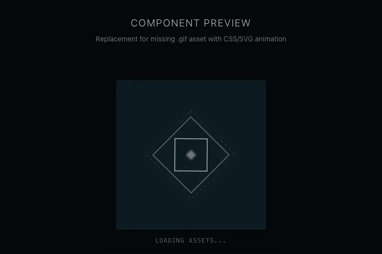 All Prompts
Component 2
UI компонент: шаблон для автогенерации из вставленного кода. Без иконок.
by Wesley AlexanderLive Preview
Prompt
# Component 2

You are given a task to integrate an existing React component in the codebase

~~~/README.md
# Spinning Diamond

A production-ready replacement for the `spinning-diamond.gif` loader. It uses lightweight SVG animations and CSS transforms to replicate a sci-fi/techno aesthetic diamond spinner without requiring external image assets.

## Dependencies
- React
- Tailwind CSS (standard configuration)

## Props
This component currently accepts no props but can be easily extended to accept `className` or `size` if needed. It inherits specific dimensions (`300px`) from the original design requirements.

## Usage
```tsx
import { SpinningDiamond } from '@/sd-components/spinning-diamond';

export default function Page() {
  return (
    <div className="bg-black">
      <SpinningDiamond />
    </div>
  );
}
```
~~~

~~~/src/App.tsx
import React from 'react';
import { SpinningDiamond } from './SpinningDiamond';

export default function App() {
  return (
    <div className="min-h-screen w-full flex flex-col items-center justify-center bg-[#050a0e] text-white p-8 gap-8">
      <div className="text-center space-y-2">
        <h1 className="text-xl font-light tracking-widest uppercase text-[#e8e6e3] opacity-80">Component Preview</h1>
        <p className="text-sm text-[#e8e6e3] opacity-50">Replacement for missing .gif asset with CSS/SVG animation</p>
      </div>

      {/* Container to demonstrate mix-blend-lighten effect against a subtle gradient */}
      <div className="relative p-10 border border-[#e8e6e3]/10 bg-gradient-to-br from-[#0d1820] to-[#050a0e] rounded-lg shadow-2xl">
        <SpinningDiamond />

        <div className="absolute bottom-4 left-0 right-0 text-center">
          <span className="text-xs font-mono text-[#e8e6e3]/40 tracking-widest">LOADING ASSETS...</span>
        </div>
      </div>
    </div>
  );
}
~~~

~~~/src/SpinningDiamond.tsx
import React from 'react';

export const SpinningDiamond: React.FC = () => {
  return (
    <div
      className="relative flex items-center justify-center w-[300px] h-[300px] bg-[#102029] mix-blend-lighten mb-2 overflow-hidden"
      role="status"
      aria-label="Loading"
    >
      {/* Ambient Glow Background */}
      <div className="absolute inset-0 bg-radial-gradient from-[#e8e6e3]/5 to-transparent opacity-50" />

      <svg
        viewBox="0 0 100 100"
        className="w-[60%] h-[60%] text-[#e8e6e3] overflow-visible"
        aria-hidden="true"
      >
        {/* Outer Rotating Diamond */}
        <g className="origin-center animate-[spin_12s_linear_infinite]">
          <rect
            x="20"
            y="20"
            width="60"
            height="60"
            transform="rotate(45 50 50)"
            fill="none"
            stroke="currentColor"
            strokeWidth="0.5"
            className="opacity-80 drop-shadow-[0_0_8px_rgba(232,230,227,0.5)]"
          />
          <rect
            x="15"
            y="15"
            width="70"
            height="70"
            transform="rotate(45 50 50)"
            fill="none"
            stroke="currentColor"
            strokeWidth="0.2"
            strokeDasharray="2 4"
            className="opacity-40"
          />
        </g>

        {/* Inner Counter-Rotating Diamond */}
        <g className="origin-center animate-[spin_8s_linear_infinite_reverse]">
          <rect
            x="32"
            y="32"
            width="36"
            height="36"
            transform="rotate(45 50 50)"
            fill="none"
            stroke="currentColor"
            strokeWidth="0.8"
            className="opacity-90"
          />
        </g>

        {/* Center Pulse Core */}
        <rect
          x="46"
          y="46"
          width="8"
          height="8"
          transform="rotate(45 50 50)"
          fill="currentColor"
          className="animate-pulse opacity-100 blur-[1px]"
        />
      </svg>
    </div>
  );
};
~~~

Implementation Guidelines

1. Analyze the component structure, styling, animation implementations
2. Review the component's arguments and state
3. Think through what is the best place to adopt this component/style into the design we are doing
4. Then adopt the component/design to our current system

Help me integrate this into my design