All Prompts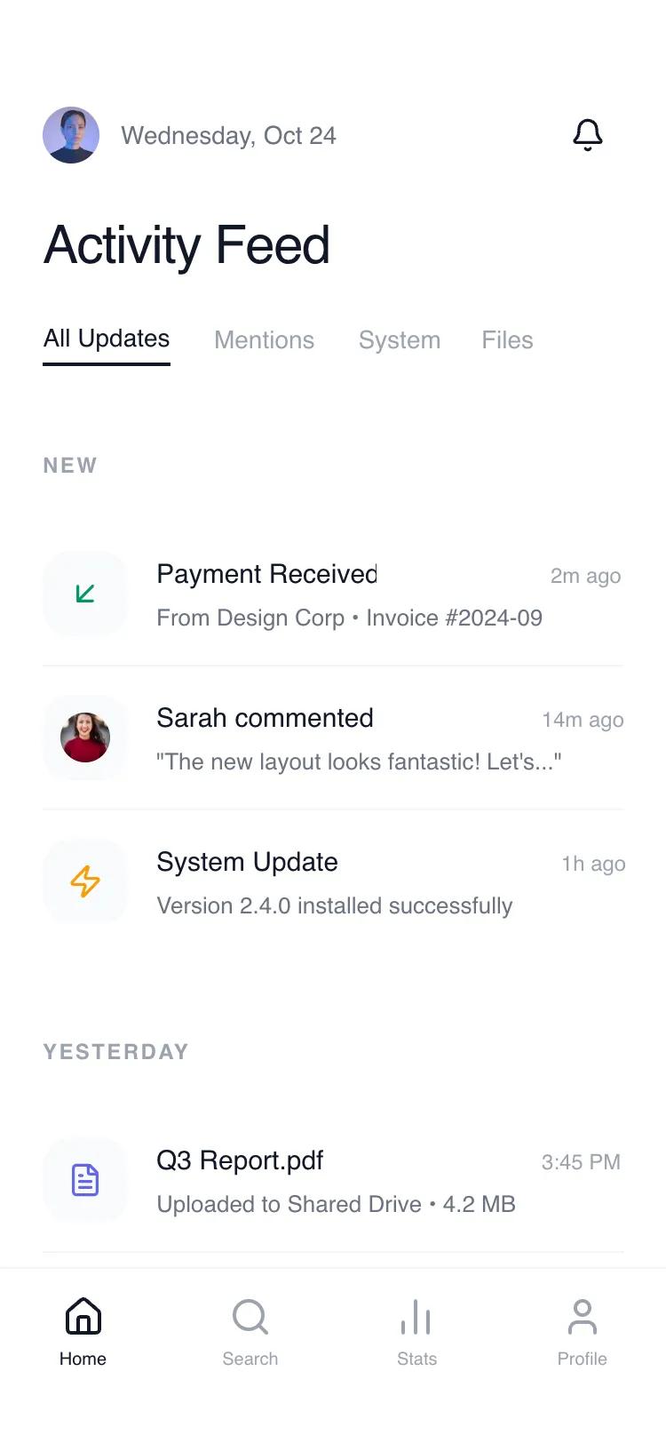 All Prompts
mobile apphomelayout
Composable Feed Home
Минималистичная лента для SaaS, финтеха, уведомлений. UI-компонент с высокой читаемостью, липкими заголовками и разделителями.
by Shirley LouLive Preview
Prompt
# Composable Feed Home

{
  "summary": "A modern, feed-centric UI that prioritizes vertical rhythm and clean typography over boxed card layouts. It uses a hierarchy of primary text, metadata, and leading visual markers to facilitate rapid scanning of information.",
  "style": {
    "description": "The style is defined by its 'Clean Utility' aesthetic. It uses a high-contrast palette of white (#FFFFFF) and rich black (#0F0F0F) for text, paired with neutral grays (Gray-50, 100, 400, 500) for UI elements. Typography utilizes 'Satoshi' and 'General Sans' for a balanced, modern feel. Micro-interactions include subtle background shifts on hover and smooth scrolling with sticky header transitions.",
    "prompt": "Create a design using a minimal grayscale palette: Background #FFFFFF, Primary Text #0F0F0F, Secondary Text #6B7280, Metadata #9CA3AF, and Dividers #F3F4F6. Use the 'Satoshi' font family: H1 at 30px font-size with font-weight 500; Feed Item Titles at 15px font-size with font-weight 500; Body/Description at 13px font-size; Metadata/Time at 12px. Feed item icons should be housed in 48x48px containers with a 16px (2xl) border-radius using #F7F7F7 backgrounds. Implement hover states on list items using a transition duration of 300ms changing background to #F9FAFB. Use backdrop-blur-sm (4px) with #FFFFFF/95% opacity for sticky headers to maintain readability during scroll."
  },
  "layout_and_structure": {
    "description": "The layout follows a strict vertical flow with a fixed top header and a floating/sticky bottom navigation. Content is categorized into sections marked by uppercase sticky headers.",
    "prompts": [
      {
        "part": "Header Section",
        "prompt": "A fixed header with a padding-top of 56px and padding-x of 24px. Top row: Left-aligned profile cluster (32x32px rounded-full image + 14px medium weight date); Right-aligned 40x40px circular notification button. Second row: 30px 'Activity Feed' title with tight letter tracking. Third row: Horizontal scrolling filter bar with 24px gap between text-only buttons; active state shown with a 2px bottom border in #0F0F0F."
      },
      {
        "part": "Main Feed Stream",
        "prompt": "A vertical list container with 24px horizontal padding. Content is organized into date sections. Each section has a sticky header: 12px bold, uppercase text with 0.1em tracking-widest, styled with a backdrop-blur-sm background for transparency. Items are spaced with 40px between sections and 16px padding within items."
      },
      {
        "part": "Feed Item Block",
        "prompt": "Each item is a flex row with a 16px gap. Left: 48px square icon container with 16px rounded corners. Center/Right: A vertical flex container. Top line: Flex row with space-between containing the item title (15px medium weight) and timestamp (12px neutral-400). Bottom line: 13px truncated description text in Gray-500. Items are separated by a 1px border-bottom in #F3F4F6, except for the last item in a section."
      },
      {
        "part": "Bottom Navigation",
        "prompt": "A fixed 56px height tab bar with an additional 34px bottom safe area padding. Background is #FFFFFF with 80% opacity and 'backdrop-blur-xl'. Features 4 evenly spaced navigation nodes, each with a 24px icon and 10px label. Active state is #0F0F0F, inactive is #9CA3AF."
      }
    ]
  },
  "special_ui_components": [
    {
      "component": "Leading Icon Container",
      "description": "Functional square with soft corners for activity identifiers.",
      "prompt": "A 48x48px div with background-color #F9FAFB and border-radius 16px. Content is a centered 20px-24px icon. Icon colors should signify type (e.g., Emerald-600 for positive financial, Amber-500 for warnings, Indigo-500 for documents)."
    },
    {
      "component": "Segmented Filter Bar",
      "description": "Zero-border horizontal scroll navigation.",
      "prompt": "A flex-row container with 'overflow-x-auto' and hidden scrollbars. Buttons use 14px medium-weight text. The active item has a 2px solid #0F0F0F bottom border positioned 4px below the text baseline. Inactive items use #9CA3AF and shift to #4B5563 on hover."
    }
  ],
  "special_notes": "MUST: Maintain at least 24px of horizontal padding throughout. MUST: Use sticky headers for temporal categories (e.g., 'Today', 'Yesterday'). MUST: Use 48px icons as visual anchors. DO NOT: Use heavy shadows or colored borders. DO NOT: Use 'cards' with borders; use background shifts and dividers instead."
}