All Prompts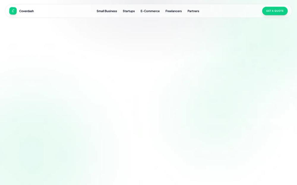 All Prompts
Coverdash Editorial Insurtech Landing
UI Kit для страховых и финтех-проектов. Дизайн-система с премиальной типографикой, контрастной палитрой и стеклянными эффектами. Создает доверие и скорость.
by Perry RaskinLive Preview
Prompt
# Coverdash Editorial Insurtech Landing

{
  "summary": "A premium editorial design system for insurtech that prioritizes 'speed' and 'craftsmanship' through bold typography, high-contrast brand colors, and fluid, non-linear micro-interactions.",
  "style": {
    "description": "The design uses 'Instrument Serif' for expressive, large-scale editorial headings (italicized for emphasis) and 'Plus Jakarta Sans' for functional body and UI text. The color system is built on a navy foundation (#202847) with a vibrant emerald primary (#0ACF83) and soft mint accents (#EEFBF4). Containers feature extreme rounding (30px-64px) and subtle depth is achieved through 100px-120px background blurs and glassmorphism headers.",
    "prompt": "Apply an 'Editorial Insurtech' style. Primary Brand Color: #0ACF83 (Coverdash Green); Foundation Color: #202847 (Deep Navy); Background Accent: #EEFBF4 (Soft Mint); Typography: 'Instrument Serif' for H1-H3 (tracking-tight, italicized emphasis) and 'Plus Jakarta Sans' for body and UI elements (weights 400-700). Animations: All entries must use a cubic-bezier(0.16, 1, 0.3, 1) curve with a 900ms duration, featuring a fade-up with a 2-degree starting rotation. Borders/Corners: Use a minimum of 24px and up to 64px (4rem) corner radii for major sections. Shadows: Buttons use shadow-lg shadow-primary/20; high-impact sections use shadow-primaryGlow (0 18px 40px rgba(10,207,131,0.22)). Navigation: Fixed glassmorphism bar (white/60 opacity, 12px backdrop-blur). Background: Use large ambient blur circles (#0ACF83 at 8-10% opacity) for atmospheric depth."
  },
  "layout_and_structure": {
    "description": "Modular, scroll-responsive layout utilizing full-width hero sections, asymmetric bento grids for product showcases, and clear status-oriented UI dashboards.",
    "prompts": [
      {
        "part": "Global Navigation",
        "prompt": "Fixed top navigation. Left: Logo mark in a #0ACF83 container with a default 3-degree rotation (rotates to 12 degrees on hover). Center: Text links in Plus Jakarta Sans (text-sm, font-semibold, #202847 at 80% opacity). Right: Pill-shaped 'Get a Quote' button (#0ACF83, white text, uppercase text-xs, tracking-widest). On scroll, background transitions to white/80 with 12px backdrop-blur."
      },
      {
        "part": "Hero Section",
        "prompt": "Centered layout. Top: Small pill badge (#EEFBF4 background, green dot pulse, 'Instant Coverage' text). Heading: Dual-line H1 using Instrument Serif at 10rem (160px), first line #202847, second line #0ACF83 and italicized. Subtext: Max-width 2xl, Plus Jakarta Sans text-lg, #202847/70. CTAs: Primary #0ACF83 pill button with heavy glow shadow; Secondary ghost button with 2px border-navy/10. Background: Large green ambient blur circles at edges."
      },
      {
        "part": "Integration Bar",
        "prompt": "Grid layout. Left: Carrier heading in Serif H2. Right: 'Partner Network' component—a navy browser window (#202847) containing a white interface mockup with a scrolling marquee of carrier names. Marquee items should transition from grayscale to primary green on hover."
      },
      {
        "part": "Insurance Product Bento",
        "prompt": "Two-column layout. Left: Vertical feature list with 56px rounded-2xl icon containers (mint background) for each product category. Right: 'Quote Simulator'—a dark-themed mockup window showing a 3-step quote flow with abstract skeleton loaders and a 'Coverage Bound' status bar."
      },
      {
        "part": "Who We Insure Grid",
        "prompt": "Asymmetric bento grid using 3-column logic. Cards use 48px (3rem) corner radii. Large card (spans 2 columns): White background, subtle border, featuring a large ghosted store icon (5% opacity). Startup card: Solid #202847 background, white text, #0ACF83 accent checkmarks. E-Commerce cards: Simple white backgrounds with grid lists of partners/platforms."
      },
      {
        "part": "Customer Dashboard Preview",
        "prompt": "Mint background (#EEFBF4) section. Centered Serif H2 heading. Content: Alternating feature rows using two-column grids. One column contains text (Plus Jakarta Sans), the other contains UI snippets (e.g., policy lists, COI generators, or support chat windows) within rounded white containers."
      },
      {
        "part": "Embedded Partner CTA",
        "prompt": "Full-width 64px (4rem) rounded container in solid #0ACF83. Background: Subtle white dot grid pattern (20% opacity, 30px spacing). Heading: Large Serif text (8rem). Buttons: High-contrast white background with green text. Include a trust-bar at the bottom with uppercase, tracking-widest documentation links."
      }
    ]
  },
  "special_ui_components": [
    {
      "component": "Animated Quote Simulator",
      "description": "A navy-themed floating browser mockup representing the quote experience.",
      "prompt": "Container: #202847 background, 40px radius. Header: 3 dots and a skeleton URL bar. Internal: White container with 3 sections: step-indicator, 2-column skeleton grid for selectors, and a footer bar. Footer: Glassmorphism bar with a green check-circle and 'Coverage Bound' label plus mono-spaced policy tags (e.g., 'GL', 'BOP') in dark capsules."
    },
    {
      "component": "Rotating Brand Mark",
      "description": "Dynamic, interactive logo container.",
      "prompt": "36px square #0ACF83 container with a 3-degree rotation. Contains a white 'C' in bold italic Serif. Micro-interaction: On hover, rotate to 12 degrees and scale by 1.05x using a 300ms transition."
    },
    {
      "component": "Live Coverage Status Badge",
      "description": "Inline status pill with pulse animation.",
      "prompt": "Pill shape, #EEFBF4 background, 1px border (#0ACF83/20). Content: 8px solid #0ACF83 dot with a pulse-ring animation (expanding glow), followed by uppercase Plus Jakarta Sans text at 11px, tracking-widest."
    }
  ],
  "special_notes": "MUST: Use 'Instrument Serif' exclusively for large headers and italic emphasis to maintain the editorial tone. MUST: Use the cubic-bezier(0.16, 1, 0.3, 1) curve for all entry animations to convey fluidity and speed. MUST: Maintain large corner radii (min 24px) to avoid a 'legacy' feel. DO NOT: Use standard system blues or reds; use #0ACF83 for all success/primary actions. DO NOT: Use sharp corners or thin borders."
}