All Prompts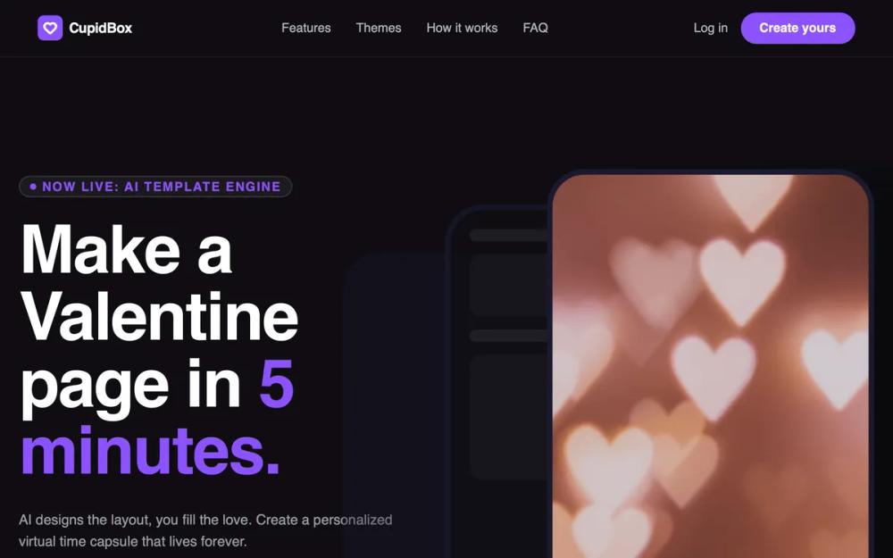 All Prompts
CupidBox Premium Dark Landing Page
Premium dark landing page UI. Features deep navy/black, purple accents, editorial typography, 3D mockups, glassmorphic cards. Ideal for SaaS, agencies, fintech.
by OetawLive Preview
Prompt
# CupidBox Premium Dark Landing Page

{
  "summary": "A high-end, premium dark landing page with a deep navy background, vibrant purple CTAs, editorial typography, and floating 3D layered mockups. It features glassmorphism card components and smooth scroll-triggered-style transitions.",
  "style": {
    "description": "The style is 'Premium Dark Editorial' characterized by high-contrast white text on a deep navy background (#0f0d13). Primary accent is a vibrant purple (#8c52ff) used for buttons and active states. Typography uses 'Clash Display' (Bold) for a boutique, editorial feel and 'DM Sans' for readability. Key visual elements include 12px blur glassmorphism, 24px-48px border radii, and soft background glows in purple and rose tones.",
    "prompt": "Create a design system with the following specs: \n- **Colors**: Background: #0f0d13; Primary Accent: #8c52ff; Card Background: rgba(26, 26, 46, 0.6); Border: rgba(255, 255, 255, 0.15); Muted Text: rgba(255, 255, 255, 0.6).\n- **Typography**: Headlines: 'Clash Display', bold weight (700), letter-spacing: -0.02em. Body: 'DM Sans', weights 400-700. Font sizes: H1: 80px (mobile 48px), H2: 64px, Body: 18px.\n- **Components**: Glassmorphism cards with `backdrop-filter: blur(12px)` and 1px solid border. Buttons have a 50px border-radius, #8c52ff background, and a hover state featuring `filter: brightness(1.1)` and a shadow of `0 10px 25px -5px rgba(140, 82, 255, 0.4)`.\n- **Animations**: 'float' animation for images (translateY -20px over 6s, ease-in-out). Smooth transitions (0.3s) for all hover states."
  },
  "layout_and_structure": {
    "description": "A vertical scrolling landing page with a fixed navigation, hero section with product visualization, horizontal stats bar, 3-column feature grid, editorial theme showcase, and a centered FAQ accordion.",
    "prompts": [
      {
        "part": "Navigation",
        "prompt": "Sticky top navigation bar with `backdrop-filter: blur(12px)` and a 1px bottom border (#ffffff/5%). Left-aligned logo with a rounded-lg purple icon. Center-aligned links in `text-sm font-medium` with 32px spacing. Right-aligned 'Log in' link and a rounded-full purple 'Create' button."
      },
      {
        "part": "Hero Section",
        "prompt": "Split layout (2-column). Left: Badge with pulse animation (text: 'Now Live'), H1 headline 'Clash Display' (80px), subtext (white/60%, max-width 500px), and two large CTA buttons. Right: Stack of three floating phone mockups (#1A1A2E frames) with varying opacities (30%, 60%, 100%) and staggered 'float' animations."
      },
      {
        "part": "Stats Bar",
        "prompt": "A horizontal strip between sections with `border-y: 1px solid rgba(255,255,255,0.05)`. Four equally spaced columns showing a large 'Clash Display' stat (e.g., 50k+) and an uppercase, tracking-widest subtitle (white/40%)."
      },
      {
        "part": "Features Grid",
        "prompt": "3-column grid of glassmorphic cards. Each card includes a 48px square icon container with 20% opacity background of the icon color, H3 headline (24px), and a 'Try it now' link with an arrow icon that shifts right on hover."
      },
      {
        "part": "Editorial Themes",
        "prompt": "A section featuring a center-aligned header followed by a grid of 'Theme' cards. Each card has an `aspect-video` gradient preview, a title, a row of circular color swatches (16px diameter, overlapping by -8px), and a full-width outline button that fills with purple on hover."
      },
      {
        "part": "FAQ",
        "prompt": "Single-column centered layout (max-width 768px). Interactive `<details>` elements styled as glassmorphic cards. Summary text is bold 18px with a purple chevron icon that rotates 180 degrees when open."
      }
    ]
  },
  "special_ui_components": [
    {
      "component": "Floating Phone Stack",
      "description": "Three layered smartphone frames that animate vertically at different intervals.",
      "prompt": "Implementation: Create 3 absolute-positioned containers with 9:19 aspect ratio and 3rem border-radius. Apply a 'float' keyframe animation. Container 1 (top): z-30, 100% opacity. Container 2 (middle): z-20, 60% opacity, -1.5s delay. Container 3 (bottom): z-10, 30% opacity, -3s delay."
    },
    {
      "component": "Theme Swatch Row",
      "description": "A specific UI pattern for showing a color palette.",
      "prompt": "Implementation: Create a flex container with `-space-x-2`. Render 16x16px circles with a 2px border matching the card background. Each circle must represent a color from the theme's palette."
    }
  ],
  "special_notes": "Must maintain high contrast between text and background. Must use the exact background color #0f0d13 to ensure depth. Do not use standard squares; all corners must have a minimum of 12px radius, with main cards at 24px and buttons at full round. Background glow effects (purple/rose) must be very subtle (blur 120px+) to avoid looking messy."
}