All Prompts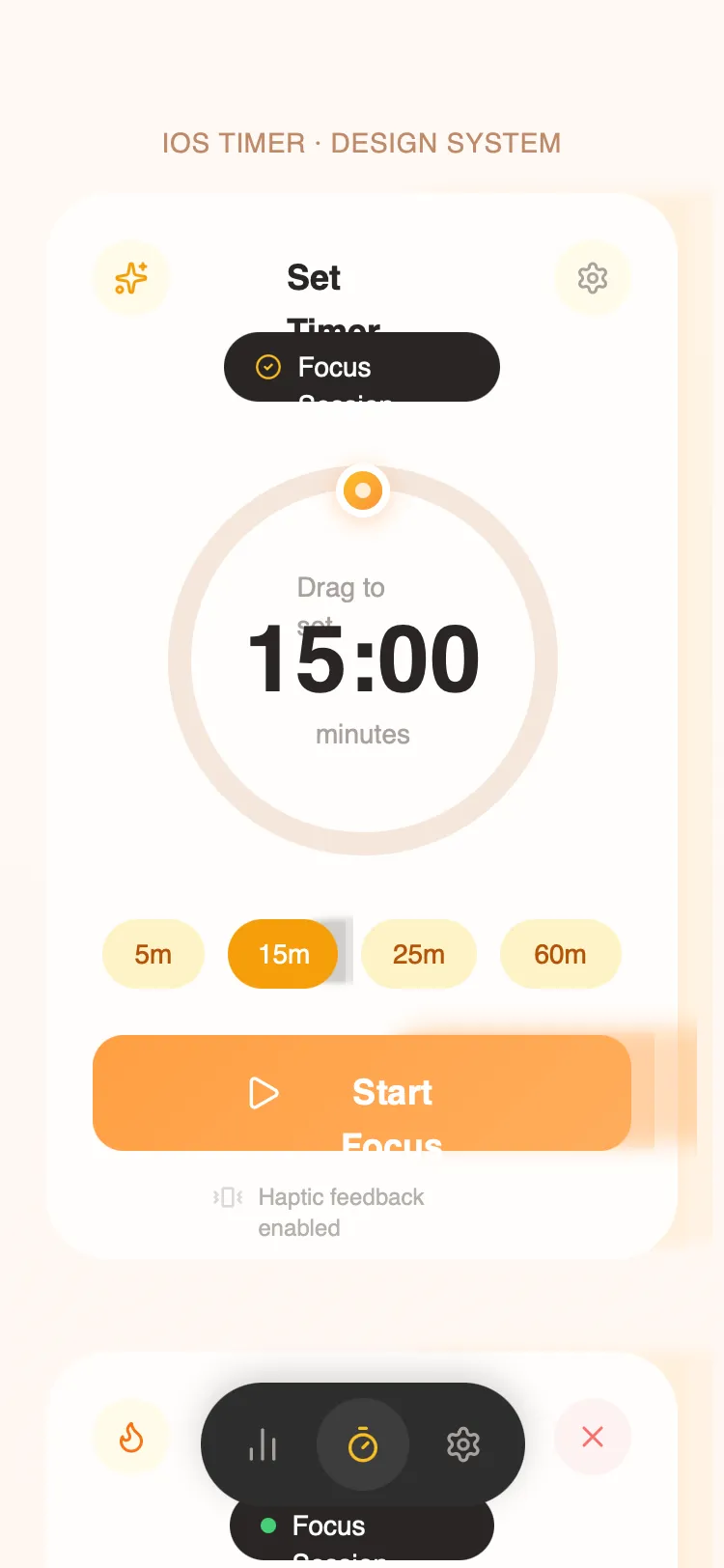 All Prompts
Cute Timer App - Natural Growth Palette
UI-кит для приложений таймера: природная палитра, круглые индикаторы, микро-взаимодействия. Для wellness, productivity, mindfulness.
by Ibolly ŞerLive Preview
Prompt
# Cute Timer App - Natural Growth Palette

{
  "summary": "A friendly and tactile mobile-first UI focused on focus and growth. It uses high-contrast earthy tones against soft white backgrounds to create a sense of calm productivity. The design is characterized by large, playful buttons, circular geometry, and haptic-inspired feedback cycles.",
  "style": {
    "description": "The style is 'Organic Productivity'. It combines a soft background (#F5F5F5 to #FAF7F4 gradient) with a primary 'Growth' color of Spring Green (#7CB342). Typography uses Cabinet Grotesk (Extrabold) for high-impact numbers and Satoshi (Medium/Bold) for readability. Interactions are bouncy and spring-based, using scale-downs on click and soft glows on active states.",
    "prompt": "Create a design system with the following specifications: **Colors**: Background is a linear gradient from #F5F5F5 to #FAF7F4. Primary action color is Spring Green (#7CB342) used in a 135-degree gradient to #8BC34A. Accent colors include Sky Blue (#A8D8EA) for info/secondary elements, Warm Tan (#D4A574) for warmth, and Dark Brown (#3E2723) for primary text. **Typography**: Use 'Cabinet Grotesk' (Extrabold, 800) for timer digits (48px+) and headers. Use 'Satoshi' (Regular 400, Medium 500, Bold 700) for all body text, buttons, and labels. **Shadows**: Primary cards use '0 8px 32px rgba(62, 39, 35, 0.08)'. Buttons use a colored shadow: '0 8px 24px rgba(124, 179, 66, 0.35)'. **Animations**: Transitions use 'cubic-bezier(0.4, 0, 0.2, 1)'. Click states should scale to 0.96 with a 150ms spring effect. **Visual Elements**: Corner radii are a consistent 32px for cards and 16px-24px for buttons."
  },
  "layout_and_structure": {
    "description": "The layout is centered around a primary interactive focus card within a full-bleed soft background. Elements are vertically stacked with high internal padding (24px) to emphasize touch-friendly interaction.",
    "prompts": [
      {
        "part": "Header Navigation",
        "prompt": "Top bar features a three-part layout: Left icon in a 40px circular container (#E3F2E9), Center text in Cabinet Grotesk (18px, Bold, #3E2723), and Right icon in a 40px circular container (#EAF4FB). Spacing: 16px bottom margin."
      },
      {
        "part": "Main Timer Card",
        "prompt": "A white (#FFFFFF) card with 32px border radius. Contains a 220x220px SVG timer ring. The ring has a 12px stroke width with a background path of #E8E4E0 and a progress path using a gradient from #7CB342 to #A8D8EA. Center content includes large 48px Cabinet Grotesk timer text and small 14px caption text in #8D6E63."
      },
      {
        "part": "Action Controls",
        "prompt": "Primary action button is a full-width, 64px height button with 16px radius, featuring a gradient from #7CB342 to #8BC34A, white bold text, and a play icon. Secondary controls are 64x64px or 80x80px square cards with 24px-32px radius, colored white or primary green depending on importance."
      },
      {
        "part": "Preset Selection",
        "prompt": "Horizontal scrolling or flex-wrap chips (32px height) with rounded-full borders. Inactive chips use #E3F2E9 background with #5D7B3A text. Active chips use solid #7CB342 with white text and a subtle shadow."
      },
      {
        "part": "Bottom Navigation",
        "prompt": "Floating pill-shaped dock (#3E2723) with 56px height. Contains 48x48px circular nav items. Active items have a background of #5D4037 and change icon color to #7CB342. Inactive icons are #8D6E63."
      }
    ]
  },
  "special_ui_components": [
    {
      "component": "Interactive SVG Timer Ring",
      "description": "A customizable progress ring with a draggable handle.",
      "prompt": "Implementation: SVG circle with stroke-dasharray/offset. Stroke-width: 12px. Progress stroke: url(#greenGradient). Add a 'drag-handle' component: 28x28px circle with 4px white border, background-gradient (#7CB342 to #A8D8EA), and a 8x8px centered white dot. Handle must have a filter: drop-shadow(0 4px 12px rgba(124, 179, 66, 0.4))."
    },
    {
      "component": "Celebration Particles",
      "description": "Confetti system for completion states.",
      "prompt": "8x8px rounded rectangles in five colors (#7CB342, #A8D8EA, #D4A574, #FFA726, #8BC34A). Animation: 'confettiFall' 3s ease-out infinite with random rotation and x-axis drift."
    },
    {
      "component": "Haptic Pulse Indicator",
      "description": "Small status label with a rhythmic pulse animation.",
      "prompt": "Horizontal layout: Iconify icon + 12px text. The entire container should have an animation: 'pulse 2s ease-in-out infinite' shifting opacity from 0.6 to 1.0."
    }
  ]
}