All Prompts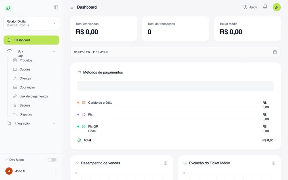 All Prompts
Dark Mode Listings Dashboard
Дашборд в темной теме для списков. UI-компонент с темной палитрой, метриками, прогресс-барами и таблицей данных. Идеально для маркетплейсов.
by João MoitinhoLive Preview
Prompt
# Dark Mode Listings Dashboard

{
  "summary": "A professional dark-mode management interface with a fixed sidebar, integrated search, high-visibility metric cards, and a detailed data table for tracking listings and statuses.",
  "style": {
    "description": "Professional dark mode using 'General Sans' typography. Palette focuses on deep neutrals (#141416, #1A1B1E, #222327) contrasted with functional status colors (Green #4CA758, Orange #F59E0B, Blue #3B82F6). The aesthetic is defined by subtle borders (#2E2F36), large border-radii (up to 16px), and high-quality micro-interactions on hover.",
    "prompt": "Implement a dark-themed UI system. **Colors:** Background #141416, Sidebar #1A1B1E, Surfaces/Cards #222327, Borders #2E2F36. **Brand Accents:** Primary Green #4CA758, Warning Orange #F59E0B, Critical Red #EF4444, Info Blue #3B82F6. **Typography:** Use 'General Sans' or similar geometric sans-serif; Headings at 24px bold (white), Body at 14px (gray-400), Captions at 12px (gray-500). **Effects:** Rounded corners: 12px for small components, 16px for cards, 9999px for pills. Borders should be 1px solid #2E2F36. Hover states should transition over 200ms, changing background to #2C2D33 or border to #4B5563. Include a 'glow' shadow effect for primary actions: 0 0 20px rgba(76, 167, 88, 0.15)."
  },
  "layout_and_structure": {
    "description": "Fixed sidebar navigation with a flexible main content area. Content is structured into a search-focused header, a summary metrics grid, and a large-format data list.",
    "prompts": [
      {
        "part": "Sidebar Navigation",
        "prompt": "Width: 280px, background: #1A1B1E, border-right: 1px solid #2E2F36. Includes a user-profile trigger at the top (12px padding, #222327 background), a navigation list with icons (18px icon size, 14px text), and a fixed bottom user-account section featuring a gradient avatar (Green to Emerald) and logout button."
      },
      {
        "part": "Top Header Customer",
        "prompt": "Height: 64px, background: #1A1B1E, sticky positioning. Features a centered search bar (max-width: 576px) with 40px height, rounded-full shape, and #141416 background. Right side contains a 'Create' button (pill shape, #4CA758 background) and a cluster of notification/help icons with subtle hover highlights."
      },
      {
        "part": "Metrics Grid",
        "prompt": "A 4-column responsive grid (1 column on mobile). Each card has 20px padding, a #222327 surface, and contains: a category label (14px gray), a large value (30px bold white), and a functional icon in a 40x40px rounded box. A 4px thick progress bar at the bottom reflects the metric status using brand colors."
      },
      {
        "part": "Listings Table",
        "prompt": "Container: #222327 background, 16px radius. Header: 12px uppercase tracking-wider text. Rows: 16px vertical padding, 24px horizontal. Features multi-line cell content (Primary text 14px medium white, Secondary text 12px gray). Status badges: Pill shape, 10% opacity background of the brand color with 20% opacity border."
      },
      {
        "part": "Top Header Non Customer",
        "prompt": "Height: 64px, background: #1A1B1E, sticky positioning. Features a centered search bar (max-width: 576px) with 40px height, rounded-full shape, and #141416 background. Right side contains a 'Create' button (pill shape, #4CA758 background), logotype in left-side, and a cluster of signin/up/notification/help icons with subtle hover highlights."
      }
    ]
  },
  "special_ui_components": [
    {
      "component": "Status Badge Pill",
      "description": "A refined status indicator with low-alpha backgrounds.",
      "prompt": "Create a pill-shaped badge with 10px vertical and 4px horizontal padding. Font: 12px semi-bold. For 'Success': background rgba(76, 167, 88, 0.1), text #4CA758, border 1px solid rgba(76, 167, 88, 0.2). For 'Warning': background rgba(245, 158, 11, 0.1), text #F59E0B, border 1px solid rgba(245, 158, 11, 0.2)."
    },
    {
      "component": "Progressive Metric Card",
      "description": "Summary card with integrated health-bar.",
      "prompt": "Card layout: Padding 20px, Background #222327, Border 1px #2E2F36. Top section: Title (gray-400) and large numeric value (white). Bottom section: A full-width 4px height track (#141416) with a colored fill representing a percentage of total capacity. Fill colors correspond to metric type (e.g., Blue for total, Green for active)."
    }
  ],
  "special_notes": "MUST maintain the high contrast between text (#FFFFFF) and background (#141416). DO NOT use pure black (#000000); use the specified charcoal tones. MUST ensure all interactive elements have a :hover state transition. Icons should always be accompanied by labels or clear tooltips."
}