All Prompts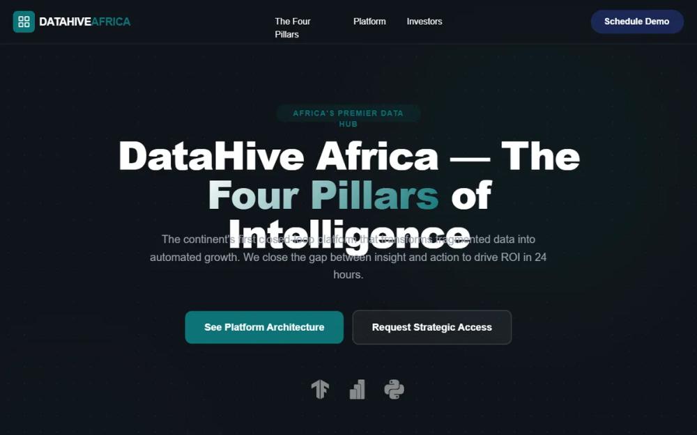 All Prompts
DataHive Africa Dark Mode
Темная тема лендинга DataHive Africa для SaaS, финтеха. Современный дизайн с бенто-сеткой, анимациями и стеклянным эффектом. Обеспечивает безопасность и эффективность.
by VICTOR MAGADILive Preview
Prompt
# DataHive Africa Dark Mode

{
  "summary": "DataHive Africa Dark Mode style guide: A futuristic, secure, and professional dark-themed web layout. It uses a hierarchy of dark navy and charcoal backgrounds with teal highlights, utilizing a 'Four Pillars' bento grid and scroll-reveal transitions to create a dynamic user journey. The aesthetic balances tech-heavy data visualization with clean, accessible typography.",
  "style": {
    "description": "The style is 'Corporate Tech Noir'—a blend of high-end editorial fonts and technical elements. It uses 'Cabinet Grotesk' for bold, authoritative headlines and 'Plus Jakarta Sans' for clean, readable body text. Colors are strictly layered: deep base charcoal (#0F1419), secondary navy (#161B26), and component backgrounds (#1A1F2E). Accent highlights are primarily Teal (#0D7377) with secondary vibrant status colors. Transitions are smooth, using a cubic-bezier(0.16, 1, 0.3, 1) curve for natural feel.",
    "prompt": "Apply a dark-mode theme using #0F1419 as the primary background and #161B26 for section breaks. Typography: Headings in 'Cabinet Grotesk' (weights 700-800) with tracking-tight; Body in 'Plus Jakarta Sans' (weights 400-600) with leading-relaxed. Color Palette: Primary Teal (#0D7377), Navy (#1A2854), Gold (#D4AF37), Coral (#FF6B6B), Emerald (#2ECC71), Sapphire (#0066CC). Backgrounds should feature a radial-gradient grid pattern (circle, rgba(255,255,255,0.05) 1px, transparent 1px, size 30px). Interactive elements must use a 'card-hover' effect: transform: translateY(-8px) and a transition-duration of 500ms. Headlines should occasionally use a linear-gradient text effect from #FFFFFF to #0D7377 at 135deg. Buttons: Primary buttons are solid Teal (#0D7377) with rounded-xl corners (12px); secondary buttons are ghost-style with 2px white/10 borders."
  },
  "layout_and_structure": {
    "description": "A vertically stacked structure beginning with a sticky blurred header, followed by a hero section with floating background elements, a 4-column bento grid for core features, a split-screen feature showcase, and a multi-column modular footer.",
    "prompts": [
      {
        "part": "Header",
        "prompt": "Create a sticky header with a backdrop-blur-md and background #0F1419/80. Layout: Max-width 7xl (1280px), height 80px, flex-row with space-between. Left side: Logo with Teal icon container and uppercase bold text. Center: Navigation links in weight-500 font with Teal hover transition. Right: 'Schedule Demo' button in Navy (#1A2854) with 24px horizontal padding."
      },
      {
        "part": "Hero Section",
        "prompt": "Full-width section with pt-32 (128px) padding. Background: Apply radial grid and two large animated blur blobs (top-right Teal/5%, bottom-left Navy/5%). Content: Center-aligned. Elements: (1) Teal/10% rounded pill with uppercase tracking-widest text. (2) H1 headline text-7xl font-extrabold with gradient span. (3) Max-width 3xl paragraph in text-gray-400. (4) Dual CTA buttons (Teal solid and White ghost). (5) Tech stack logo row with grayscale filter and opacity 50% (hover to full color)."
      },
      {
        "part": "Pillars Bento Grid",
        "prompt": "Padding py-24 (96px) on background #161B26. Title section centered with H2 and gray-400 description. Grid: 4 equal columns on desktop, 1 on mobile, gap-8 (32px). Cards: Background #1A1F2E, rounded-3xl (24px), border border-white/5. Each card contains: (1) 56px square icon container with 10% opacity background of the accent color (Gold, Coral, etc.). (2) Bold H3 title. (3) Small text body. (4) Checkmark list using the specific pillar accent color for icons."
      },
      {
        "part": "Feature Loop Showcase",
        "prompt": "Section with py-24 and a 'carbon-fibre' pattern overlay (opacity 20%). Split layout: Left column (50%) features H2 with teal highlights and a numbered list (01, 02) with circular teal border indicators. Right column (50%) features a mockup card: background #0A0E14/40, backdrop-blur-xl, border border-white/10. Inside card: Live activity pulse icon (Teal) and vertical feed of UI components representing real-time data status updates (Intelligence, Action triggers)."
      },
      {
        "part": "Footer",
        "prompt": "Background #0F1419 with top border white/10. Upper row: Logo and horizontal nav links. Middle row: 3-column grid (Contact, Headquarters, Social). Social icons: circular background white/5, transition to Teal on hover. Bottom: Centered copyright and versioning text in gray-400."
      }
    ]
  },
  "special_ui_components": [
    {
      "component": "Scroll Reveal Component",
      "description": "An opacity and transform-based reveal animation triggered on scroll.",
      "prompt": "Any element with the '.reveal' class should start at opacity: 0 and transform: translateY(30px). Upon entering the viewport (150px threshold), apply a class '.active' that transitions to opacity: 1 and translateY(0) using transition: all 0.8s cubic-bezier(0.16, 1, 0.3, 1). Link this to a scroll event listener in Javascript."
    },
    {
      "component": "Interactive Integration Loop",
      "description": "A glassmorphism card mimicking a live dashboard interface.",
      "prompt": "Construct a card with background rgba(10, 14, 20, 0.4) and backdrop-blur(20px). Border: 1px solid rgba(255, 255, 255, 0.1). Include a 'Live' indicator with a pulse animation (scale from 1 to 1.1). Content blocks inside should use background white/5 and have a 'status' text label in Gold (#D4AF37) or Emerald (#2ECC71) depending on successful state."
    }
  ]
}