All Prompts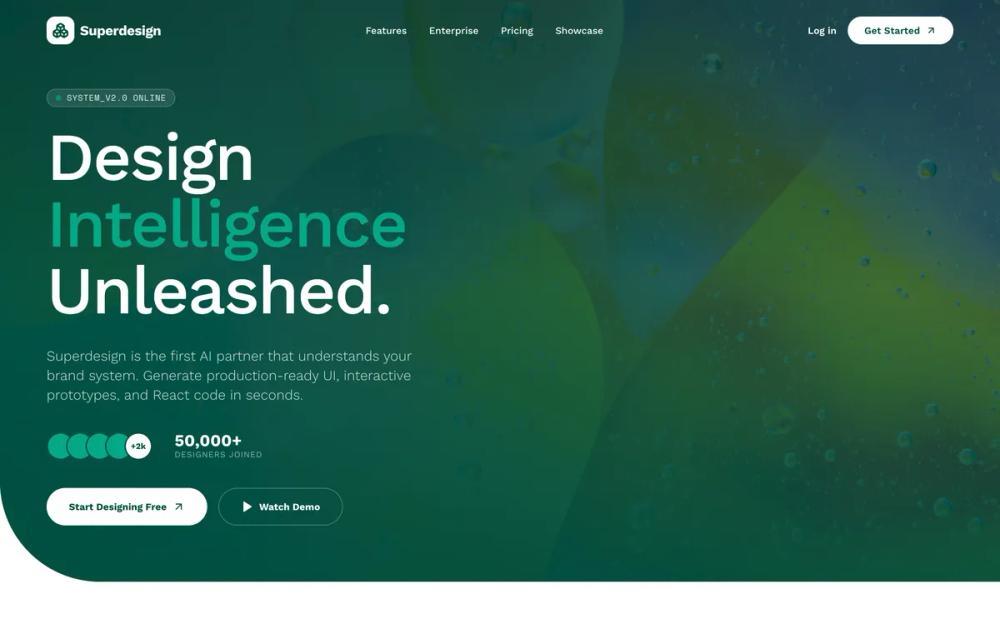 All Prompts
landing pagepagestyle
Digital Naturalism
Стиль Digital Naturalism: органичные формы, глубокие зелёные оттенки, асимметричное скругление. Идеально для AI-продуктов, SaaS, финтеха.
by Zhou JasonLive Preview
Prompt
# Digital Naturalism

{
  "summary": "Digital Naturalism UI: A premium, tech-organic design system utilizing deep greens, massive corner radii, and sophisticated glassmorphism to create a 'system-grade' yet approachable brand identity.",
  "style": {
    "description": "The style centers on a high-contrast 'Forest-to-Emerald' theme. Typography combines bold, tight-tracked sans-serif headings for impact with technical monospace labels for system status and data. Micro-interactions utilize smooth spring animations and subtle 1.1x scaling on hover. Shadows are deep but soft (emerald-tinted), and borders often use low-opacity white (10-30%) on dark backgrounds to create a layered, depth-heavy environment.",
    "prompt": "Color Palette: Primary Dark Forest: #004F3F, Vibrant Emerald Accent: #04A887, Soft Mint Background: #F5FAF8, Light Border/Neutral: #E7F2EE. Typography: Headings use a bold sans-serif with -0.05em tracking and 0.95 line-height; Labels/Badges use a monospace font (10px-12px) with uppercase 0.2em letter spacing. Borders & Radii: Container radii at 80px to 140px for hero/sections; component cards at 32px. Use 'rounded-bl' or 'rounded-tr' exclusively on large sections for an asymmetrical feel. Glassmorphism: Backgrounds use bg-white/95 with backdrop-blur-md for light cards, and bg-white/10 with backdrop-blur-sm for dark-mode accents. Animations: use cubic-bezier(0.4, 0, 0.2, 1) for transitions, 600ms duration for entrance fades."
  },
  "layout_and_structure": {
    "description": "A tiered layout moving from high-impact immersive headers to modular 'Bento-style' feature grids. Key characteristic: sections are often contained within large 'rounded-bottom' or 'rounded-top' containers that reveal or transition into different background colors.",
    "prompts": [
      {
        "part": "Navigation",
        "prompt": "Sticky header with 500ms transition. Initial state: transparent, white text, 24px padding. Scrolled state: white background, #004F3F text, 16px padding, backdrop-blur-md, soft bottom shadow. Include a logo with a #004F3F rounded-xl background icon (40x40px) and a pill-shaped CTA button."
      },
      {
        "part": "Hero Section",
        "prompt": "Height: 92vh. Background: #004F3F with a 40% opacity image overlay (mix-blend-overlay) and a gradient from #004F3F/90 to transparent. Feature: massive bottom-left corner radius (80px to 140px). Text: Left-aligned large heading (text-7xl+) in white with emerald highlights. Include a monospace status badge with a pulsing #04A887 dot at the top. CTA: Pill-shaped buttons (8px horizontal padding, 4px vertical padding) with high-contrast colors (white vs #004F3F)."
      },
      {
        "part": "Intro Split Section",
        "prompt": "2-column grid. Column 1: A vertical-oriented image with a massive top-right corner radius (120px) and a floating glassmorphism card overlay. Column 2: 4-part stack comprising a monospace category tag, a medium-sized heading (text-5xl), a light-weight body paragraph (leading-relaxed), and a 2-column stats grid with 3xl font-bold numbers."
      },
      {
        "part": "Features Grid",
        "prompt": "Section background: #F5FAF8. Top-border: massive top-radius (96px). Grid: 3-column bento style. Cards: Aspect-square, white background, 32px radius, 1px border (#E7F2EE). Feature: Top-left corner of cards should have an internal absolute-positioned tag (bg-white/90, backdrop-blur) containing a 2-line label (Category + Title). Hover effect: image scales 1.1x inside the card."
      },
      {
        "part": "Highlight Callout",
        "prompt": "A contained section inside a #F5FAF8 rounded box (48px radius) with an 1px #E7F2EE border. Grid: 1.2fr image (left) vs 1fr content (right). Image side contains a floating testimonial card with a 3-avatar stack and a small emerald text highlight ('+5 active'). Content side features a vertical progress bar accent (48px height, 4px width, #04A887) before the heading."
      },
      {
        "part": "Newsletter Footer",
        "prompt": "Background: #004F3F. Text: #FFFFFF. Top-border: 96px radius. Layout: 2-columns. Left side: High-depth image with emerald gradient overlay. Right side: Email capture with #004F3F input field, #04A887/50 border, and white rounded-full button. Bottom footer area: 4-column link grid with #FFFFFF/40 uppercase monospace subtext for system info (version, status)."
      }
    ]
  },
  "special_ui_components": [
    {
      "component": "Floating Status Overlay",
      "description": "A glassmorphism card used to show 'live' system processing.",
      "prompt": "Container: white/95 opacity, backdrop-blur-xl, 24px radius, 1px white/50 border, shadow-lg. Content: Top row with an icon circle (#E7F2EE) and 2-line monospace text. Bottom: list of checkmark items using #04A887 for icons. Include a small 14px spin-animated border circle for 'loading' states."
    },
    {
      "component": "Asymmetric Bento Card",
      "description": "A card where the content label is physically 'cut' into the corner.",
      "prompt": "White 32px rounded card. Inside, an absolute-positioned div in the top-left (padding: 24px, bg-white/90, backdrop-blur, rounded-br-2xl, border-b, border-r). This div contains a 24px bold font-size title. The background image of the card should be zoom-able on parent hover."
    }
  ],
  "special_notes": "MUST: Maintain a strict 80px+ radius on main section transitions. MUST: Use #004F3F as the primary text color on light backgrounds, never pure black. MUST: Pair monospace system labels with all major headers. MUST NOT: Use sharp corners anywhere except for internal icons. MUST NOT: Use standard 16px border-radius; use 24px-32px as the minimum for cards."
}