Загрузка...
Editorial onboarding UI для креативных платформ. Минималистичный дизайн с тактильной текстурой и интерактивными элементами для улучшения пользовательского опыта.
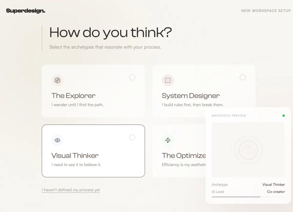
# Editorial onboarding

{
  "summary": "An editorial onboarding flow with a warm minimalist aesthetic, featuring huge typography, a noise-textured background with organic floating blobs, and high-precision interactive UI components.",
  "style": {
    "description": "The style is 'Warm Minimalist Editorial.' It uses Clash Display (Variable) for high-impact headings and Satoshi for legible, wide-spaced body text. The color palette is centered on neutrals: Cream (#F8F6F3), Deep Taupe (#6B5D56), and Charcoal (#2A2624), with Muted Rose (#D4A5A5) as a soft accent. Key stylistic traits include a 5% opacity noise overlay, ambient blurred background circles that drift slowly, and a 1.2s cubic-bezier entrance animation for content elements.",
    "prompt": "Apply a design system called 'Superdesign' with the following specs: \n- **Color Palette**: Background: #F8F6F3 (Cream); Primary Text: #2A2624 (Charcoal); Secondary Text: #6B5D56 (Deep Taupe); Accent: #D4A5A5 (Muted Rose); Secondary Accent: #E8DCC8 (Warm Beige).\n- **Typography**: Headings use 'Clash Display', weight 500-700, tracking -0.02em. Hero text size: 96px to 128px (leading 0.9). Body text uses 'Satoshi', weight 400-500, font-size 18px. Labels/Captions: Satoshi, uppercase, tracking 0.15em.\n- **Visual Texture**: Apply a global background noise texture using an SVG filter (fractalNoise, baseFrequency 0.65, 0.05 opacity). \n- **Background Layers**: Include large blurred circles (#E8DCC8 at top-left, #D4A5A5 at bottom-right) with a 20s 'drift' animation (translate 30px, rotate 5deg).\n- **Interactions**: Buttons use #2A2624 background, rounded-full, with 10px padding and a 300ms transition. Hover states for cards should include a subtle -1deg to 2deg rotation change and a shadow: 0 20px 40px -10px rgba(107, 93, 86, 0.15)."
  },
  "layout_and_structure": {
    "description": "The layout follows a centered, single-column scroll-based journey with a max-width of 768px (3xl). Sections are separated by massive vertical gaps (128px to 192px) to ensure focus on individual steps. A persistent floating panel on the right side provides real-time feedback.",
    "prompts": [
      {
        "part": "Header/Navigation",
        "prompt": "A fixed top navigation, 100% width, px-8 py-6. Left: Logo 'Superdesign.' in Clash Display Bold 20px. Right: 'New Workspace Setup' label in Satoshi 12px, uppercase, tracking-widest, opacity 60%. Use mix-blend-darken for background interaction."
      },
      {
        "part": "Floating Echo Panel",
        "prompt": "Fixed bottom-right aside panel (width 288px). Content: white/80 background with backdrop-blur-xl, border white/50, rounded-2xl, shadow-2xl. Inside: A manifesto preview with an abstract visual DNA (spinning concentric circles), status indicators (green pulsing dot), and small progress bars in Deep Taupe/30."
      },
      {
        "part": "Hero Section",
        "prompt": "Min-height 70vh, flex-column, center-aligned. Heading: 'Design at the' followed by an italicized line 'speed of thought.' (Clash Display, 96px+). Subtext: Max-width 448px, Satoshi 20px, opacity 70%. CTA: Rounded-full charcoal button with a lucide:arrow-down icon that translates vertically on hover."
      },
      {
        "part": "Archetype Grid",
        "prompt": "A 2-column grid (1-column on mobile) of selectable cards. Each card: p-8, white/60 background, backdrop-blur-sm, rounded-2xl. On select (checkbox peer-checked): border-deep-taupe and bg-white. Features unique icon containers (40x40 rounded-full) in varying soft pastel colors."
      },
      {
        "part": "Success Masonry",
        "prompt": "A relative container (height 500px) with three overlapping cards. Card 1: Top-left, -1deg rotation. Card 2: Top-right, 120px offset, 2deg rotation. Card 3 (Featured): Center-bottom, charcoal background, cream text, -1deg rotation. All cards transition to 0deg rotation and scale 1.01 on hover."
      },
      {
        "part": "Orbital Control Dial",
        "prompt": "A relationship dial UI. Layout: A central horizontal line with a large semicircular dashed arc above it. A series of vertical tick marks (px-1) connected to the base. A central active node (16px circle) in charcoal. Labels below in Satoshi 12px, tracking-widest, with the active state underlined and bolded."
      },
      {
        "part": "Completion Moment",
        "prompt": "Centered final CTA section. Visual: A 96px white circle with a Lucide:Sparkles icon, floating over a blurred gradient blob (#E8DCC8 to #D4A5A5). Heading: 'Your studio is ready.' 64px Clash Display. Secondary button has deep-taupe/20 border and transparent background."
      }
    ]
  },
  "special_ui_components": [
    {
      "component": "Interactive Archetype Card",
      "description": "A sophisticated checkbox replacement card that uses peer-state styling.",
      "prompt": "Create a card component using a hidden checkbox input. The wrapper div should be styled with transition-all duration-300. Inside, include a top-row flex container for a colored icon badge (10x10 units) and a custom checkmark indicator (20x20 circle, border-deep-taupe/30). When the hidden input is checked, the outer container should gain a solid border-deep-taupe and the internal checkmark circle should fill with charcoal and show a white Lucide:Check icon."
    },
    {
      "component": "Noise Overlay",
      "description": "A global texture that gives the design a tactile, paper-like feel.",
      "prompt": "Inject an absolute inset-0 div with pointer-events-none and z-index 50. Apply a background-image via data-uri SVG containing a turbulence filter. Set opacity to 0.05 and mix-blend-multiply to ensure it adds grain to all underlying colors without washing them out."
    }
  ]
}