All Prompts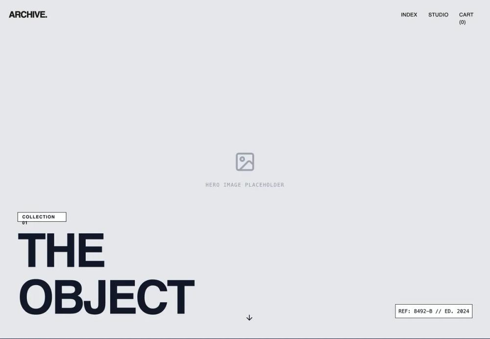 All Prompts
shopifyecommercelayoutproduct pagepdp
Editorial Story Product Page
Шаблон "Editorial Story" для карточки товара. Вертикальный сторителлинг с героями, нарративом и отложенной кнопкой покупки. Идеально для премиум-брендов.
by Shirley LouLive Preview
Prompt
# Editorial Story Product Page

{
  "summary": "An editorial-inspired product page wireframe that balances raw structural elements with refined typography. The layout features a 2/3 width scrollable content area on the left and a 1/3 width sticky transaction module on the right, punctuated by heavy 1px borders and distinct placeholder patterns.",
  "style": {
    "description": "The style is a 'refined brutalist' wireframe using a strict grayscale palette (#000000, #FFFFFF, #F3F4F6). It pairs three font styles: 'Cabinet Grotesk' for heavy display headers, 'Satoshi' for functional UI text, and 'Sentient' (serif) for narrative copy. Animation is minimal, focusing on smooth scrolling and subtle hover states.",
    "prompt": "Create a high-contrast grayscale design system. \n- **Colors**: Primary Background: #FFFFFF; Primary Text: #000000; Secondary Background (Placeholders): #F3F4F6 with a 45-degree repeating linear gradient pattern using #E5E7EB lines at 10px intervals; Borders: Solid 1px #000000 or #E5E7EB. \n- **Typography**: Display: 'Cabinet Grotesk' (900 weight, uppercase, tracking-tighter, leading-0.85); Body: 'Satoshi' (400-700 weight); Serif Narrative: 'Sentient' (400 weight, italic for emphasis); Mono: Standard monospace for technical data (10px-12px, uppercase). \n- **Borders**: All major sections separated by 1px solid black borders. \n- **Interactive**: Navigation must use 'mix-blend-difference' to remain visible against dark/light backgrounds. Buttons should be sharp-edged (0px border-radius) with solid black fills and white text."
  },
  "layout_and_structure": {
    "description": "A vertical-oriented split layout that transitions from a full-screen immersive hero to a dual-column functional view.",
    "prompts": [
      {
        "part": "Navigation",
        "prompt": "Fixed top navigation bar, 100% width, px-6 py-6. Use mix-blend-difference to ensure visibility. Left-aligned uppercase brand name in Cabinet Grotesk. Right-aligned links (Index, Studio, Cart) in Satoshi 14px uppercase with 32px spacing."
      },
      {
        "part": "Hero Section",
        "prompt": "Full-screen (100vh) container with a placeholder-pattern background. Centered placeholder icon. At the bottom, place an h1 with 128px-160px font-size, line-height 0.85, and tracking-tighter. Include a small white box with black border containing monospaced reference data (e.g., REF: 8492-B) at the bottom-right. Include a bouncing arrow-down icon centered at the bottom."
      },
      {
        "part": "Split Content Main",
        "prompt": "A container with two columns. Left column: 66% width, scrollable, contains narrative text, specification grids, and large-scale imagery. Right column: 33% width, sticky (top: 0), 100vh height. Columns are separated by a 1px vertical black border."
      },
      {
        "part": "Product Story & Specs",
        "prompt": "Within the left column: 1. A story section with px-24 padding, featuring 32px serif text. 2. A 2-column grid within the column, one side showing an image placeholder (aspect-ratio 4/5), the other side showing a specification list using definition lists (dl). Each spec row has a 1px light gray bottom border, label on left (mono), value on right (Satoshi Bold)."
      },
      {
        "part": "Sticky Purchase Module",
        "prompt": "Right-hand 33% column. Sticky positioning. Top section contains h2 product title (48px uppercase), price ($XXX.XX in mono), and variant selectors. Variant selectors are 48px circles with 1px borders. Size selectors are a 3-column grid of rectangles. Bottom section contains a full-width black button with an arrow icon and a micro-disclaimer in 10px mono text."
      },
      {
        "part": "Related Products Grid",
        "prompt": "Full-width section after the split layout. Header with 48px title and a 'View All' link with a bottom-border hover state. 4-column grid of cards. Each card: 3/4 aspect ratio placeholder, bold uppercase title, price in mono, and subtle gray subtitle."
      }
    ]
  },
  "special_ui_components": [
    {
      "component": "Placeholder Pattern",
      "description": "A diagnostic-style background for empty containers.",
      "prompt": "Apply background-color #F3F4F6. Create a background-image using repeating-linear-gradient at 45deg, using #E5E7EB for 1px and transparent for 10px. Add a centered iconify-icon (lucide:image) in #9CA3AF and a bottom-centered label in 10px Mono."
    },
    {
      "component": "Interactive Size Button",
      "description": "A size selector button indicating 'out of stock' with a visual strike.",
      "prompt": "Rectangle 1px border. For 'out of stock', use text-gray-400 and an absolute-positioned 1px diagonal line (rotate-45) spanning from corner to corner of the button."
    },
    {
      "component": "Magnetic Navigation Link",
      "description": "A minimalist link with a blend mode effect.",
      "prompt": "Font: Satoshi 14px, uppercase, tracking-widest. Parent nav: mix-blend-difference. Hover: opacity-70. Transition: 200ms ease-in-out."
    }
  ]
}