All Prompts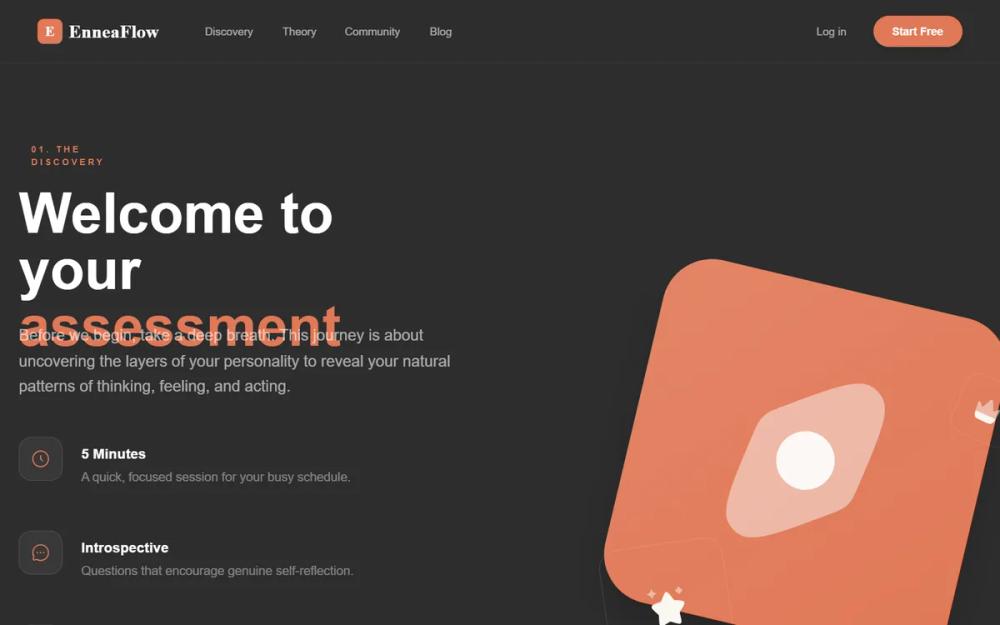 All Prompts
EnneaFlow - Warm Asymmetrical Discovery
UI-компонент: асимметричный дизайн для лендингов, тестов личности, психологии. Теплые цвета, геометрия, вертикальный прогресс.
Prompt
# EnneaFlow - Warm Asymmetrical Discovery

{
  "summary": "EnneaFlow is a 'Warm Asymmetrical Discovery' style that combines brutalist layout principles with an organic, earthy color palette. It avoids all rounded edges, opting for a sharp, modern angularity. The design uses heavy typography (DM Sans) and a distinctive 45-degree rotated visual language to create a sense of direction and precision.",
  "style": {
    "description": "The style is defined by its warm-toned color palette (Cream #faf7f2, Terracotta #e07856, Ochre #d4a574) and sharp geometric constraints. Typography pairings include DM Sans for bold, high-impact headings and Inter for clean body text. Visuals are characterized by layered squares rotated at 45 degrees with subtle floating animations and offset hard-drop shadows.",
    "prompt": "### Design System: Warm Asymmetrical Discovery\n\n**1. Colors:**\n- **Background:** Cream (#faf7f2)\n- **Primary Accent:** Terracotta (#e07856)\n- **Secondary Accent:** Ochre (#d4a574)\n- **Tertiary Accent:** Forest Green (#5f7a61)\n- **Primary Text:** Charcoal (#1a1a1a)\n- **Secondary Text:** Warm Gray (#6b6b6b)\n- **Footer Background:** Dark Charcoal (#26211e)\n\n**2. Typography:**\n- **Headings (Display):** DM Sans. Weight: 900 (Black). Leading: 0.95. Letter-spacing: -0.05em. Style: Tight, bold, impactful.\n- **Body Text:** Inter. Weight: 400 (Regular). Leading: 1.6. Color: Warm Gray (#6b6b6b).\n- **Logo/Serif Accents:** Bespoke Serif. Weight: 700.\n- **Utility/Labels:** Uppercase, tracking: 0.4em, font-weight: 900.\n\n**3. Visual Style & Effects:**\n- **Corners:** 0px (Always sharp, no rounding).\n- **Shadows:** Hard offset shadows (e.g., `10px 10px 0px 0px rgba(224,120,86,0.1)`) for buttons; soft, large-spread shadows for hero visuals.\n- **Gradients:** 135-degree linear gradients using primary/secondary colors (e.g., #e07856 to #c96542).\n- **Animations:** Slow floating effects (`translateY(-20px)`) combined with subtle rotation (45deg to 47deg) over 12s.\n\n**4. UI Elements:**\n- **Buttons:** Large, blocky, sharp-edged. High contrast text. Hover state includes X-axis translation for icons.\n- **Icons:** Solar icons in 'bold' or 'duotone' styles, strictly using the accent color palette."
  },
  "layout_and_structure": {
    "description": "The layout uses a 50/50 split on desktop, prioritizing a left-aligned typography stack and a right-aligned layered geometric composition. A distinctive vertical line connects list items to guide the eye.",
    "prompts": [
      {
        "part": "Navigation",
        "prompt": "Sticky header with a cream (#faf7f2) background and a very subtle charcoal (5% opacity) bottom border. Left side: Logo using Bespoke Serif and a square terracotta background for the initial icon. Center: Minimalist text links (14px, medium weight) with terracotta hover states. Right side: 'Start Free' button with high-contrast terracotta background and sharp corners."
      },
      {
        "part": "Hero Section",
        "prompt": "Asymmetrical layout. Left column (approx 55% width): Top label in uppercase tracking 0.4em with a 2px terracotta underline. H1 heading in DM Sans Black at 90rem, leading 0.95. Right column (approx 45% width): A large, floating composition of two overlapping squares. One primary terracotta square rotated 45 degrees with a white/20% border and a secondary ochre square at 30% opacity shifted behind it."
      },
      {
        "part": "Feature Vertical Stack",
        "prompt": "Located within the hero column. A 2px wide terracotta line (20% opacity) runs vertically behind the icons. Each item consists of a 56x56px white square icon box with a 1px charcoal border (5%). Upon hover, the square border changes to solid terracotta. Text labels are uppercase DM Sans, accompanied by Inter-based subtext."
      },
      {
        "part": "Call to Action (Primary)",
        "prompt": "An oversized button (padding: 2rem 3.5rem) with a solid terracotta background. Text: 'BEGIN ASSESSMENT' in DM Sans Black, 3xl. Features a 'ghost' offset shadow (10px 10px 0px 0px) and a large right arrow icon that moves 12px to the right on hover."
      },
      {
        "part": "Footer",
        "prompt": "Deep charcoal background (#26211e) with a 4px solid terracotta top border. 4-column layout. Column 1: Large white logo and mission statement in white/40%. Columns 2-3: Utility links with terracotta hover effects. Column 4: Social icons in 48x48px white/5% opacity squares that fill with terracotta on hover."
      }
    ]
  },
  "special_ui_components": [
    {
      "component": "Layered 45-Degree Hero Visual",
      "description": "A complex layered geometric arrangement that serves as the visual centerpiece.",
      "prompt": "Construct a container with two primary shapes: 1. A background 'ghost' square (#d4a574 at 30% opacity) rotated 30 degrees. 2. A foreground 'hero' square (650px) using a terracotta gradient, rotated exactly 45 degrees. Inside the hero square, place a large duotone icon (300px) counter-rotated to appear upright. Apply a slow floating animation (12s duration) and a large terracotta-tinted drop shadow."
    },
    {
      "component": "The 'Ennea-Line' List",
      "description": "A progress-oriented list component with a connecting spine.",
      "prompt": "Create a vertical list where each item is spaced 3rem apart. Use a centered 2px terracotta line to connect all items. Each item 'bullet' is a sharp 56px square box with a white background and an iconify icon inside. Ensure the text content (Header + Subtext) is vertically centered with the square icon box."
    }
  ]
}