All Prompts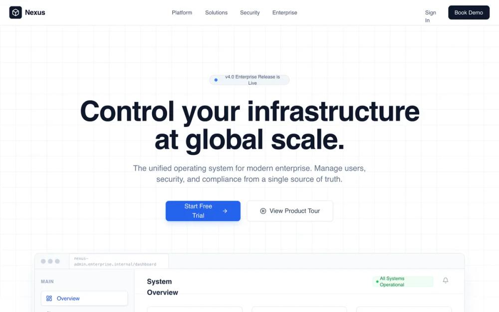 All Prompts
slate colourhigh contrastenterprise softwareminimalistbrutalistgrid basedsasslanding pageb2badmin platformleads generation
Enterprise Admin Platform
Лендинг для B2B SaaS: Admin Platform. Структурная сетка, корпоративные цвета, фокус на контроль и безопасность. Идеально для CRM, финтех, инфраструктуры.
by Shirley LouLive Preview
Prompt
# Enterprise Admin Platform

{
  "summary": "A clean, authoritative enterprise admin landing page using a strict grid layout, technical typography (Satoshi), and a professional color scheme of slate and primary blue. Features include a dashboard UI preview, audit log tables, and security policy management components, all enhanced by subtle fadeInUp animations and glass-morphism effects.",
  "style": {
    "description": "The style is 'Corporate Professional' with a focus on legibility and scale. It uses the Satoshi font family (weights 400-900) for a neutral but modern feel. The palette relies on Slate 950 (#020617) for dark backgrounds and Blue 600 (#2563eb) for actions. Micro-interactions include 0.8s ease-out fades, 12px backdrop blurs for nav panels, and scale transitions on feature cards. Borders are subtle (#e2e8f0) and layout follows a 40px grid system.",
    "prompt": "Create a design with a professional enterprise aesthetic. \n- **Typography**: Use 'Satoshi' sans-serif. Headers should be Bold/ExtraBold with tight tracking (-0.02em). Body text in Slate 500/600 with 1.625 line-height.\n- **Colors**: Primary: #2563eb, Deep Slate: #151e2e, Background: #ffffff, Muted BG: #f8fafc. Accents: Success (#16a34a), Warning (#d97706), Error (#dc2626).\n- **Borders & Radius**: Border-radius 12px for cards, 8px for buttons. Borders should be 1px solid #e2e8f0.\n- **Effects**: Navigation uses a 'glass-panel' effect: background rgba(255, 255, 255, 0.7) with 12px backdrop-filter blur. Hero background uses a 40px x 40px gray grid line pattern.\n- **Animations**: Implement 'fadeInUp' (0.8s duration, 20px offset) for section reveals. Use cubic-bezier(0.4, 0, 0.2, 1) for all hover transitions."
  },
  "layout_and_structure": {
    "description": "The layout follows a predictable, top-down enterprise narrative: Navigation -> Hero with Product Visual -> Social Proof -> Core Modules -> Quantifiable Impact (Stats) -> Security Proof -> FAQ -> CTA -> Detailed Footer.",
    "prompts": [
      {
        "part": "Navigation",
        "prompt": "Fixed header at top, 64px height. Left-aligned logo with a #020617 square icon. Center-aligned nav links (Platform, Solutions, Security) in text-sm font-medium Slate 600. Right-aligned 'Book Demo' button in Slate 900 background with white text."
      },
      {
        "part": "Hero Section",
        "prompt": "Centered layout with 128px top padding. A pill-shaped badge at the top (#eff6ff) with a pulsing green status dot. Title in 72px bold text-slate-900. Two primary CTAs: a blue primary button with right-arrow icon and a white outline button with play-circle icon. Background features a faint 40px grid overlay."
      },
      {
        "part": "Dashboard Preview",
        "prompt": "A max-width 1152px container showing a simulated browser window. Include a browser top-bar with three dots and a URL bar. The internal UI consists of a 256px sidebar (Slate 50), a header with system status indicators, a 3-column stats row (e.g., Active Users, API Requests), and a detailed data table. Table rows must show hover states with light blue background (#eff6ff)."
      },
      {
        "part": "Module Grid",
        "prompt": "3-column grid layout for core features. Each card has a 12px radius, light gray border, and a subtle icon in a tinted square box (e.g., Blue for Users, Emerald for Security). On hover, cards transition to white background with a soft shadow (shadow-xl shadow-slate-200/50)."
      },
      {
        "part": "Stats Section",
        "prompt": "Full-width section with background #020617. Features a decorative background of concentric white circles with 10% opacity. Display four major KPIs with a count-up animation script. Numbers in #60a5fa (Primary 400), labels in uppercase Slate 400."
      },
      {
        "part": "Security UI Section",
        "prompt": "Split 2-column layout. Left: Checklist of certifications (SOC2, GDPR) with blue check-circle icons. Right: A 'Policy Toggle' card showing active/inactive switches for security protocols like MFA, IP Whitelisting, and Key Rotation. Include an overlapping 'Threat Blocked' alert card in Slate 800 for depth."
      },
      {
        "part": "Enterprise Footer",
        "prompt": "6-column structure. Left-most 2 columns for logo, location, and social icons. Remaining 4 columns for Product, Resources, Company, and Legal link lists. Bottom bar includes copyright and a 'System Status' indicator with a green pulsing dot."
      }
    ]
  },
  "special_ui_components": [
    {
      "component": "KPI Count-up",
      "description": "Animated numbers that count from zero to the target value when entering the viewport.",
      "prompt": "Use an IntersectionObserver to trigger a 2000ms animation. Use an ease-out quartic function: 1 - Math.pow(1 - progress, 4). Format integers without decimals and percentages to 2 decimal places."
    },
    {
      "component": "Audit Log Table",
      "description": "High-density information table with status badges.",
      "prompt": "A table component with sticky header. Rows feature a 0.2s transition-color background on hover. Use status badges: Success (Green-100/800), Warning (Yellow-100/800), Failed (Red-100/800). Time columns must be right-aligned and text-slate-400."
    },
    {
      "component": "Glass-Morphism Toggle",
      "description": "Operational switch used for security policy simulations.",
      "prompt": "A 40px width pill-shaped toggle. Track color #2563eb for 'On'. The thumb is a white circle with shadow-sm, positioned 4px from the edge. Include a 'just-in-time' hover effect that slightly glows the track."
    }
  ],
  "special_notes": "MUST: Maintain a strict vertical rhythm with 128px spacing between major sections. MUST: Use only grayscale and primary blue for main UI, reserving colors like green/red strictly for status indicators. MUST NOT: Use rounded corners larger than 12px for structural elements. MUST NOT: Use heavy gradients; keep all surfaces flat or slightly glass-morphic."
}