All Prompts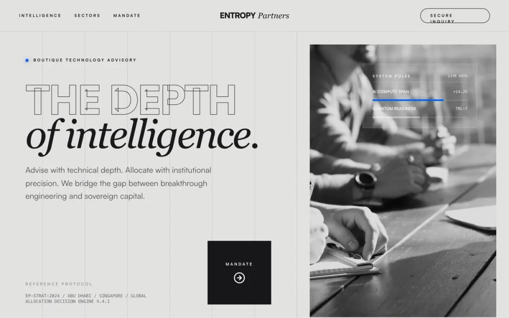 All Prompts
Entropy Partners | High-Contrast Minimalist (Abu Dhabi Institutional Imagery अपडेट)
Минималистичная дизайн-система с высоким контрастом для финтеха и консалтинга. Применяет брутализм, монохромную палитру и крупную типографику.
by Ali AlnuaimiLive Preview
Prompt
# Entropy Partners | High-Contrast Minimalist (Abu Dhabi Institutional Imagery अपडेट)

{
  "summary": "A sophisticated, high-stakes institutional design system using 'Satoshi' and 'Playfair Display' typography. It relies on a black-white-coral color scheme, aggressive negative space, and architectural-inspired SVG dividers.",
  "style": {
    "description": "The style is 'Institutional Brutalism'—refined, authoritative, yet modern. Typography pairs a variable sans-serif (Satoshi) for bold headers with an elegant serif (Playfair Display) for italic emphasis. The color palette is strictly #050505 (bg), #FFFFFF (fg), and #FF6B50 (accent). UI elements feature 12px blur glassmorphism, 1px borders at 10% opacity, and grayscale high-contrast imagery (filter: grayscale(1) contrast(1.1)). Micro-interactions use a custom cubic-bezier (0.16, 1, 0.3, 1) for a high-end feel.",
    "prompt": "Create a design system with a background of #050505 and foreground text of #FFFFFF. Use #FF6B50 as the primary accent color for call-to-actions and highlights. \n\n**Typography:** \n- Primary: 'Satoshi Variable' or 'Inter'. Headers should be font-weight 900, uppercase, with letter-spacing -0.05em. \n- Secondary: 'Playfair Display' (Italic) for emphasis and labels. \n- Label Caps: 8px size, 700 weight, 0.34em letter-spacing, uppercase.\n- Hero Text: 13vw size, line-height 0.9.\n\n**Visual Effects:**\n- Apply a global fixed noise overlay using a fractal noise SVG at 0.02 opacity.\n- Implement a fixed 12-column background grid using 1px lines at 6% opacity (#FFFFFF).\n- Images must be processed with 'grayscale(1) contrast(1.1) brightness(0.8)'.\n- Dividers should use a geometric 'Louvre Lattice' pattern (48px pattern size) at 18% opacity.\n\n**Animations:**\n- Transition Ease: cubic-bezier(0.16, 1, 0.3, 1) over 600ms.\n- View Transitions: scale(0.98) fade-out to scale(1.02) fade-in."
  },
  "layout_and_structure": {
    "description": "A 12-column grid system with fixed vertical guide-lines. Sections are separated by architectural SVG dividers and alternate between dark-mode backgrounds and high-contrast white-background sector grids.",
    "prompts": [
      {
        "part": "Sticky Header",
        "prompt": "Height 80px, bg #050505, border-bottom 1px white/10. Left side contains 'label-caps' navigation links. Center contains the brand logo (Sans-serif Black + Serif Italic). Right side features a 'Secure Inquiry' button with 1px white/25 border and no border-radius."
      },
      {
        "part": "Hero Section",
        "prompt": "Split 12-column layout. Left (7 cols): Massive uppercase text (13vw) with stroke-text effects. Includes a 'System Pulse' status indicator and a technical 'Reference Protocol' mono-text block. Right (5 cols): Grayscale institutional image with a 32px thick frame of the background color (#050505). Floating inside the image is a glassmorphism data card (blur 12px) showing live-metrics."
      },
      {
        "part": "Lattice Divider",
        "prompt": "Horizontal divider spanning 100% width, 18px height. Features a center-aligned 120px wide SVG pattern of intersecting diamonds (Lattice) at 95% opacity, flanked by 1px lines at 18% opacity."
      },
      {
        "part": "Sector Grid",
        "prompt": "High-contrast section with #FFFFFF background. 3-column grid layout with 1px #050505/10 borders between items. Each card contains a Lucide-style icon that scales 1.1x and changes to #FF6B50 on hover, followed by bold uppercase headers and mono-spaced project metrics."
      },
      {
        "part": "Portfolio Gallery",
        "prompt": "Staggered 2-column layout. Articles use 4:3 aspect ratio images with 65% opacity grayscale filters that become 100% and scale 1.05x on hover. Titles are 3xl bold tracking-tight with a circular arrow icon button that fills with #FF6B50 on hover."
      }
    ]
  },
  "special_ui_components": [
    {
      "component": "Floating Glass Bottom Nav",
      "description": "A fixed-bottom navigation bar with high-end glassmorphism and icon-only primary links.",
      "prompt": "Position: fixed bottom 24px, left 50%, translate-x-50%. Background: rgba(17, 17, 17, 0.8) with 12px backdrop-filter blur. Border-radius: 16px. Left side: Group of 4 icon buttons (Lucide icons) separated by a 1px white/10 vertical divider. Right side: A rounded-xl 'Contact' button with bg #FF6B50 and black uppercase text."
    },
    {
      "component": "Institutional Pulse Card",
      "description": "A floating informational card representing real-time system/market data.",
      "prompt": "Glassmorphism container (rgba(17, 17, 17, 0.55), 12px blur). Padding 24px. Header: label-caps text for 'System Pulse' and a mono-font 'LIVE DATA' tag. Body: Multiple rows showing a title (10px bold uppercase), a percentage value in #FF6B50 mono-font, and a custom progress bar (bg white/10, fill #FF6B50)."
    },
    {
      "component": "Hero Circular CTA",
      "description": "Large square button with a circular rotation animation.",
      "prompt": "Width/Height 160px. Border 1px white/25. Background #050505. Layout: flex-col, center-aligned. Elements: 'MANDATE' label-caps + Lucide:arrow-right-circle icon. Interaction: On hover, border color changes to #FF6B50 and the icon rotates 45 degrees."
    }
  ]
}