All Prompts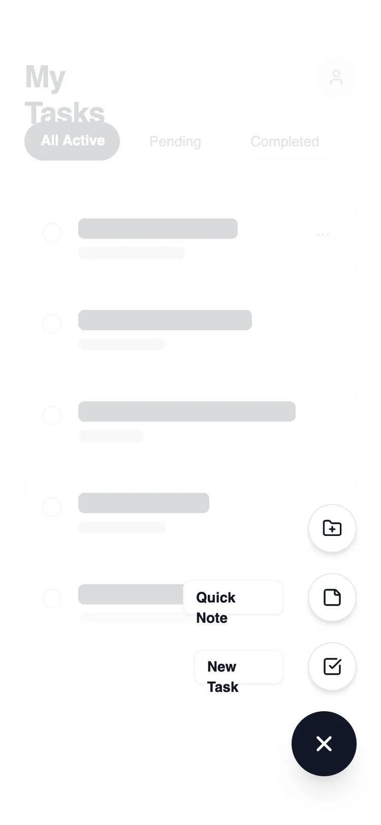 All Prompts
mobile appnavigationlayout
FAB Navigation
FAB Navigation: паттерн мобильной навигации с плавающей кнопкой для быстрых действий. Идеален для приложений заметок, задач, дизайна.
by Shirley LouLive Preview
Prompt
# FAB Navigation

{
  "summary": "A clean, modern mobile task management UI with a dynamic FAB interaction. The design features a layered architecture where a primary action trigger reveals a staggered list of secondary actions over a blurred, dimmed background. It emphasizes negative space, sharp borders (1px), and generous rounding (rounded-xl) for content cards.",
  "style": {
    "description": "The style is built on a high-contrast 'Carbon & Chalk' theme. Typography uses Manrope for a modern, tech-forward feel. Primary actions are solid #111827, while secondary elements use #FFFFFF with subtle #E5E7EB borders. Animations are fluid, using 300ms transitions for opacity and 2D transforms (rotation and Y-axis translation). A unique visual touch is the use of a mask-gradient on the main content to suggest depth and continuity.",
    "prompt": "Create a design system using a monochrome palette: Primary Black (#111827), Pure White (#FFFFFF), and a grayscale scale (Gray-50: #F9FAFB to Gray-900: #111827). Typography: 'Manrope' sans-serif; Headings at 30px/bold/tracking-tight; Body at 16px; Labels at 14px/semibold. UI components must have 1px borders in #E5E7EB and corner radii of 12px (cards) or 9999px (pills/buttons). Use a backdrop blur of 4px with a 60% white overlay for active states. Motion: 300ms ease-in-out for all transitions, including a 45-degree rotation for the FAB icon and staggered delays (50ms increments) for expanding menu items."
  },
  "layout_and_structure": {
    "description": "A single-column mobile layout focused on vertical scrolling. The structure consists of a fixed-position header, a scrollable content area with a bottom-fade mask, and a fixed interaction layer in the bottom-right corner.",
    "prompts": [
      {
        "part": "Header and Navigation Tabs",
        "prompt": "Header: 30px bold title 'My Tasks' left-aligned, paired with a 40px circular user avatar in #F3F4F6 on the right. Below, a horizontal scrolling filter bar with pill-shaped tabs. Active tab: #111827 background with white text; Inactive tabs: White background, #E5E7EB border, #4B5563 text. Padding: 56px top, 24px sides."
      },
      {
        "part": "Task List Content",
        "prompt": "A vertical stack of cards with 16px spacing. Each card: White background, 1px #E5E7EB border, 16px padding, 12px radius. Internal layout: 20px circular checkbox on the left, multi-line skeleton text/content in the center (shades of #111827 and #D1D5DB), and a 32px circular 'more' button on the right. Apply a `mask-image: linear-gradient(to bottom, black 90%, transparent 100%)` to the entire container to create a fade-out effect at the bottom."
      },
      {
        "part": "Interaction Layer (FAB)",
        "prompt": "Fixed container at bottom-right (24px from edges). Primary FAB: 64px circle, #111827 background, white 'plus' icon. On activation: Icon rotates 45deg. Secondary items: 48px circles, white background, #111827 icon, #E5E7EB border. Each secondary item is paired with a left-aligned text label in a white 8px-radius box with a subtle shadow. Items appear staggered from bottom to top using 2D translation (16px vertical slide)."
      }
    ]
  },
  "special_ui_components": [
    {
      "component": "Staggered Action Menu",
      "description": "A vertical stack of action buttons that animate in sequence.",
      "prompt": "Individual menu items consist of a flex-row (reverse) container. Elements: (1) A button: 48px diameter, bg-#FFFFFF, border-1px #E5E7EB, centered Lucide icon. (2) A label: text-14px semibold #111827, bg-#FFFFFF, border-1px #F3F4F6, px-3 py-1.5, rounded-lg. Interaction: items are hidden via opacity-0 and transform: translateY(16px). When active, they transition to opacity-100 and translateY(0) with incremental delays."
    },
    {
      "component": "Dynamic Icon FAB",
      "description": "Main trigger button that visually transforms upon interaction.",
      "prompt": "64px circular button with bg-#111827. Centered Iconify-icon (lucide:plus). On click, the icon performs a CSS transition: transform: rotate(45deg); duration: 300ms. The button itself should have a slight scale-down effect (scale-95) on active click to simulate tactile feedback."
    }
  ],
  "special_notes": "MUST: Use a semi-transparent white backdrop (bg-white/60) with backdrop-filter: blur(4px) to separate the FAB menu from the main content. MUST: Implement staggered animation delays (50ms, 75ms, 100ms) for the secondary action items to create a 'fanning out' effect. DO NOT: Use heavy drop shadows; stick to subtle 1px borders or very soft 'sm' shadows for depth. DO NOT: Allow background content to be interactable (pointer-events-none) when the FAB menu is open."
}