All Prompts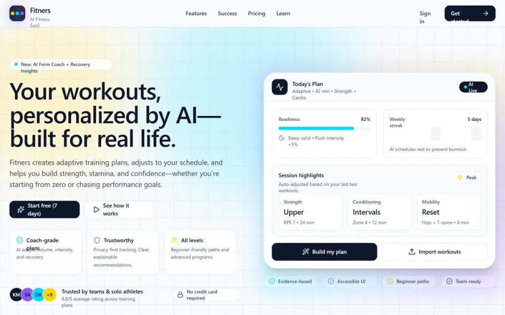 All Prompts
Fitners — AI Fitness SaaS Homepage
Дизайн системы для AI Fitness SaaS. Высококонтрастная палитра, неоновые акценты, bento-grid, glassmorphism. Идеально для финтех, health-tech, SaaS. Демонстрирует технологичность и мотивацию.
by Lino BarahonaLive Preview
Prompt
# Fitners — AI Fitness SaaS Homepage

{
  "summary": "Fitners is a modern fitness SaaS design that uses a clean, grid-based layout with vibrant neon accents to convey energy and high-tech AI capability. It balances professional structure with motivational dynamic elements like glowing cards and subtle mesh gradients.",
  "style": {
    "description": "The style utilizes a 'Neo-Grotesk' typographic approach pairing Space Grotesk for headlines (geometric, tech-feel) with Source Sans 3 for high-readability body copy. The color palette is strictly managed: Yellow (#FFD60A) for highlights/results, Cyan (#00D9FF) for AI/activity, and Purple (#8B5CF6) for recovery/community. UI elements feature large border-radii (12px to 32px), subtle borders (#E2E8F0), and distinctive 60px blur 'glow' shadows in brand colors.",
    "prompt": "Create a design system with a background of #F8FAFC and a primary text color of #0B1220. Typography: Use 'Space Grotesk' for headings (weights: 600, 700) with -0.02em tracking; use 'Source Sans 3' for body (weights: 400, 500). Colors: Yellow #FFD60A, Cyan #00D9FF, Purple #8B5CF6. UI Elements: Buttons should be #0B1220 with white text or white with a 1px border of #E2E8F0; border-radius of 12px (xl) for small components and 16px (2xl) for cards. Animations: Hover states should include a -4px Y-axis translate and a colored glow shadow: 'box-shadow: 0 20px 60px rgba(0, 217, 255, 0.18)' for Cyan. Backgrounds: Use a 44px square grid pattern using 1px lines of rgba(15, 23, 42, 0.06). Incorporate glassmorphism effects using backdrop-blur-md and white/80 backgrounds."
  },
  "layout_and_structure": {
    "description": "A structured multi-section landing page with a sticky navigation bar, a high-impact split-hero, a 3-column feature grid, a mixed-media social proof section, and a 3-tier pricing table.",
    "prompts": [
      {
        "part": "Header",
        "prompt": "A sticky navigation bar with a backdrop-blur effect (bg-white/75). Left: A logo consisting of a dark #0B1220 rounded-xl square containing three small colored dots (Yellow, Cyan, Purple) and the brand name in Space Grotesk. Center: Four text links in #475569 with a hover transition to #0B1220. Right: A 'Sign in' ghost button and a primary CTA in #0B1220 with an arrow icon."
      },
      {
        "part": "Hero Section",
        "prompt": "Two-column layout. Left Column: An 'AI New' pill badge, followed by a headline with a Yellow-highlighted word. Include a short descriptive paragraph and two CTA buttons (Primary Black, Secondary White). Below CTAs, add a 3-card mini-feature row and a trust-bar with user avatars. Right Column: A large dashboard mockup with a 32px border-radius, featuring 'Today's Plan' with readiness bars (Cyan), a weekly streak calendar, and activity breakdown cards. Use deep glow shadows behind the mockup."
      },
      {
        "part": "Features Bento Grid",
        "prompt": "A header with a title and a 'Compare Plans' button. Below, a 3-column grid of cards. Each card features: a 12px rounded-xl icon container in black, a bold headline, and a checkmark list. Card 1 (Cyan blur top-right), Card 2 (Purple blur bottom-left), Card 3 (spanning 1 or 2 columns with a Yellow blur). Add hover animations: translate-y-[-4px] and shadow-glow."
      },
      {
        "part": "Success Stories",
        "prompt": "A split section. Left: Headline and three small stat cards (e.g., +31% Consistency). Below, a large dark #0B1220 card with a Cyan quote icon and a 5.0 star rating. Right: A vertical stack of three smaller testimonial cards and a dark 'Designed for Trust' feature box with a 2x2 grid of micro-features."
      },
      {
        "part": "Pricing Table",
        "prompt": "Three vertical cards. The center card (Pro) is dark #0B1220 with a Cyan glow shadow and 'Most Popular' badge. The outer cards are white with #E2E8F0 borders. Use large font sizes for prices ($24). Include a monthly/annual toggle at the top and a full-width accessibility/contact bar at the bottom."
      }
    ]
  },
  "special_ui_components": [
    {
      "component": "Interactive AI Dashboard Card",
      "description": "A complex UI mockup demonstrating app functionality.",
      "prompt": "A rounded-3xl (32px) container with a #F1F5F9 header and white body. Include: 1. A 'Readiness' gauge using a Cyan progress bar. 2. A 7-day 'Weekly Streak' grid using colored blocks (#FFD60A/70, #00D9FF/50). 3. Session highlight cards with 'Strength', 'Conditioning', and 'Mobility' metrics in a 3-column layout. 4. Primary 'Build Plan' button with a wand icon."
    },
    {
      "component": "Neon Glow Card",
      "description": "Hover-active feature cards with specific light-leak effects.",
      "prompt": "A white card with 1px #E2E8F0 border. Inside, an absolute-positioned div with a 128px diameter, 15% opacity, and 40px blur using one of the brand colors (Cyan, Purple, or Yellow) positioned in a corner. On hover, the box-shadow transitions to a wide, soft glow of the same color."
    },
    {
      "component": "Dark Mode",
      "description": "coherence",
      "prompt": "implement dark mode keeping the coherence"
    }
  ]
}