All Prompts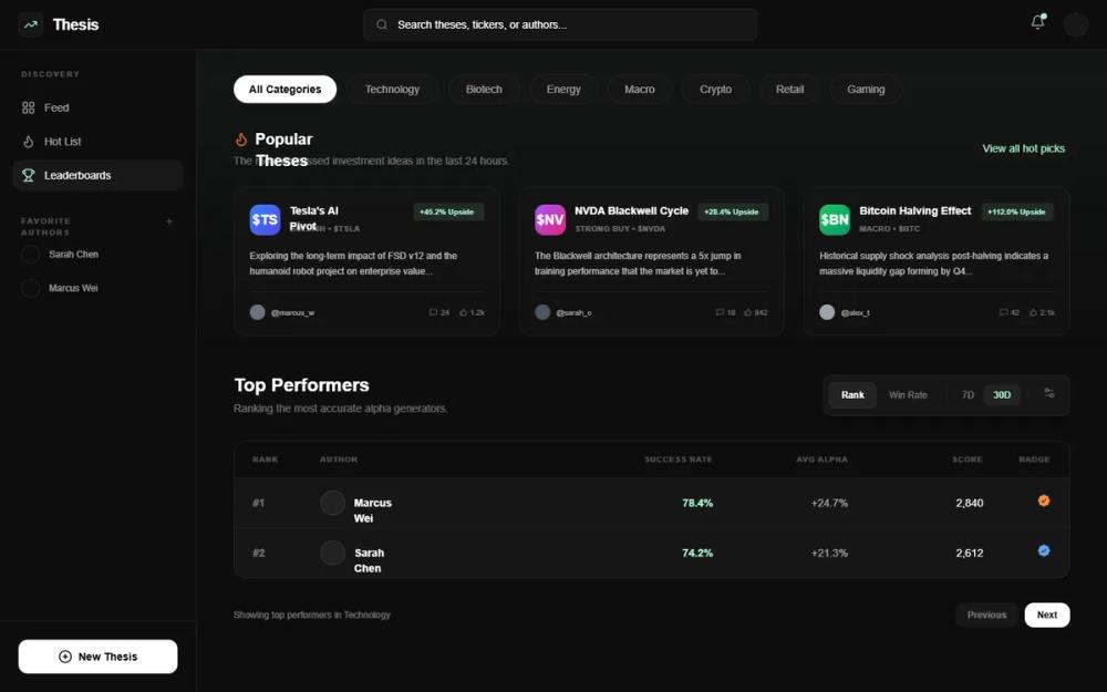 All Prompts
Fix Broken Image
Компонент UI для исправления битых изображений. Автоматически заменяет неработающие картинки на плейсхолдеры или альтернативный контент. Улучшает пользовательский опыт.
by Robert FraserLive Preview
Prompt
# Fix Broken Image

{
  "summary": "A sophisticated dark-themed data dashboard utilizing a tiered navigation system, glass-morphic cards with glowing progress indicators, and a high-contrast typography hierarchy.",
  "style": {
    "description": "The style is 'Dark Editorial' with a focus on deep blacks and subtle grays. Typography uses 'Plus Jakarta Sans' with heavy reliance on 10px bold uppercase labels for metadata. Colors center around #0D0D0D (background), #161616 (primary panels), and #222222 (borders). Accents include Mint (#A7F3D0) for success/positive consensus and Indigo (#4F46E5) for primary actions. Micro-interactions use cubic-bezier(0.4, 0, 0.2, 1) for smooth transitions and scale-up hover effects on cards.",
    "prompt": "### Visual Theme\n- **Base Background**: #0D0D0D (Deep Black)\n- **Panel Backgrounds**: #161616 with 1px border #222222.\n- **Glassmorphism**: .glass-panel { background: rgba(22, 22, 22, 0.4); backdrop-filter: blur(12px); border: 1px solid rgba(255, 255, 255, 0.05); }\n\n### Typography (Plus Jakarta Sans)\n- **Headings**: Semi-bold to Bold. Hero titles at 20px, card titles at 14px.\n- **Labels**: 10px, Font-weight 700, Uppercase, Tracking 0.1em, color white/30.\n- **Body**: 12px (text-xs), Medium weight.\n\n### Accents & Indicators\n- **Success/Mint**: #A7F3D0 (used for consensus bars and status dots).\n- **Primary Indigo**: #4F46E5 (buttons).\n- **Alert/Orange**: Orange-500 (hot badges/icons).\n- **Shadows**: Subtle glows for progress bars using rgba(accent, 0.4) and 8px blur.\n\n### Transitions\n- **Curves**: cubic-bezier(0.4, 0, 0.2, 1).\n- **Hover States**: Cards lift translateY(-4px) and images scale(1.05)."
  },
  "layout_and_structure": {
    "description": "A multi-pane layout featuring a 64px slim utility bar, a 256px secondary navigation sidebar, and a fluid main content area with an ambient image-gradient header.",
    "prompts": [
      {
        "part": "Primary Slim Sidebar",
        "prompt": "64px width (w-16). Background #0D0D0D, right border #222222. Contains a logo in a 40x40px #161616 rounded-xl container. Navigation group consists of 40x40px rounded-xl buttons with icons/initials. Bottom section includes notification bell with a #A7F3D0 indicator dot."
      },
      {
        "part": "Secondary Navigation Sidebar",
        "prompt": "256px width (w-64). Background #0D0D0D, right border #222222. Top: User profile section with 40px circular avatar and 10px metadata labels. Search bar: 32px height, bg #161616, border #222222, includes 'Cmd+K' visual shortcut. Navigation: Vertical list of links with 18px icons and 14px medium-weight text. Bottom: 'Invite' CTA button (bg #4F46E5, rounded-xl, padding 12px)."
      },
      {
        "part": "Main Content Header",
        "prompt": "Fluid height. Features an ambient background image (Unsplash: abstract tech) with opacity 0.08 and a grayscale filter. A heavy linear gradient transition from transparent to #0D0D0D ensures content legibility. Top controls include pill-shaped category filters (bg #161616, border #222222, text-xs) and a segmented time-period toggle (24h, 7D, 30D)."
      },
      {
        "part": "Featured Bento Grid",
        "prompt": "3-column grid of 'Thesis Cards'. Each card features a 128px high image with a bottom-to-top dark gradient overlay, a floating status badge (e.g., 'Hot', 'Trending'), and a descriptive title (14px, line-clamp-2). Includes a horizontal progress bar (h-1px) with an outer glow matched to the bar's color."
      },
      {
        "part": "Data Table Section",
        "prompt": "Container: #161616, rounded-2xl, border #222222. Header: Grid layout (12 columns) with 10px uppercase bold labels. Rows: Hover-effect bg white/5, transition-colors. Columns: Numerical place, Player (avatar + name), Stats (ratio), Winrate (color-coded red/green), KDA, and Rank (icon + badge)."
      }
    ]
  },
  "special_ui_components": [
    {
      "component": "Glowing Progress Bar",
      "description": "Minimalist consensus/metric indicator.",
      "prompt": "Full width 4px container (bg white/5). Inner fill uses color-coded hex (e.g., #A7F3D0 or #3b82f6) with a box-shadow: 0 0 8px rgba(accent_color, 0.4). Above the bar, show a 10px bold uppercase label on the left and a percentage on the right."
    },
    {
      "component": "Thesis Card",
      "description": "Editorial-style card with hover interaction.",
      "prompt": "rounded-2xl overflow-hidden glass-panel. Image height: 128px with scale(1.05) on parent hover. Content: 20px padding. Footer of card contains avatar group (-1.5px negative spacing) and message counts with lucide:message-square icon."
    }
  ],
  "special_notes": "MUST: Use 1px borders for all UI elements to maintain the tech aesthetic. MUST: Use 'Plus Jakarta Sans' for all text. MUST: Ensure that all background images have a bottom-up gradient to pure #0D0D0D. DO NOT: Use standard system colors; use the specific hex values provided (#0D0D0D, #161616, #222222)."
}