All Prompts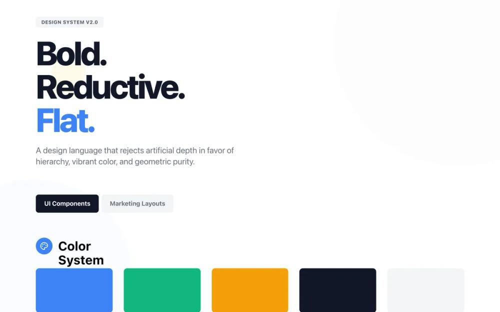 All Prompts
style
Flat design
Flat design: минималистичный UI-стиль без теней и градиентов. Подходит для чистого и современного веб-дизайна.
by Zhou JasonLive Preview
Prompt
# Flat design

<design-system>

# Design Philosophy

**Flat Design** removes all artifice. It rejects the illusion of three-dimensionality—no drop shadows, no bevels, no realistic gradients, no textures. It relies entirely on **hierarchy through size, color, and typography**. This is not minimalism for the sake of being minimal; it's **confident reduction** that creates visual interest through pure form.

The aesthetic is **digital-native but print-inspired**: crisp edges, solid blocks of color, and a strict reliance on the grid. It communicates clarity, efficiency, and modernity. It is not "boring" or "plain"; it is **boldly reductive and graphic**. Every element exists because it is necessary. Visual interest comes from the strategic interplay of solid shapes, vibrant (but controlled) color palettes, and dynamic scale.

**Core Principles:**

1. **Zero Artificial Depth**: The Z-axis does not exist. Everything is on the same plane. However, visual hierarchy is created through scale, color contrast, and strategic layering of flat shapes.

2. **Color as Structure**: Bold background colors define sections and grouping, not lines or shadows. Color transitions are sharp, never blurred or gradual.

3. **Typography as Interface**: Text size and weight bear the load of hierarchy. Typography is geometric, bold, and demands attention.

4. **Geometric Purity**: Rectangles, circles, and squares dominate. Rounded corners are consistent and moderate. No organic blobs or complex shapes.

5. **Interactive Feedback**: Hover states are pronounced through color shifts, scale transformations, and instant transitions—never through shadow depth.

6. **Strategic Decoration**: Large, subtle geometric shapes in background create visual interest without breaking the flat aesthetic—think poster design.

# Design Token System

## Colors (Single Palette: Light Mode)

A vibrant, confident palette that avoids muddy tones. High contrast is essential.

- **Background**: `#FFFFFF` (Pure White) - The canvas.

- **Foreground**: `#111827` (Gray 900) - Sharp, high-contrast text.

- **Primary**: `#3B82F6` (Blue 500) - The "Action" color. Bright, standard digital blue.

- **Secondary**: `#10B981` (Emerald 500) - Supporting accent.

- **Accent**: `#F59E0B` (Amber 500) - For highlights/badges.

- **Muted**: `#F3F4F6` (Gray 100) - Used for secondary backgrounds/blocks.

- **Border**: `#E5E7EB` (Gray 200) - Used sparingly.

## Typography

**Font Family**: **'Outfit', sans-serif**.

A geometric sans-serif that mirrors the shapes of the UI.

- **Headings**: Bold (700) or Extra Bold (800). Tight letter-spacing `-0.02em`).

- **Body**: Regular (400). Readable, standard spacing.

- **Labels/Buttons**: Medium (500) or SemiBold (600). Uppercase often used for labels `tracking-wider`).

## Radius & Shapes

- **Radius**: `rounded-md` (6px) or `rounded-lg` (8px). Consistent throughout. Not fully rounded (pill) unless it's a tag.

- **Borders**: generally `0px`. We use background colors to define edges. If a border is needed (e.g., inputs), `border-2` solid color.

## Shadows & Effects

- **Shadows**: `shadow-none`. **ABSOLUTELY NO BOX SHADOWS ON ELEMENTS.**

- **Gradients**: Only subtle directional gradients for background decoration (e.g., `from-[#F3F4F6] to-transparent`). Never on buttons or cards. Never colorful or vibrant gradients.

- **Blur**: None on elements. No backdrop-blur effects.

- **Background Decoration**: Large geometric shapes with low opacity `bg-white/5`) positioned absolutely for visual interest.

# Component Stylings

## Buttons

- **Primary**: Solid Primary color background. White text. `rounded-md`. Height `h-14` to `h-16` for good touch targets. `transition-all duration-200 hover:scale-105` (scale transformation for feedback). Color shift on hover (e.g., `hover:bg-blue-600`). No shadow.

- **Secondary**: Solid Muted background (Gray 100). Dark text. `hover:bg-gray-200` with scale effect.

- **Outline**: `border-4` solid color (not border-2 for more boldness). Text matches border color. Transparent bg. `hover:bg-[color] hover:text-white` (fill effect on hover).

## Cards

- **Style**: "Color Block".

- **Appearance**: Solid background color (White on Gray page, or soft color tints like `bg-blue-50`, `bg-green-50` for features). No shadow. No border. Padding is generous `p-6` or `p-8`). Rounded corners `rounded-lg`.

- **Interaction**: `group cursor-pointer transition-all duration-200 hover:scale-[1.02]` (subtle scale). For colored backgrounds, add `hover:bg-[color]-100` for intensification. Icons within cards can have `group-hover:scale-110`.

## Inputs

- **Normal**: Gray 100 background `bg-gray-100`). No border. Text Gray 900. `rounded-md`.

- **Focus**: White background. `border-2` solid Primary. No focus ring glow, just the hard border.

## Section Stylings

- **Alternating Backgrounds**: Use White vs. Gray 100 `#F3F4F6`) vs. Bold accent colors (Primary Blue, Emerald, Amber) to distinguish page sections. Sharp color transitions between sections.

- **Dividers**: No thin line dividers between sections. Use whitespace or color blocks. Exception: FAQ uses thick `border-2` between items for structure.

- **Background Decoration**: Use `absolute` positioned geometric shapes with low opacity or subtle gradients for visual interest. Examples: large circles `rounded-full`), rotated squares, gradient overlays `from-[color] to-transparent`).

# Iconography

- **Library**: `lucide-react`.

- **Style**: Standard to bold stroke (2px to 2.5px for emphasis).

- **Treatment**: Often placed inside a solid colored circle (white circle with colored icon like `bg-white text-blue-600`). Circle size `h-14 w-14` or `h-16 w-16`.

- **Animation**: `transition-transform duration-200 group-hover:scale-110` for icons within cards. Simple color intensity shifts on hover.

# Layout & Spacing

- **Container**: `max-w-7xl`.

- **Grid**: Rigid. 12-column base. Elements align perfectly.

- **Spacing**: Comfortable but structured. Multiples of 4 (Tailwind default).

- **Density**: Medium. Not too airy, not too dense. "Functional".

# Motion

- **Vibe**: "Digital", "Snappy", "Direct".

- **Transitions**: `transition-all duration-200` for most interactions. `duration-300` for larger transformations.

- **Hover**: Immediate visual feedback through:

~~~
 - Scale transformations `hover:scale-105` for buttons, `hover:scale-[1.02]` for cards)

 - Color shifts (darkening or lightening)

 - Color fills (outline buttons filling with color)

 - Icon scaling within cards `group-hover:scale-110`)
~~~

# Accessibility

- **Focus Rings**: Since we have no shadows, focus states must use high-contrast `ring-2 ring-offset-2 ring-blue-500` or similar solid outlines.

- **Contrast**: Text on colored backgrounds must pass WCAG AA (e.g., White text on Blue 500 is okay, but check carefully with lighter accents).

# Non-Genericness / "The Bold Factor"

- **Avoid**: "Material Design" floating cards, generic Bootstrap layouts, subtle pastels everywhere.

- **Emphasize**: The "Poster" look. Treat every section like a flat graphic poster with bold color blocking.

- **Bold Choices Implemented**:

~~~
 - **Large decorative geometric shapes** in hero background (circles, rotated squares with low opacity)

 - **Vibrant full-section color blocks** (Blue hero, Emerald benefits, Amber CTA, Dark gray How It Works & Footer)

 - **Dramatic scale effects** on pricing cards (popular tier starts larger and scales more)

 - **Multi-color stat numbers** (each stat uses a different accent color)

 - **Abstract geometric compositions** (overlapping shapes in hero illustration and benefits section)

 - **Pronounced hover states** (scale, color intensification, fills)

 - **Bold typography** with tight leading and strong weight contrast

 - **Thick borders** (border-4 on outline buttons, border-2 on FAQ items)
~~~

- **Visual Interest Without Depth**: Achieved through color contrast, geometric layering, and scale—never shadows or gradients.

</design-system>