All Prompts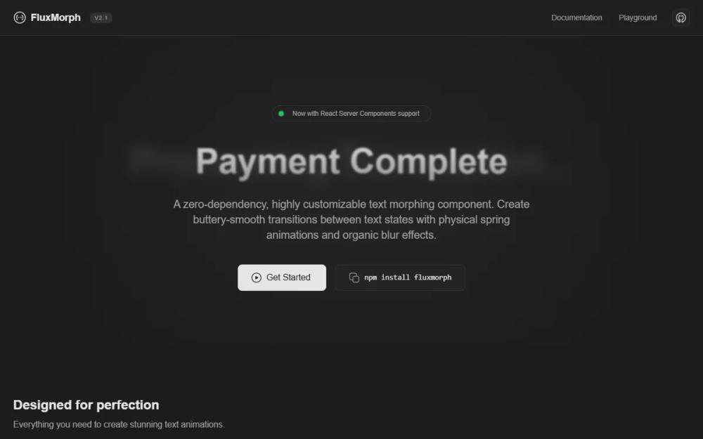 All Prompts
FluxMorph Premium Landing Page
Лендинг FluxMorph: темный дизайн для SaaS, финтех, анимаций. SVG-текст, 'gooey' фильтр, стеклянная навигация, интерактивные зоны.
by CliptLive Preview
Prompt
# FluxMorph Premium Landing Page

{
  "summary": "A minimalist, dark-themed developer showcase site featuring smooth text-morphing animations, interactive SVG-driven bento grids, and a comprehensive code playground with a focus on fluid transitions and organic motion.",
  "style": {
    "description": "The style is defined by a deep monochromatic theme using #1C1C1C as the primary background and #E5E5E5 for high-contrast text. It features Inter typography for a clean, professional look and relies on subtle border definitions (#333333) and soft corner radii (6px to 12px). The core of the design is its motion system: 'gooey' SVG filters, spring-based physics, and blurred staggering effects that create an organic, premium feel.",
    "prompt": "Create a high-end dark mode interface using a background of #1C1C1C and card surfaces of #242424. Typography must use 'Inter' with a base letter-spacing of -0.15px. Use #E5E5E5 for primary text and #A1A1A1 for muted labels. Borders should be 1px solid #333333 with a hover state of #4A4A4A. Implement a custom SVG 'gooey' filter using feGaussianBlur (stdDeviation: 6) and feColorMatrix (values: 1 0 0 0 0, 0 1 0 0 0, 0 0 1 0 0, 0 0 0 19 -9) to enable organic morphing effects. Corner radii are strictly 6px (small), 8px (medium), and 12px (large). Animations must utilize specific cubic-bezier curves (e.g., cubic-bezier(0.4, 0, 0.2, 1) for morphing and cubic-bezier(0.28, 0.84, 0.42, 1) for spring physics)."
  },
  "layout_and_structure": {
    "description": "A structured multi-section layout starting with a centered hero, followed by a responsive bento grid, an interactive two-column playground, and terminal-style installation blocks.",
    "prompts": [
      {
        "part": "Navigation",
        "prompt": "Fixed top header, 64px height, with a glassmorphism effect (bg: rgba(36,36,36,0.4), backdrop-filter: blur(12px)) and a 1px border-b #333333. Contains a logo-icon pair on the left, centered/right-aligned navigation links in 14px font, and a version tag in an 8px uppercase tracking-widest capsule."
      },
      {
        "part": "Hero Section",
        "prompt": "Centered layout with an ambient glow background (800px circular gradient, white at 3% opacity, 100px blur). Features an animated status badge with a pulsing green indicator. The main attraction is a morphing text container (80px height) where two text states alternate using opacity, scale (0.95 to 1.05), and 12px blur transitions. Includes a primary CTA button (#E5E5E5 background) and a secondary 'copy-to-clipboard' command line input."
      },
      {
        "part": "Bento Grid Features",
        "prompt": "A 3-column grid (on large screens) with 24px gaps and 280px base row height. Feature cards use #242424 background and 1px borders. Large cards should span 2 columns and contain custom SVG animations (e.g., floating icons, gooey blobs, or staggered character reveal boxes). Each card features a 40x40px icon container with a 1px border."
      },
      {
        "part": "Interactive Playground",
        "prompt": "A two-column section with a 320px sidebar on the left and a larger preview area on the right. The sidebar contains form controls (inputs, range sliders with 12px custom thumbs, and selects) using #1C1C1C backgrounds. The preview area features a dot-pattern background (radial-gradient white 10% opacity, 24px spacing) and displays the live morphing animation. Below the preview, include a code editor block using #111111 background and syntax highlighting (colors: #C678DD, #98C379, #E06C75)."
      }
    ]
  },
  "special_ui_components": [
    {
      "component": "Text Morphing Engine",
      "description": "A layering of two text elements that swap visibility using Gaussian blur and scale transforms.",
      "prompt": "Stack two text elements absolutely within a relative container. Use an animation sequence where the 'outgoing' text fades to opacity 0, applies a 12px blur, and scales to 1.05, while the 'incoming' text fades from 0, removes a 12px blur, and scales up from 0.95. Both must use the same cubic-bezier(0.4, 0, 0.2, 1) timing for synchronized motion."
    },
    {
      "component": "Spring-Loaded Indicator",
      "description": "An SVG-based animation demonstrating physical mass and tension.",
      "prompt": "An SVG container showing a central circle that moves vertically on a spring path. Keyframe 'springBounce' should translate the object 25px down while scaling Y to 0.8 (squash), then -30px up scaling Y to 1.1 (stretch), settling back to center with decreasing oscillation."
    }
  ],
  "special_notes": "Must maintain a strict monochromatic palette; avoid any vibrant colors except for functional status indicators (e.g., green for 'live'). Ensure all interactive elements have a subtle scale or border-color transition. The 'gooey' filter is mandatory for the text-morphing component to prevent harsh edges during the transition phase."
}