All Prompts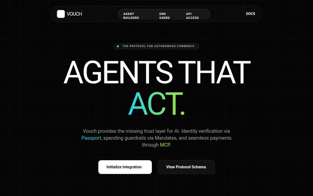 All Prompts
FOB | Production-Ready Universal Trust Layer
UI Kit 'Cyberpunk Fintech' для AI, Web3 и платформ разработчиков. Система дизайна с неон-акцентами, стеклянными картами и крипто-элементами для SaaS-дашбордов.
by Aniket BhattLive Preview
Prompt
# FOB | Production-Ready Universal Trust Layer

{
  "summary": "A production-ready, dark-mode design system with a 'Trust Layer' aesthetic, utilizing neon accents, glassmorphism, and interactive technical components like live ledgers and programmable mandate engines.",
  "style": {
    "description": "The style is defined as 'Industrial Cyberpunk'. Typography: Cabinet Grotesk (Display, weights 800-900, uppercase, -0.02em tracking), Satoshi (Body, 400-700), Space Grotesk (Mono-technical, 300-700). Color Palette: #050505 (Background), #00f2ff (Cyan), #ff00e5 (Magenta), #adff00 (Lime). UI Effects: 1px solid rgba(255, 255, 255, 0.08) borders, backdrop-filter: blur(12px), 40px grid background pattern, and CSS-driven scanline animations.",
    "prompt": "Create a design system with a primary background of #050505. Implement a 40px x 40px grid pattern using 1px lines at rgba(255,255,255,0.03). Use 'Cabinet Grotesk' for H1-H3 headers in uppercase with tight letter-spacing. Use 'Satoshi' for body text with a line-height of 1.7. Use 'Space Grotesk' for all technical data, labels, and code blocks. Color tokens: Cyan #00f2ff, Magenta #ff00e5, Lime #adff00. UI components should be 'glass-cards' with background: rgba(255, 255, 255, 0.025), a 12px backdrop blur, and a 1px border of rgba(255, 255, 255, 0.08). Buttons should have a 16px border-radius and use high-contrast transitions (white/black or neon/black). Animation: Use cubic-bezier(0.16, 1, 0.3, 1) for all transitions. Add a 2px horizontal scanline that cycles from top to bottom every 10 seconds."
  },
  "layout_and_structure": {
    "description": "A comprehensive 13-section landing page and application UI, featuring an interactive dashboard, real-time transaction ledgers, and programmable settings panels.",
    "prompts": [
      {
        "part": "Navigation",
        "prompt": "Fixed header at top-4, centered, width 95%. Glass-card container with 16px padding. Left: Logo with shield icon. Center: Monospaced nav links (10px, uppercase, tracking-widest). Right: System status indicator (pulsing green dot) and a high-contrast 'Console' CTA in #00f2ff."
      },
      {
        "part": "Hero Section",
        "prompt": "Height 90vh. Centered layout with a large radial gradient background (Cyan to Magenta at 10% opacity). Headline: Cabinet Grotesk, 10rem size on desktop, 0.85 line-height. Subtext: Satoshi, 20px, max-width 600px. Primary CTA: Solid white with black text and 24px padding. Include floating glass-card elements with subtle parallax rotation (-12deg) on mouse move."
      },
      {
        "part": "Command Center Dashboard",
        "prompt": "Bento-grid layout. Top row: 4 stats cards (Balance, Trust Score, Active Agents, System Health). Each card features a neon accent border-top. Middle row: 2/3 width real-time transaction table with 600px min-width scroll, 1/3 width animated spend velocity sparkline chart using a SVG path animation. Table rows should have hover states changing opacity from 0.4 to 1.0."
      },
      {
        "part": "Identity Portal",
        "prompt": "Two-column interactive form. Left: Form fields for 'Legal Name' and 'Jurisdiction' with 16px rounded inputs and #00f2ff focus rings. Right: A simulated biometric scanner UI. Use a dark container with a pulsing camera icon and a vertical #00f2ff scanning line moving infinitely."
      },
      {
        "part": "Mandate Engine",
        "prompt": "Configuration panel. Features a custom range slider for 'Transaction CAP' with #00f2ff accent. Domain whitelist UI using small glass tags with lime checkmarks. Frequency selector: 4-column grid of buttons with 40% opacity for inactive and 100% with lime border for active."
      },
      {
        "part": "Developer Portal",
        "prompt": "Split layout. Left: Documentation links with magenta icons. Right: Code editor window with window controls (red/yellow/green dots). Implement a code block with syntax highlighting (Magenta for keywords, Lime for strings, Cyan for constants) and a 'Copy' button that appears on hover."
      }
    ]
  },
  "special_ui_components": [
    {
      "component": "Neon Status Indicator",
      "description": "A live-health pulse for network connectivity.",
      "prompt": "A 8px circle with a 4px shadow blur. Animation: opacity 1.0 to 0.4 every 1.5s. Color: #22c55e for active, #ef4444 for error. Paired with 10px bold monospaced text 'SYSTEMS ACTIVE'."
    },
    {
      "component": "Animated Sparkline",
      "description": "SVG-based real-time data visualization.",
      "prompt": "A continuous SVG path stroke with a linear-gradient from #00f2ff to #ff00e5. Animate the 'd' attribute using 3 keyframes to simulate fluctuating financial data. Stroke-width: 3px. Background: subtle vertical bars with 10-40% height in #00f2ff at 15% opacity."
    },
    {
      "component": "Featured Pricing Badge",
      "description": "Floating badge for the recommended tier.",
      "prompt": "A pill-shaped badge with background #00f2ff and black text. Animation: pulse-glow (opacity 1.0 to 0.7 and box-shadow 10px to 20px of #00f2ff) every 2s."
    }
  ],
  "special_notes": "MUST: Maintain a strict dark palette; any color brighter than #050505 must be a neon accent or glass border. MUST: Use 12px or higher backdrop blur on all cards to ensure readability over the grid background. MUST NOT: Use standard blue or standard red; only use Cyan, Magenta, Lime, or high-contrast White. MUST NOT: Use rounded corners smaller than 12px for cards or larger than 24px for sections."
}