All Prompts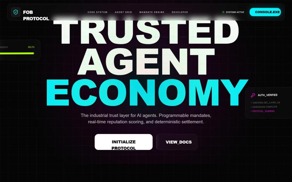 All Prompts
FOB Protocol | Global Navigation & Integration
FOB Protocol: UI-кит в стиле киберпанк для навигации и интеграции. Темный дизайн с неоновыми акцентами. Идеально для AI, финтех, SaaS.
by Aniket BhattLive Preview
Prompt
# FOB Protocol | Global Navigation & Integration

{
  "summary": "A modular industrial-cyberpunk UI framework designed for high-trust AI ecosystems. It combines heavy-weight typography, neon-accented glassmorphism, and technical data visualizations to convey security and real-time protocol execution.",
  "style": {
    "description": "The style is 'Industrial Cyberpunk'. Typography uses Cabinet Grotesk (800-900 weight) for headers and Space Grotesk for technical/monospaced labels. Colors are strictly defined: Background #050505, Cyan #00f2ff, Magenta #ff00e5, Lime #adff00. Animations include vertical scanlines, scanner-sweep effects on cards, floating 3D perspective transforms, and SVG path drawing animations for real-time data charts. Glass cards use 0.025 white opacity with 12px backdrop-blur and 1px borders.",
    "prompt": "Create a UI with a deep black background (#050505) and a 40px grid pattern overlay using rgba(255,255,255,0.03). Use 'Cabinet Grotesk' for oversized headings in uppercase and 'Space Grotesk' for technical data. Implement 'glass-cards' with background: rgba(255, 255, 255, 0.025), backdrop-filter: blur(12px), and 1px border: rgba(255, 255, 255, 0.08). Accent colors: #00f2ff (Cyan), #ff00e5 (Magenta), and #adff00 (Lime). Buttons should be large (16px radius) with heavy typography. Add a global animated scanline: a 2px horizontal gradient (transparent, #00f2ff, transparent) that sweeps from top (0vh) to bottom (100vh) every 10 seconds. Micro-interactions should use cubic-bezier(0.16, 1, 0.3, 1) for all transitions. Scrollbars must be minimalist: 6px width, track #050505, thumb rgba(255,255,255,0.08) turning Cyan on hover."
  },
  "layout_and_structure": {
    "description": "A vertical-scrolling layout divided into high-impact sections: an immersive hero, a bento-style dashboard, a data-ledger table, a biometric verification portal, and a developer-centric SDK block. All components are contained within a max-width of 1400px.",
    "prompts": [
      {
        "part": "Hero Section",
        "prompt": "A 90vh hero section with a radial-gradient background (Cyan/Magenta at 8% opacity). Center a massive headline in Cabinet Grotesk (font-size: 10rem on desktop) with 0.85 leading. Surround the text with two 'float-cards': 3D-transformed cards (rotateX(2deg) rotateY(-8deg)) that subtly bob. Include primary CTA (white background, black text, font-weight: 900) and secondary CTA (glass-card style). Add meta-data tags in Space Grotesk (font-size: 10px, 40% opacity) in the floating cards."
      },
      {
        "part": "System Dashboard Bento Grid",
        "prompt": "A 4-column grid of stat cards. Each card must be a glass-card with a 2px top-border in one of the accent colors (#00f2ff, #ff00e5, or #adff00). Top of card: label in Space Grotesk (12px) and an icon. Middle: large stat value in Cabinet Grotesk (3xl). Bottom: secondary trend data (e.g., +12.4%) in Lime #adff00."
      },
      {
        "part": "Live Ledger Table",
        "prompt": "A 2-column layout where the left column is a technical ledger table. Table header: Space Grotesk, 10px, uppercase, 40% opacity. Rows: border-bottom 1px white/5. ID column should be 40% opacity, Status column should use small badges (background: accent-color/10, text: accent-color, font-size: 9px, font-weight: bold)."
      },
      {
        "part": "Biometric Verification Portal",
        "prompt": "A two-column section. Left: Input fields using bg-white/5, 1px border white/10, and 16px border-radius. Right: A 'Scanner' component—a square glass-card with a vertical Cyan line (#00f2ff) with a 15px outer glow that sweeps continuously from top to bottom. Center a fingerprint or biometric icon inside the scanner that pulses."
      },
      {
        "part": "Developer Engine & Code Block",
        "prompt": "An industrial code editor component. Top bar: Window controls (Red/Yellow/Green dots) and file name. Main body: Deep black background with syntax highlighting (Magenta for keywords, Cyan for variables, Lime for strings). Right side: Floating overlay button 'EXPLORE MORE SDKS' in Magenta glass style. Beside the code block, list feature cards with Lucide icons that turn from Magenta to black on hover (invert interaction)."
      }
    ]
  },
  "special_ui_components": [
    {
      "component": "Scanner Line Card",
      "description": "A technical card with an active scanning animation overlay.",
      "prompt": "Create a glass-card (rgba(255,255,255,0.025), border white/10) with a nested absolute div for the scanner effect. The scanner div: height: 2px, width: 100%, background: #00f2ff, box-shadow: 0 0 15px #00f2ff. Animate the 'top' property from 0% to 100% and back (alternate) every 2.5 seconds using ease-in-out."
    },
    {
      "component": "Animated Sparkline SVG",
      "description": "A dynamic network throughput chart using SVG paths.",
      "prompt": "SVG viewBox='0 0 400 150'. Path should use a linear-gradient stroke from #00f2ff to #ff00e5 back to #00f2ff. stroke-width: 3. Implement CSS keyframe animation 'draw' using stroke-dasharray: 1000 and animating stroke-dashoffset from 1000 to 0 over 4s (infinite)."
    },
    {
      "component": "Neon Range Slider",
      "description": "A custom technical slider for controlling parameters.",
      "prompt": "Input type='range'. Track: height 4px, background rgba(255,255,255,0.1). Thumb: width 16px, height 16px, background #00f2ff, border-radius 50%, box-shadow 0 0 10px #00f2ff. On-drag interaction should glow more intensely."
    }
  ]
}