All Prompts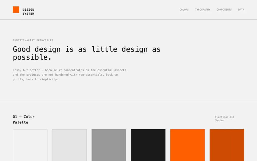 All Prompts
Functionalist Design System
Система дизайна UI: Технологичный, минималистичный дизайн для инженерных дашбордов, финтеха и SaaS. Акцент на данные и четкую иерархию.
by Niles RowlandLive Preview
Prompt
# Functionalist Design System

{
  "summary": "A technical 'Functionalist' design system characterized by a high-contrast International Orange and Charcoal palette, a 1px baseline grid, and a total reliance on IBM Plex Mono for an industrial, precise look. It removes all non-essentials like border-radii or shadows in favor of purity and function.",
  "style": {
    "description": "The style essence is 'Technical Purity.' It utilizes IBM Plex Mono for all text, ranging from Light (300) for display headers to Medium (500) for labels. The color palette is strictly technical: International Orange (#FF5F00) for highlights/actions, Charcoal (#1A1A1A) for structure and primary text, and Cool Gray (#F2F2F2) for backgrounds. Micro-interactions use smooth cubic-bezier(0.4, 0, 0.2, 1) transitions. Borders are always 1px solid, usually at low opacities (10-20%) for subtle separation.",
    "prompt": "Create a design system with a 'Functionalist' aesthetic. \n- **Typography**: IBM Plex Mono exclusively. Headings: H1 (48px, Light), H2 (32px, Light), H3 (24px, Medium), H4 (18px, Medium). Body: 14px (Regular), Small/Technical: 12px (Regular). Use uppercase with tracking-widest (0.1em+) for all labels and navigation.\n- **Colors**: \n  - Background: #F2F2F2 (Cool Gray)\n  - Primary Accent: #FF5F00 (Int. Orange)\n  - Secondary Accent: #CC4C00 (Deep Orange)\n  - Text/Border: #1A1A1A (Charcoal)\n  - Neutrals: #E5E5E5 (Mid Gray), #999999 (Dark Gray)\n- **Geometry**: Zero border-radius (sharp corners only). 1px solid borders for all containers.\n- **Grid**: 8px baseline grid for spacing (8px, 16px, 24px, 32px, 48px increments).\n- **Animations**: CSS view-transitions with 0.4s duration and cubic-bezier(0.4, 0, 0.2, 1) curve."
  },
  "layout_and_structure": {
    "description": "A modular, section-based layout separated by horizontal 1px charcoal dividers. Sections are highly structured with large margins (px-16) and vertical spacing (py-16 to py-24). Information is often presented in grid columns (1, 2, 3, or 6 columns) to maintain technical order.",
    "prompts": [
      {
        "part": "Header",
        "prompt": "Height: 80-100px. Border-bottom: 1px Charcoal/20%. Left: 32x32px solid #FF5F00 square logo followed by uppercase 'DESIGN SYSTEM' title in Charcoal. Right: Nav links in 12px uppercase IBM Plex Mono (Dark Gray #999999), hover color transition to #FF5F00."
      },
      {
        "part": "Hero Section",
        "prompt": "Padding: 64px to 96px vertical. Max-width content: 768px. Elements: Small uppercase label (Functionalist Principles), followed by H1 (48px, Light weight) 'Good design is as little design as possible.' followed by a body paragraph (14px, leading-relaxed) in Dark Gray. Border-bottom: 1px Charcoal/20%."
      },
      {
        "part": "Technical Grid Sections",
        "prompt": "Generic section structure: Flexbox or Grid header with a Section Number (e.g., 01 — Title) in 18px Medium Charcoal, and a right-aligned technical descriptor in 12px Dark Gray. Content follows in responsive grids (1, 2, 3, or 6 cols). Each section ends with a full-bleed 1px Charcoal/20% divider."
      },
      {
        "part": "Data Visualization & Tables",
        "prompt": "Charts: 1px Charcoal/10% internal grid lines. Line charts use #FF5F00 stroke-width: 2 with circle markers. Data Tables: Header row with 12px Dark Gray labels and bottom border. Data rows use 12px mono numerals. Status indicators: 8px solid colored dots (#FF5F00, #CC4C00, #1A1A1A)."
      }
    ]
  },
  "special_ui_components": [
    {
      "component": "Functionalist Button",
      "description": "A sharp-edged interactive element with high-contrast states.",
      "prompt": "Primary: Square corners, 0 border-radius. Padding: 12px 32px. Background: #FF5F00. Text: 12px uppercase White, tracking-widest. Hover: Background: #CC4C00. Secondary: 1px solid #1A1A1A border, text #1A1A1A, hover: Background #1A1A1A, text White. All transitions 0.2s ease-in-out."
    },
    {
      "component": "Technical Input Field",
      "description": "Form input with distinct focus states and label pairing.",
      "prompt": "Label: 12px uppercase Charcoal/60% tracking-widest. Input: Full width, 1px solid Charcoal/20% border. Background: White. Padding: 12px 16px. Text: 14px Charcoal. Focus State: Border color #FF5F00, outline: none. Placeholder: Charcoal/60%."
    },
    {
      "component": "Status Card",
      "description": "Modular container for metrics or status updates.",
      "prompt": "Container: 1px solid Charcoal/20% border. Background: #FFFFFF or #E5E5E5/50%. Padding: 32px. Top Element: 24x24px colored square swatch. Body: H3 (18px) heading and 12px body text. Optional: Top-right status badge (12px uppercase colored text)."
    }
  ]
}