All Prompts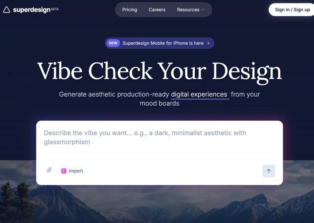 All Prompts
landing pagepagestylewebapptechfowardfuturisticindigo accentpurple accent
Futuristic SasS Landing Page
Футуристичный дизайн лендинга SaaS. Сочетает темные и светлые темы, стекломорфизм, элегантную типографику. Идеально для AI-стартапов, дизайн-инструментов.
by Shirley LouLive Preview
Prompt
# Futuristic SasS Landing Page

{
  "summary": "Superdesign is a sophisticated, vibe-centric design system that blends deep slate atmospheric backgrounds with a clean, grid-based feature layout. It utilizes a mix of 'Inter' (sans) for utility, 'Lora' (serif) for emotional headlines, and 'Space Grotesk' for a technical edge. The visual identity relies on glass panels (blur 12px), vibrant indigo accents (#6366f1), and animated glow gradients to create a futuristic, premium feel.",
  "style": {
    "description": "The style is 'Modern Atmospheric'. It pairs dark, deep backgrounds (#0f172a) in the hero and testimonials with clean, off-white surfaces (#f8f9fa) for detailed features. Typography is a critical pillar, using a serif font (Lora) for large, expressive headlines and a high-legibility sans (Inter) for body text. Animations are subtle but intentional: typing cursors, 180-degree logo rotations on hover, and 500ms smooth transitions for sticky navigation states.",
    "prompt": "### Visual Language\n- **Base Palette**: Primary Dark (#0f172a), Brand Indigo (#6366f1), Surface White (#f8f9fa), Border White (rgba(255,255,255,0.1)).\n- **Typography**: \n  - Headlines: Serif (Lora), 400-700 weight, tracking-tight, leading 1.1.\n  - UI/Body: Sans (Inter), 400-600 weight, leading-relaxed.\n  - Accents/Branding: Display (Space Grotesk), tracking-tight.\n- **Glassmorphism**: \n  - Soft: `background: rgba(255, 255, 255, 0.05); backdrop-filter: blur(12px); border: 1px solid rgba(255, 255, 255, 0.1);`.\n  - Strong: `background: rgba(30, 41, 59, 0.7); backdrop-filter: blur(16px); border: 1px solid rgba(255, 255, 255, 0.1); shadow: 0 4px 30px rgba(0, 0, 0, 0.1);`.\n- **Effects**: \n  - Outer Glow: `radial-gradient(from-indigo-500 via-purple-500 to-pink-500), blur(20px), opacity(0.3)`. \n  - Grid Overlays: Subtle 1px grid pattern with linear-gradient masks."
  },
  "layout_and_structure": {
    "description": "A tiered layout starting with a 110vh atmospheric hero section, transitioning into a multi-column feature section with sticky side-navigation, followed by a glassmorphic masonry testimonial grid and a clean accordion-based FAQ.",
    "prompts": [
      {
        "part": "Navigation",
        "prompt": "Sticky or absolute top navigation. Logo on left (icon + bold lowercase text). Center: a capsule-shaped pill `bg-white/10 backdrop-blur-md` containing links. Right: Primary CTA button with `shadow-[0_0_20px_rgba(255,255,255,0.2)]`."
      },
      {
        "part": "Hero Section",
        "prompt": "Full viewport (110vh). Background: Image overlayed with a slate-900 to transparent gradient. Center-aligned content. Top: Small indigo badge with a 'New' tag. Middle: Serif headline (text-7xl). Bottom: Large white input area (rounded-2xl) with a multi-colored outer glow shadow. Ensure a typing cursor animation on subheading text."
      },
      {
        "part": "Integration Bar",
        "prompt": "Floating glass panel (width: max-w-4xl) at the bottom of the hero. Two-part horizontal split. Left: 'Frameworks' label + logos. Right: 'Integrations' label + marquee/scrollable list of monochrome icons with hover color transitions."
      },
      {
        "part": "Feature Scroll-Spy",
        "prompt": "Light mode background (#f8f9fa). Layout: 25% sticky left sidebar for navigation, 75% main content. Sidebar features vertical links with a dot indicator that activates on scroll. Feature cards are alternating 2-column grids (Text vs Visual). Visuals include code snippets in dark blocks or grayscale blueprints with SVG overlay lines."
      },
      {
        "part": "Testimonials",
        "prompt": "Switch back to Slate-900 background. Use a masonry grid layout. Cards must use 'Glass Strong' style. Profiles include avatar, name, and social handle. Quotes should use 14px text-slate-200 with high line-height."
      },
      {
        "part": "FAQ",
        "prompt": "Centered 4xl container on white background. Items use light gray (#f3f4f6) rounded blocks. Interaction: Smooth height transition from 0 to max-content on click, with chevron rotation."
      }
    ]
  },
  "special_ui_components": [
    {
      "component": "Vibe Input Box",
      "description": "A high-fidelity text input that feels like a primary command center.",
      "prompt": "White container, 16px padding, rounded-2xl. Underneath, a hidden `div` with absolute positioning and `-inset-1` spacing applies a multi-color gradient (indigo to pink) with a `blur-lg` effect that intensifies on hover. Internal layout includes a borderless textarea (text-xl) and a bottom utility bar with attachment and 'send' (arrow-up) buttons."
    },
    {
      "component": "Sticky Feature Nav",
      "description": "Vertical navigation that tracks user progress through content sections.",
      "prompt": "Left-aligned list. Items transition from text-slate-400 (medium) to text-slate-900 (bold) based on scroll intersection. A 6px rounded circle (bg-black) appears to the left of the active item. Use a 500ms ease-in-out transition for the opacity and color shift."
    }
  ]
}