All Prompts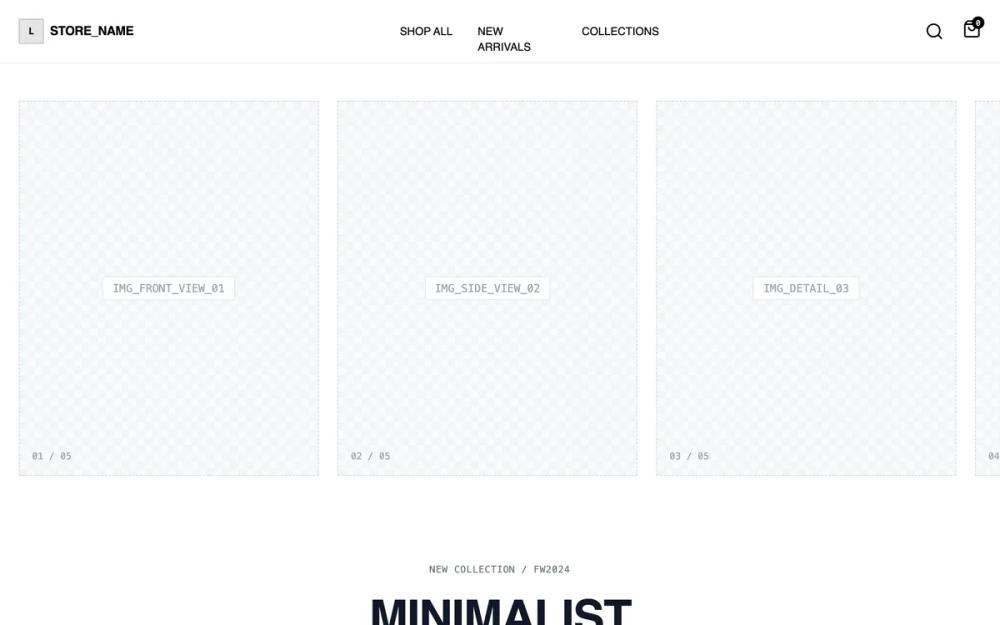 All Prompts
shopifylayoutecommerceproduct pagepdp
Gallery-First Product Page
Шаблон страницы товара с акцентом на галерею изображений. Идеально для fashion и lifestyle брендов, где визуал стимулирует покупку.
by Shirley LouLive Preview
Prompt
# Gallery-First Product Page

{
  "summary": "A clean, structured e-commerce product page that emphasizes visual hierarchy through whitespace and typography rather than color. It features a full-width horizontal gallery, centered primary information, and a detailed two-column technical breakdown at the bottom.",
  "style": {
    "description": "Monochrome editorial style with high-contrast typography. Uses 'General Sans' for main headings/body and 'JetBrains Mono' for technical details and meta-labels. The palette is restricted to #000000, #FFFFFF, and varying shades of gray (#F3F4F6 for backgrounds, #D1D5DB for borders). Animations include smooth horizontal scrolling with snap-alignment and subtle hover states on buttons.",
    "prompt": "Create a design with a pure #FFFFFF background. Use 'General Sans' as the primary font and 'JetBrains Mono' for mono-spaced technical elements. Heading 1 should be 64px, font-weight: 700, line-height: 0.9. Body text should be 18px with 1.6 line-height. Borders should be 1px solid #E5E7EB or dashed for placeholders. Buttons are solid #000000 with white text, 56px height, and letter-spacing: 0.05em. Use a placeholder pattern for images: 45-degree linear gradients in #F3F4F6 at 20px intervals. All transitions should be 200ms ease-in-out. Sticky elements (header/footer) should have a backdrop-blur of 8px and a 95% opacity white background."
  },
  "layout_and_structure": {
    "description": "A vertical stack consisting of a sticky header, a wide horizontal gallery, a centered product summary, a two-column detail grid, and a sticky transactional footer.",
    "prompts": [
      {
        "part": "Header",
        "prompt": "Sticky header at 80px height. Left: Square logo (32px) with mono 'L' and bold 'STORE_NAME'. Center: Horizontal nav links (SHOP ALL, NEW ARRIVALS, COLLECTIONS) in 14px medium General Sans. Right: Search and Shopping Bag icons with a numeric badge in black circle (16px) using mono font."
      },
      {
        "part": "Horizontal Gallery",
        "prompt": "Full-width section with horizontal overflow. Items are cards with 4:5 aspect ratio, width: 30vw (desktop) or 85vw (mobile). Use snap-center behavior. Each card has a centered mono-label (e.g., IMG_FRONT_VIEW) and a bottom-left counter (01 / 05) in 12px mono. Padding between items: 24px."
      },
      {
        "part": "Product Info",
        "prompt": "Centered column, max-width 672px. Start with 'New Collection' label in mono. Title in 64px bold caps. Below, a 1px x 48px horizontal line for visual rest. Color selector: 40px circular buttons with 2px ring offset for active state. Size selector: 64px x 48px rectangular buttons with 1px border. Main CTA: 64px height, solid black, full-width with a right arrow icon."
      },
      {
        "part": "Detail Grid",
        "prompt": "12-column grid with 96px top/bottom padding. Left 7 columns: 'Product Description' heading in small mono caps, followed by 3-4 paragraphs of prose. Right 5 columns: 'Technical Details' list using bullet points (6px black circles). Include a 'Material Map' box at the bottom-right with a 2-tone progress bar showing composition percentages (e.g., 85% vs 15%)."
      },
      {
        "part": "Sticky Footer CTA",
        "prompt": "Bottom-fixed bar, 80px height, white background, top border #E5E7EB. Left: Thumbnail (40px) and product title/meta info. Right: Full-width (mobile) or 256px (desktop) black CTA button displaying price (e.g., 'Add to Cart — $120')."
      }
    ]
  },
  "special_ui_components": [
    {
      "component": "Material Map Progress Bar",
      "description": "A technical visualization of fabric composition.",
      "prompt": "Create a container with 24px padding and dashed borders. Title: 'Material Map' in 10px mono. Progress bar: 8px height, rounded-full. Primary segment #000000 (85%), secondary segment #9CA3AF (15%). Footer text: labels on left and right for material types in 12px mono."
    },
    {
      "component": "Gallery Scroll Indicator",
      "description": "Mobile-only visual cue for image navigation.",
      "prompt": "A flex-row centered below the gallery on mobile. 4 dots of 6px diameter. Active dot: #000000, Inactive dots: #D1D5DB. 8px gap between dots."
    }
  ],
  "special_notes": "Must maintain a strict monochrome palette. Do not use rounded corners except for color swatches; keep all other elements (buttons, inputs, images) with 0px border-radius for an architectural feel. The 'General Sans' heading must use tight line-height (0.9) to create a 'blocky' typographic look. All image placeholders must maintain a consistent 4:5 aspect ratio."
}