All Prompts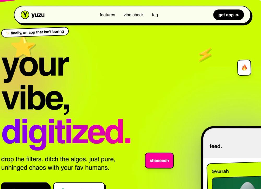 All Prompts
acid lime accenthigh contrastneon accentsboldmobile applanding pagehigh conversion pagegen zwaitlistloudmemebrutalistenergetic
Gen-Z Social App
Дизайн-система в стиле нео-брутализм для Gen-Z: яркие цвета, жирная типографика, асимметрия. Идеально для молодежных соцсетей, финтеха, креативных портфолио.
by Shirley LouLive Preview
Prompt
# Gen-Z Social App

{
  "summary": "Expressive, playful, and high-contrast 'Neo-Brutalist' UI for Gen-Z products. Characterized by bouncy micro-interactions, hard-edged 'brutal' shadows, and a saturated tri-color palette against deep black or crisp white backgrounds.",
  "style": {
    "description": "The style uses a combination of 'Space Grotesk' for bold, tight headlines and 'DM Sans' for clean, casual body text. Colors are high-saturation (#ccff00, #7000ff, #ff0099) used as background blocks or accents. Key visual markers include 4px-8px black borders, 6px hard shadows without blur, and elements that are frequently rotated between -3 and 3 degrees to create a 'placed' feel. Animations use a signature bouncy cubic-bezier curve (0.175, 0.885, 0.32, 1.275).",
    "prompt": "Apply a Neo-Brutalist Gen-Z aesthetic. Palette: Acid Green (#ccff00), Electric Purple (#7000ff), Hot Pink (#ff0099), and Deep Black (#0a0a0a). Typography: Headlines in 'Space Grotesk', bold weight, tracking -0.05em, lowercase-first style; Body text in 'DM Sans' 400-500 weight. Borders: All containers must have a solid 4px black border. Shadows: Use hard-offset shadows (6px 6px 0px #000000) instead of blurs. Interaction: Every button and card must use a bouncy scale transition (cubic-bezier(0.175, 0.885, 0.32, 1.275)). Elements like stickers and badges should have a floating animation (translateY: -15px to 15px with slight rotation) and be placed asymmetrically across the layout."
  },
  "layout_and_structure": {
    "description": "An asymmetrical, modular layout featuring sticky navigation pills, scrolling text marquees, and bento-style feature grids with varying column spans.",
    "prompts": [
      {
        "part": "Sticky Nav Pill",
        "prompt": "Create a floating navigation pill anchored at the top. Design: White background (90% opacity), 2px solid black border, 6px hard black shadow, fully rounded (border-radius: 9999px). Inside, place a logo mark (a circle with a single character) and 3-4 links in lowercase. The right side should have a high-contrast 'Get App' button with a black background and white text."
      },
      {
        "part": "Hero Section",
        "prompt": "A two-column layout on a high-saturation background (#ccff00). Left side: Massive headline (7xl-9xl) with tight leading, using a gradient-text span from #7000ff to #ff0099; include a subtext paragraph and a dual-button CTA row (black vs white buttons with brutalist shadows). Right side: A floating mobile phone mockup tilted 2-5 degrees, surrounded by 'stickers' (emojis or icons with white borders and hard shadows) that float independently. Background should include large, blurred decorative circles in contrasting colors."
      },
      {
        "part": "Slanted Marquee",
        "prompt": "A continuous horizontal scrolling text marquee. Background: Black with white text. Placement: Rotated 1-2 degrees across the page width. Text: Large, uppercase, extra-bold, separated by icons or bullets. Border: 4px white border on top and bottom."
      },
      {
        "part": "Bento Feature Grid",
        "prompt": "An asymmetrical grid using 12 columns. Layout: Mix of 7-column, 5-column, and 12-column spanning cards. Design: Each card has a 4px black border and hard shadow. Card A: Light gray background with a large icon popping out from the bottom right. Card B: Black background with neon accent text. Card C: Full-width spanning card with #ff0099 background, containing a mini-dashboard or interactive demo UI inside a 4px black-bordered container."
      },
      {
        "part": "Brutalist FAQ",
        "prompt": "Centered container with a maximum width of 800px. Each item is an accordion (details/summary). Style: White background, 4px black border, 6px hard shadow. Open state: Background of summary changes to light gray, icon rotates 45 degrees. Text inside should be conversational and casual."
      },
      {
        "part": "Giant CTA and Footer",
        "prompt": "The final CTA section should have a Hot Pink (#ff0099) background with massive headlines (8xl) stacked. Include large emoji stickers (e.g., bomb, unicorn) at 20% opacity. The footer should be white with an 8px black top border, featuring massive background text that says the brand name in 10vw size with 5% opacity, creating a subtle texture behind the social links and legal text."
      }
    ]
  },
  "special_ui_components": [
    {
      "component": "Floating Sticker System",
      "description": "Decorative icons or emojis that appear 'stuck' onto the interface.",
      "prompt": "Implementation: Position absolute icons with white 2px borders and drop-shadow(4px 4px 0px rgba(0,0,0,0.2)). Apply a CSS keyframe 'float' (0%, 100% { transform: translateY(0px) rotate(0deg); } 50% { transform: translateY(-20px) rotate(2deg); }) with a 6-8s duration."
    },
    {
      "component": "Brutalist Phone Mockup",
      "description": "An in-app UI preview inside a stylized phone frame.",
      "prompt": "Create a black frame (8px border) with 3rem corner radius. Inside, simulate a social feed using high-contrast blocks. Each post in the mockup should be tilted -1 to 1 degree, have a 2px black border, and a 4px hard black shadow. Include a bottom tab bar with oversized icons and one highlighted 'Action' button in #ccff00."
    },
    {
      "component": "Wobble Button",
      "description": "A button that shakes when hovered to grab attention.",
      "prompt": "Apply a hover keyframe 'wobble': 0% { transform: rotate(0deg); } 25% { transform: rotate(-5deg); } 75% { transform: rotate(5deg); } 100% { transform: rotate(0deg); }. Duration: 0.5s. Ease: ease-in-out."
    }
  ],
  "special_notes": "MUST: Use lowercase for the majority of the UI to maintain a casual 'anti-corporate' tone. MUST: Use hard black borders on every interactive element. MUST NOT: Use subtle shadows, gradients (except for headlines), or standard rounded corners; use either fully rounded pills or 2.5rem large-radius corners. MUST: Keep sections asymmetrical by applying slight rotations (1deg to 3deg) to cards."
}