Загрузка...
Система навигации для мобильных приложений, основанная на жестах. Уменьшает видимый интерфейс, переключает разделы свайпами для погружения.
# Gesture First Navigation System
Here is a reference implementation:
~~~html
<!DOCTYPE html>
<html lang="en">
<head>
<meta charset="UTF-8">
<meta name="viewport" content="width=device-width, initial-scale=1.0, maximum-scale=1.0, user-scalable=no">
<title>Gesture Navigation System</title>
<script src="https://cdn.tailwindcss.com"></script>
<script src="https://code.iconify.design/iconify-icon/1.0.7/iconify-icon.min.js"></script>
<link href="https://fonts.googleapis.com/css2?family=Manrope:wght@200;300;400;500;600;700;800&display=swap" rel="stylesheet">
<style>
body {
font-family: 'Manrope', sans-serif;
overscroll-behavior: none;
background-color: #f3f4f6;
}
/* Hide scrollbars for clean look */
.no-scrollbar::-webkit-scrollbar { display: none; }
.no-scrollbar { -ms-overflow-style: none; scrollbar-width: none; }
/* Physics-based transitions */
.snap-transition {
transition: transform 0.5s cubic-bezier(0.19, 1, 0.22, 1);
}
/* Animation for gesture hints */
@keyframes hint-bounce-x {
0%, 100% { transform: translateX(0); opacity: 0; }
20% { opacity: 0.6; }
50% { transform: translateX(-12px); opacity: 0; }
}
@keyframes hint-bounce-y {
0%, 100% { transform: translateY(0); opacity: 0; }
20% { opacity: 0.6; }
50% { transform: translateY(12px); opacity: 0; }
}
.hint-x { animation: hint-bounce-x 2.5s ease-in-out infinite; }
.hint-y { animation: hint-bounce-y 2.5s ease-in-out infinite 1s; }
/* Glass morphism */
.glass {
background: rgba(255, 255, 255, 0.8);
backdrop-filter: blur(12px);
-webkit-backdrop-filter: blur(12px);
}
</style>
</head>
<body>
<!-- Main App Container -->
<!-- touch-action: pan-y allows vertical scroll on children but we capture horizontal -->
<div id="app" class="w-full h-screen bg-white overflow-hidden relative text-gray-900 shadow-2xl mx-auto" style="touch-action: none; max-width: 100%;">
<!-- TOP ACTION LAYER (Hidden initially) -->
<div id="action-layer" class="absolute inset-0 bg-gray-900 z-50 transform -translate-y-full text-white pt-14 pb-[34px] px-6 flex flex-col justify-between shadow-2xl" style="will-change: transform;">
<div class="opacity-0 transition-opacity duration-500 delay-100" id="action-content">
<div class="flex items-center justify-between mb-12">
<h2 class="text-3xl font-light tracking-tight">Quick Actions</h2>
<button id="close-actions" class="w-12 h-12 flex items-center justify-center bg-white/10 rounded-full hover:bg-white/20 active:scale-95 transition-all">
<iconify-icon icon="lucide:x" class="text-2xl"></iconify-icon>
</button>
</div>
<div class="grid grid-cols-2 gap-4">
<button class="h-32 bg-white/5 rounded-2xl flex flex-col items-center justify-center gap-3 hover:bg-white/10 active:scale-95 transition-all group">
<iconify-icon icon="lucide:filter" class="text-3xl text-gray-400 group-hover:text-white transition-colors"></iconify-icon>
<span class="font-medium text-sm text-gray-300">Filter Feed</span>
</button>
<button class="h-32 bg-white/5 rounded-2xl flex flex-col items-center justify-center gap-3 hover:bg-white/10 active:scale-95 transition-all group">
<iconify-icon icon="lucide:search" class="text-3xl text-gray-400 group-hover:text-white transition-colors"></iconify-icon>
<span class="font-medium text-sm text-gray-300">Search</span>
</button>
<button class="h-32 bg-white/5 rounded-2xl flex flex-col items-center justify-center gap-3 hover:bg-white/10 active:scale-95 transition-all group">
<iconify-icon icon="lucide:bell" class="text-3xl text-gray-400 group-hover:text-white transition-colors"></iconify-icon>
<span class="font-medium text-sm text-gray-300">Notifications</span>
</button>
<button class="h-32 bg-white/5 rounded-2xl flex flex-col items-center justify-center gap-3 hover:bg-white/10 active:scale-95 transition-all group">
<iconify-icon icon="lucide:settings-2" class="text-3xl text-gray-400 group-hover:text-white transition-colors"></iconify-icon>
<span class="font-medium text-sm text-gray-300">Preferences</span>
</button>
</div>
</div>
<div class="flex flex-col items-center gap-2 pb-8 opacity-50">
<iconify-icon icon="lucide:chevron-up" class="text-2xl animate-bounce"></iconify-icon>
<span class="text-xs font-mono uppercase tracking-widest">Push up to close</span>
</div>
</div>
<!-- CONTENT WRAPPER (Horizontal Slider) -->
<div id="content-wrapper" class="flex h-full w-[300%] relative z-10" style="will-change: transform;">
<!-- PAGE 1: FEED -->
<div class="w-1/3 h-full pt-14 pb-[34px] px-6 flex flex-col bg-white overflow-hidden">
<header class="shrink-0 mb-8">
<div class="flex justify-between items-center">
<span class="text-[10px] font-bold tracking-[0.2em] text-gray-400 uppercase">01 / 03</span>
<div class="w-2 h-2 rounded-full bg-red-500"></div>
</div>
<h1 class="text-4xl font-light mt-4 leading-tight tracking-tight">Daily<br>Insight</h1>
</header>
<div class="flex-1 overflow-y-auto no-scrollbar pb-10 space-y-8 scroll-container">
<article class="group">
<div class="w-full aspect-[16/10] bg-gray-100 mb-4 rounded-lg overflow-hidden relative">
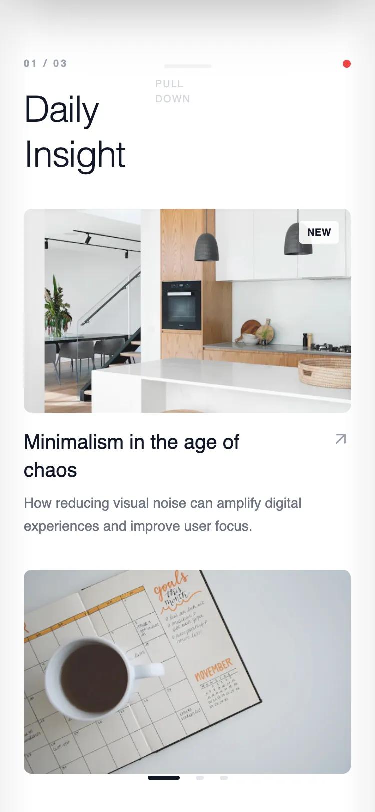
<img src="https://images.unsplash.com/photo-1600607686527-6fb886090705?q=80&w=600&auto=format&fit=crop" class="w-full h-full object-cover opacity-90 group-hover:scale-105 transition-transform duration-700" alt="content">
<div class="absolute top-3 right-3 bg-white/90 backdrop-blur px-2 py-1 rounded text-[10px] font-bold uppercase tracking-wide">New</div>
</div>
<div class="flex justify-between items-start">
<h3 class="text-xl font-medium leading-snug w-3/4">Minimalism in the age of chaos</h3>
<iconify-icon icon="lucide:arrow-up-right" class="text-xl text-gray-400"></iconify-icon>
</div>
<p class="text-gray-500 text-sm mt-2 leading-relaxed line-clamp-2">How reducing visual noise can amplify digital experiences and improve user focus.</p>
</article>
<article class="group">
<div class="w-full aspect-[16/10] bg-gray-100 mb-4 rounded-lg overflow-hidden relative">
<img src="https://images.unsplash.com/photo-1506784983877-45594efa4cbe?q=80&w=600&auto=format&fit=crop" class="w-full h-full object-cover opacity-90 group-hover:scale-105 transition-transform duration-700" alt="content">
</div>
<div class="flex justify-between items-start">
<h3 class="text-xl font-medium leading-snug w-3/4">Natural forms</h3>
<iconify-icon icon="lucide:arrow-up-right" class="text-xl text-gray-400"></iconify-icon>
</div>
<p class="text-gray-500 text-sm mt-2 leading-relaxed line-clamp-2">Exploring organic shapes in rigid grid systems.</p>
</article>
</div>
</div>
<!-- PAGE 2: EXPLORE -->
<div class="w-1/3 h-full pt-14 pb-[34px] px-6 flex flex-col bg-gray-50 overflow-hidden">
<header class="shrink-0 mb-8">
<div class="flex justify-between items-center">
<span class="text-[10px] font-bold tracking-[0.2em] text-gray-400 uppercase">02 / 03</span>
</div>
<h1 class="text-4xl font-light mt-4 leading-tight tracking-tight">Explore<br>Topics</h1>
</header>
<div class="flex-1 overflow-y-auto no-scrollbar pb-10 scroll-container">
<!-- Masonry-ish Grid -->
<div class="flex gap-4 mb-4">
<div class="w-1/2 aspect-[3/4] bg-white p-4 flex flex-col justify-between rounded-lg shadow-sm active:scale-95 transition-transform">
<iconify-icon icon="lucide:camera" class="text-2xl text-gray-300"></iconify-icon>
<span class="text-sm font-medium">Photography</span>
</div>
<div class="w-1/2 flex flex-col gap-4">
<div class="flex-1 bg-gray-900 p-4 flex flex-col justify-between rounded-lg shadow-sm text-white active:scale-95 transition-transform">
<iconify-icon icon="lucide:music" class="text-2xl text-gray-600"></iconify-icon>
<span class="text-sm font-medium">Music</span>
</div>
<div class="flex-1 bg-white p-4 flex flex-col justify-between rounded-lg shadow-sm active:scale-95 transition-transform">
<iconify-icon icon="lucide:pen-tool" class="text-2xl text-gray-300"></iconify-icon>
<span class="text-sm font-medium">Design</span>
</div>
</div>
</div>
<div class="w-full aspect-video bg-white mb-4 rounded-lg p-6 flex flex-col justify-center gap-2 shadow-sm active:scale-95 transition-transform">
<span class="text-xs font-bold text-blue-600 uppercase tracking-widest">Featured Collection</span>
<h3 class="text-2xl font-light">Interface Dynamics</h3>
<p class="text-sm text-gray-400">12 curated items</p>
</div>
<div class="flex gap-4">
<div class="w-1/2 aspect-square bg-gray-200 p-4 flex flex-col justify-between rounded-lg active:scale-95 transition-transform">
<iconify-icon icon="lucide:code-2" class="text-2xl text-gray-500"></iconify-icon>
<span class="text-sm font-medium">Dev</span>
</div>
<div class="w-1/2 aspect-square bg-white p-4 flex flex-col justify-between rounded-lg shadow-sm active:scale-95 transition-transform">
<iconify-icon icon="lucide:globe" class="text-2xl text-gray-300"></iconify-icon>
<span class="text-sm font-medium">Web</span>
</div>
</div>
</div>
</div>
<!-- PAGE 3: PROFILE -->
<div class="w-1/3 h-full pt-14 pb-[34px] px-6 flex flex-col bg-white overflow-hidden">
<header class="shrink-0 mb-8 flex justify-between items-start">
<div>
<span class="text-[10px] font-bold tracking-[0.2em] text-gray-400 uppercase">03 / 03</span>
<h1 class="text-4xl font-light mt-4 leading-tight tracking-tight">User<br>Profile</h1>
</div>
<div class="w-14 h-14 rounded-full bg-gray-100 overflow-hidden ring-4 ring-gray-50">
<img src="https://images.unsplash.com/photo-1500648767791-00dcc994a43e?q=80&w=200&auto=format&fit=crop" class="w-full h-full object-cover grayscale" alt="profile">
</div>
</header>
<div class="flex gap-12 mb-10 shrink-0">
<div>
<div class="text-2xl font-light tabular-nums">842</div>
<div class="text-[10px] text-gray-400 uppercase tracking-widest mt-1">Following</div>
</div>
<div>
<div class="text-2xl font-light tabular-nums">12.5k</div>
<div class="text-[10px] text-gray-400 uppercase tracking-widest mt-1">Followers</div>
</div>
</div>
<div class="flex-1 border-t border-gray-100 pt-6 overflow-y-auto no-scrollbar scroll-container">
<h3 class="text-xs font-bold uppercase tracking-widest mb-6 text-gray-400">Saved Lists</h3>
<div class="space-y-3">
<div class="group flex items-center justify-between p-4 bg-gray-50 hover:bg-gray-100 transition-colors rounded-lg cursor-pointer">
<div class="flex items-center gap-4">
<div class="w-10 h-10 bg-white rounded flex items-center justify-center text-gray-400">
<iconify-icon icon="lucide:bookmark"></iconify-icon>
</div>
<span class="font-medium">Reading List</span>
</div>
<span class="text-gray-400 text-xs font-mono">12</span>
</div>
<div class="group flex items-center justify-between p-4 bg-gray-50 hover:bg-gray-100 transition-colors rounded-lg cursor-pointer">
<div class="flex items-center gap-4">
<div class="w-10 h-10 bg-white rounded flex items-center justify-center text-gray-400">
<iconify-icon icon="lucide:heart"></iconify-icon>
</div>
<span class="font-medium">Liked Posts</span>
</div>
<span class="text-gray-400 text-xs font-mono">148</span>
</div>
<div class="group flex items-center justify-between p-4 bg-gray-50 hover:bg-gray-100 transition-colors rounded-lg cursor-pointer">
<div class="flex items-center gap-4">
<div class="w-10 h-10 bg-white rounded flex items-center justify-center text-gray-400">
<iconify-icon icon="lucide:archive"></iconify-icon>
</div>
<span class="font-medium">Archive</span>
</div>
<span class="text-gray-400 text-xs font-mono">4</span>
</div>
</div>
</div>
</div>
</div>
<!-- OVERLAYS & CONTROLS -->
<!-- Pagination Indicators -->
<div class="absolute bottom-8 left-0 w-full flex justify-center gap-4 z-30 pointer-events-none">
<div id="dot-0" class="h-1 rounded-full bg-gray-900 transition-all duration-300 w-8"></div>
<div id="dot-1" class="h-1 rounded-full bg-gray-200 transition-all duration-300 w-2"></div>
<div id="dot-2" class="h-1 rounded-full bg-gray-200 transition-all duration-300 w-2"></div>
</div>
<!-- Initial Gesture Hints -->
<div id="hints" class="absolute inset-0 pointer-events-none z-40 transition-opacity duration-700">
<div class="absolute top-1/2 right-6 -translate-y-1/2 flex flex-col items-end opacity-0 hint-x">
<iconify-icon icon="lucide:arrow-left" class="text-3xl text-gray-400"></iconify-icon>
</div>
<div class="absolute top-14 left-0 w-full flex justify-center opacity-0 hint-y">
<div class="flex flex-col items-center gap-2">
<div class="w-12 h-1 bg-gray-200 rounded-full"></div>
<span class="text-[10px] uppercase tracking-widest text-gray-400 font-medium">Pull Down</span>
</div>
</div>
</div>
<!-- Depth Shadows -->
<div class="absolute top-0 bottom-0 left-0 w-8 bg-gradient-to-r from-black/5 to-transparent pointer-events-none z-20"></div>
<div class="absolute top-0 bottom-0 right-0 w-8 bg-gradient-to-l from-black/5 to-transparent pointer-events-none z-20"></div>
</div>
<script>
/*
GESTURE NAVIGATION CORE
Handles horizontal swipes for pages and vertical pull for action layer.
*/
// State
let state = {
page: 0,
isDragging: false,
startX: 0,
startY: 0,
direction: null, // 'horizontal' or 'vertical'
isActionOpen: false
};
// Configuration
const config = {
snapThreshold: window.innerWidth * 0.25,
verticalThreshold: 120,
dragResistance: 0.3
};
// DOM Elements
const els = {
app: document.getElementById('app'),
content: document.getElementById('content-wrapper'),
actions: document.getElementById('action-layer'),
actionContent: document.getElementById('action-content'),
closeBtn: document.getElementById('close-actions'),
hints: document.getElementById('hints'),
dots: [0, 1, 2].map(i => document.getElementById(`dot-${i}`))
};
// Lifecycle & Hints
setTimeout(() => {
if (els.hints) {
els.hints.querySelectorAll('div').forEach(el => el.classList.remove('opacity-0'));
}
}, 500);
const removeHints = () => {
const hintsEl = els.hints;
if(hintsEl) {
hintsEl.style.opacity = '0';
setTimeout(() => hintsEl.remove(), 700);
els.hints = null;
}
};
// UI Updates
const updatePagination = () => {
els.dots.forEach((dot, idx) => {
if (idx === state.page) {
dot.className = 'h-1 rounded-full bg-gray-900 transition-all duration-300 w-8';
} else {
dot.className = 'h-1 rounded-full bg-gray-200 transition-all duration-300 w-2';
}
});
};
const updateActionLayerOpacity = (percent) => {
// Fade in content as we pull down
const opacity = Math.min(Math.max(percent, 0), 1);
els.actionContent.style.opacity = opacity;
};
// Input Handlers
const onPointerDown = (e) => {
removeHints();
state.isDragging = true;
state.startX = e.clientX;
state.startY = e.clientY;
state.direction = null;
// Disable transitions for direct 1:1 movement
els.content.classList.remove('snap-transition');
els.actions.classList.remove('snap-transition');
};
const onPointerMove = (e) => {
if (!state.isDragging) return;
const dx = e.clientX - state.startX;
const dy = e.clientY - state.startY;
// Determine Gesture Direction (Lock)
if (!state.direction) {
if (Math.abs(dx) > Math.abs(dy) && Math.abs(dx) > 5) state.direction = 'horizontal';
else if (Math.abs(dy) > Math.abs(dx) && Math.abs(dy) > 5) state.direction = 'vertical';
}
if (state.direction === 'horizontal') {
if (state.isActionOpen) return; // Lock horiz swipe if actions open
// Prevent default browser nav actions
if (e.cancelable) e.preventDefault();
const baseTranslate = -state.page * els.app.clientWidth;
let moveX = baseTranslate + dx;
// Resistance at edges
if ((state.page === 0 && dx > 0) || (state.page === 2 && dx < 0)) {
moveX = baseTranslate + (dx * config.dragResistance);
}
els.content.style.transform = `translateX(${moveX}px)`;
} else if (state.direction === 'vertical') {
// Logic for Pull Down Actions
// Only trigger pull down if we are at top of scroll or action layer is open
// For this demo, we assume pull down works from header area mostly, but we'll allow it generally
// if the intention is clearly DOWN and we are at top.
// Simple check: if dragging DOWN and not open, OR dragging UP and open
if (!state.isActionOpen && dy > 0) {
// Opening
const moveY = -els.app.clientHeight + dy;
// Only move if we are actually pulling down
if (moveY < 0) {
els.actions.style.transform = `translateY(${moveY}px)`;
updateActionLayerOpacity(dy / (els.app.clientHeight * 0.5));
}
} else if (state.isActionOpen) {
// Closing (dragging up)
let moveY = dy;
if (moveY > 0) moveY *= 0.2; // Resistance if pulling down more
els.actions.style.transform = `translateY(${moveY}px)`;
}
}
};
const onPointerUp = (e) => {
if (!state.isDragging) return;
state.isDragging = false;
// Restore smooth physics
els.content.classList.add('snap-transition');
els.actions.classList.add('snap-transition');
const dx = e.clientX - state.startX;
const dy = e.clientY - state.startY;
if (state.direction === 'horizontal') {
if (Math.abs(dx) > config.snapThreshold) {
if (dx > 0 && state.page > 0) state.page--;
else if (dx < 0 && state.page < 2) state.page++;
}
els.content.style.transform = `translateX(-${state.page * (100 / 3)}%)`;
updatePagination();
} else if (state.direction === 'vertical') {
if (state.isActionOpen) {
// Close if dragged up significantly
if (dy < -config.verticalThreshold) {
state.isActionOpen = false;
els.actions.style.transform = 'translateY(-100%)';
els.actionContent.style.opacity = '0';
} else {
els.actions.style.transform = 'translateY(0)'; // Snap back open
}
} else {
// Open if dragged down significantly
if (dy > config.verticalThreshold) {
state.isActionOpen = true;
els.actions.style.transform = 'translateY(0)';
els.actionContent.style.opacity = '1';
} else {
els.actions.style.transform = 'translateY(-100%)'; // Snap back closed
els.actionContent.style.opacity = '0';
}
}
}
state.direction = null;
};
// Bind Events
els.app.addEventListener('pointerdown', onPointerDown);
els.app.addEventListener('pointermove', onPointerMove);
els.app.addEventListener('pointerup', onPointerUp);
els.app.addEventListener('pointerleave', onPointerUp);
// Accessibility / Mouse Fallbacks
els.closeBtn.addEventListener('click', (e) => {
e.stopPropagation();
state.isActionOpen = false;
els.actions.classList.add('snap-transition');
els.actions.style.transform = 'translateY(-100%)';
els.actionContent.style.opacity = '0';
});
</script>
</body>
</html>
~~~