All Prompts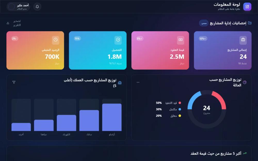 All Prompts
Glassmorphism HR Dashboard
Glassmorphism HR Dashboard: футуристичный UI-дизайн для HR и финансов. Темная тема, эффект матового стекла, SVG-визуализация. Идеально для управления персоналом и финтех.
by Ahmed AkearLive Preview
Prompt
# Glassmorphism HR Dashboard

{
  "summary": "Design a responsive HR and management dashboard using a Glassmorphism aesthetic. The interface should feel premium and data-rich, utilizing a deep dark theme, backdrop blurs (16px), and vibrant gradient stat cards. The layout features high-density information modules, custom animated SVG charts, and interactive data tables, all tied together with smooth entrance transitions and subtle background 'blob' animations.",
  "style": {
    "description": "The style is defined by 'Glassmorphism'—frosted glass panels with 16px blur and semi-transparent borders. Typography uses 'Cairo' for a modern, clean RTL experience. Colors follow a primary brand palette of Blue (#667eea) and Purple (#764ba2), accented by task-specific gradients (Pink-to-Red for high value, Cyan-to-Blue for success). Animations are pervasive, featuring staggered slide-ups and breathing background gradients.",
    "prompt": "Implement a design system based on a dark-mode palette: Background #0f172a, Surface rgba(17, 24, 39, 0.6). Glass Panels: Apply `backdrop-filter: blur(16px)`, `border: 1px solid rgba(255, 255, 255, 0.08)`, and a subtle shadow `0 4px 30px rgba(0, 0, 0, 0.1)`. Typography: Use 'Cairo' font family. Headers: Bold, 1.25rem to 1.875rem. Body: 0.875rem, slate-300 color. Data/Numbers: Use monospace or semi-bold weights for legibility. Color Palette: Primary #667eea, Secondary #764ba2, Success #4facfe, Warning #fee140, Danger #f5576c. Animations: 1. `blob` movement for background (scale 0.9 to 1.1 with 7s duration), 2. `slide-up` entrance (20px Y-offset to 0, ease-out, 0.6s), 3. `growBar` for SVG elements (scaleY from 0 to 1). Hover States: Lift cards by 5px and increase border opacity to 0.2."
  },
  "layout_and_structure": {
    "description": "A modular grid-based layout consisting of a sticky top navigation and a high-density content area. The content follows a hierarchy: summary stats (4-column), detailed charts (2-column), large-scale trends (full width), and data lists (tabular).",
    "prompts": [
      {
        "part": "Header/Navigation",
        "prompt": "Create a sticky header with a height of 64px. Use a glass-panel background with a bottom border (rgba(255,255,255,0.1)). On the right (RTL), place a logo/brand mark (40x40px, gradient #667eea to #764ba2) with a title and sub-caption. On the left, include a notification bell button and a user profile pill containing an avatar (32px), user name, and role label."
      },
      {
        "part": "Stats Grid (Hero Section)",
        "prompt": "Display 4 stat cards in a responsive grid (1 col mobile, 4 cols desktop). Each card has a unique linear gradient background (e.g., #667eea to #764ba2, #f093fb to #f5576c). Include an icon in a frosted glass square (32px), a trend percentage badge, a label, and a large bold metric. Cards should have a hover 'lift' effect."
      },
      {
        "part": "Bento Chart Section",
        "prompt": "A 2-column grid featuring a 'Donut Chart' on one side and a 'Vertical Bar Chart' on the other. Use glass-panel containers. The donut chart should be an SVG with multiple segments representing statuses. The bar chart should show categorical data with bars that animate from 0 to full height on load. Include a legend with color-coded dots."
      },
      {
        "part": "Trend Analysis Section",
        "prompt": "Full-width glass panel for a 'Monthly Trends' line chart. Include a section header with an icon and a 'Financial' tag. The chart should be an SVG area graph with a linear gradient fill (primary color to transparent) and a stroked line path. Overlay a horizontal grid using rgba(255,255,255,0.05). X-axis labels at the bottom."
      },
      {
        "part": "Data Table Section",
        "prompt": "A glass-panel container housing a clean data table. Columns: Index, Entity (with avatar/icon), Category, Value (monospace font), and Performance (horizontal progress bar). Header row should be slate-400 and 14px. Rows should have a subtle hover background change (rgba(255,255,255,0.05))."
      }
    ]
  },
  "special_ui_components": [
    {
      "component": "Animated Background Blobs",
      "description": "Large, soft, glowing orbs that move slowly behind the content to add depth.",
      "prompt": "Create three fixed 500-600px div elements with high z-index (-1). Apply `border-radius: 50%`, `filter: blur(120px)`, and `mix-blend-mode: screen`. Colors: Purple-600/20 and Blue-600/20. Apply a custom 'blob' animation that moves them ±30px and scales them slightly over a 7-second infinite loop."
    },
    {
      "component": "Permission Badge",
      "description": "Small status indicators used for sensitive data labels.",
      "prompt": "A pill-shaped badge with `background: rgba(var(--color), 0.2)`, `border: 1px solid rgba(var(--color), 0.3)`, and `color: var(--color)`. Font size: 10px. Include a tiny Lucide icon (e.g., lock) next to the text."
    }
  ]
}