All Prompts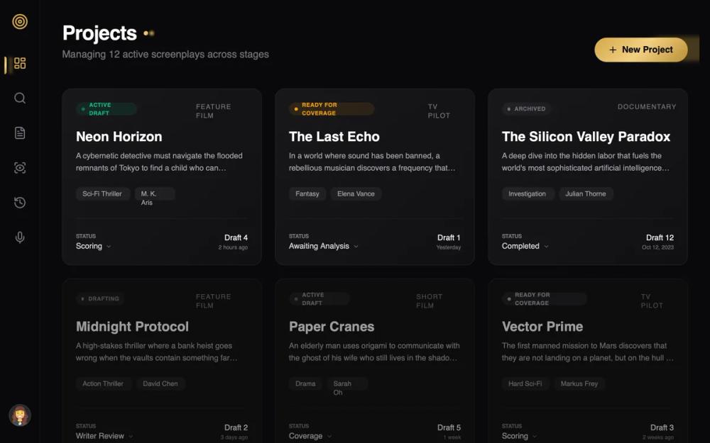 All Prompts
Goldlight Premium Refinement
Goldlight: премиальная дизайн-система в темном режиме. Высококонтрастный UI с глaссморфизмом, золотыми градиентами, типографикой. Для SaaS, финтеха, портфолио.
by AJ HartLive Preview
Prompt
# Goldlight Premium Refinement

{
  "summary": "A luxurious dark-themed dashboard with gold metallic accents, featuring glassmorphic cards, editorial Bricolage Grotesque typography, and a refined rail-style sidebar navigation.",
  "style": {
    "description": "The design uses a high-contrast palette of deep charcoal/black (#09090B) and a custom triple-stop gold gradient. Typography pairs the expressive 'Bricolage Grotesque' for headers with the clean 'DM Sans' for functional text. Key visual elements include 12px backdrop blurs, 1px subtle borders, and a signature 'gold-light' glow effect on active elements.",
    "prompt": "Create a UI with a deep black background (#09090B). Use a 3-stop gold gradient for primary accents: linear-gradient(135deg, #D4A84B 0%, #F3D081 50%, #B88E36 100%). Headings should use 'Bricolage Grotesque' (font-weight: 800, tracking-tight). Body text should use 'DM Sans' in zinc shades (#D4D4D8). Implement glassmorphism using background-color: rgba(19, 19, 22, 0.7) and backdrop-filter: blur(12px). Interactive elements should feature a cubic-bezier(0.4, 0, 0.2, 1) transition. Shadows for gold elements should be soft and colored: rgba(212, 168, 75, 0.3). Borders should be thin (1px) and low-opacity: rgba(255, 255, 255, 0.08)."
  },
  "layout_and_structure": {
    "description": "A fixed-rail sidebar layout with a fluid main content area. The main workspace utilizes a flexible grid system (typically 3 columns on desktop) with generous padding (40px) and clear vertical hierarchy.",
    "prompts": [
      {
        "part": "Sidebar Rail",
        "prompt": "A 72px wide fixed sidebar with a #09090B background and a 1px right border (rgba(255, 255, 255, 0.05)). Center icons vertically. The active state is indicated by a gold gradient pill-shaped vertical bar on the left edge (4px wide, 32px tall) with a shadow: 0 0 10px rgba(212, 168, 75, 0.5)."
      },
      {
        "part": "Header Section",
        "prompt": "A high-profile header with a 4XL title. Include a decorative 'status dot' next to the title using the gold gradient and a 8px outer glow. Place a primary action button on the far right: pill-shaped, gold gradient background, black text (#09090B), with a 15px-25px blur shadow of the same gold color."
      },
      {
        "part": "Content Grid",
        "prompt": "A responsive grid (1 col mobile, 3 cols desktop) with a 24px gap. Cards should be 'project-style' with a height that fits content, using the glassmorphic surface style and 16px border-radius."
      }
    ]
  },
  "special_ui_components": [
    {
      "component": "Glassmorphic Project Card",
      "description": "A sophisticated card with hover-triggered elevation and glow.",
      "prompt": "Build a card with background rgba(19, 19, 22, 0.7) and 12px backdrop blur. Border: 1px solid rgba(255, 255, 255, 0.08). On hover: translateY(-6px), scale(1.01), and change border-color to rgba(212, 168, 75, 0.4). Add a subtle gold glow shadow (rgba(212, 168, 75, 0.1)). Inside, include a pill-shaped status badge with 10% opacity background of the status color (e.g., emerald, amber) and a pulsing 6px dot."
    },
    {
      "component": "Gold Gradient Primary Button",
      "description": "High-luxury pill button with dimensional shadows.",
      "prompt": "A pill-shaped button using linear-gradient(135deg, #D4A84B, #F3D081, #B88E36). Text color #09090B, font-weight bold. Shadow: 0 4px 15px rgba(212, 168, 75, 0.3). On hover, increase shadow spread to 25px and reduce opacity slightly. Active state: scale(0.95)."
    }
  ],
  "special_notes": "Maintain visual hierarchy by using 60% opacity and grayscale filters on secondary or 'inactive' cards, which transition to full color and 100% opacity on hover. Every card must have a subtle diagonal top-left to bottom-right white-to-transparent gradient overlay at 3% opacity to simulate light hitting glass."
}