All Prompts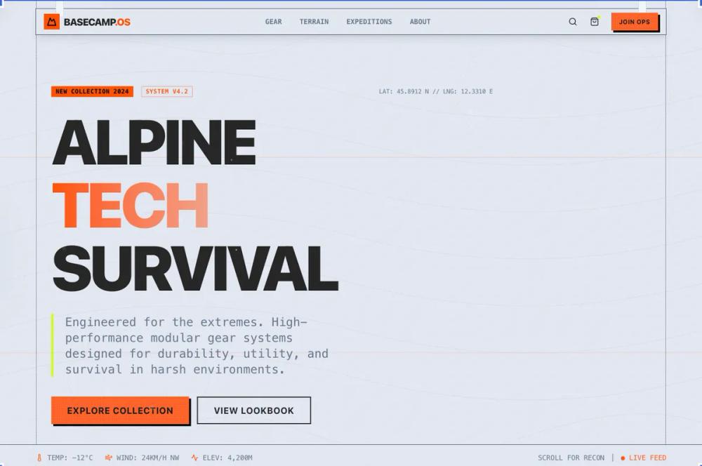 All Prompts
style
Gorpcore style
Gorpcore style: утилитарное снаряжение в альпийском стиле. Высокопроизводительная одежда из технологичных материалов для активного образа жизни.
by Zhou JasonLive Preview
Prompt
# Gorpcore style

<design-system>

Design Style: Gorpcore (Utilitarian Alpine & High-Performance Gear)

Design Philosophy

Core Concept: Technical Resilience

The Gorpcore style treats the digital interface as a piece of high-performance outdoor equipment designed for survival in extreme environments. It rejects sleekness for durability, function, and material reality. The UI should feel weatherproof, rugged, and engineered.

Core Tenets:

Material Functionality: Every element must look like it performs a physical function. Buttons are toggles or rubberized switches. Dividers are paracords or taped seams. Backgrounds are ripstop nylon or textured polymer.

High-Visibility contrast: The palette mimics safety gear. Muted, earthy tones (granite, moss) are punctuated by aggressive, high-visibility accents (safety orange, volt yellow) used for critical actions.

Topographic Structuring: Use subtle topographic map lines as background patterns to suggest terrain and depth.

Rugged Typography: Type should look like it's printed on a heavy-duty care label or stamped onto metal hardware. It is bold, condensed, and technical.

Modular Utility: The layout feels like a modular chest rig or a tactical backpack—pockets, straps, and carabiners hold the content in place.

The Vibe:

Durable & Adventure-Ready: It feels like it can survive a mountain expedition.

Technical & Engineered: Every detail has a purpose; nothing is just decorative.

Outdoorsy & Pragmatic: Focuses on utility over aesthetics.

Design Token System (The DNA)

Colors (The "Safety & Earth" Palette)

The Terrain (Backgrounds):

Granite Base: #262626 (Dark, textured charcoal).

Moss Green: #3A4035 (Muted, desaturated forest green for secondary panels).

Slate Grey: #4A5568 (Cool, technical grey for containers).

The "High-Vis" Accents:

Safety Orange: #FF4F00 (The primary action color. Blindingly bright).

Volt Yellow: #CCFF00 (For status indicators and highlights).

Summit White: #E2E8F0 (Off-white for text, avoiding pure white).

Typography

Font Family: "Druk Condensed" (Adobe/Commercial) or "Acumin Pro Condensed" (Adobe). If free is needed, "Barlow Condensed" (Google Fonts).

Hierarchy:

Headings: font-black, uppercase, tracking-tight, often with a distressed or stamped texture effect.

Body: Medium weight, highly legible technical sans-serif.

Labels: Small, uppercase, bold, looking like technical specs on a gear tag.

Textures & Materials

Ripstop Nylon: A subtle square grid pattern overlaid on backgrounds to simulate reinforced fabric.

Taped Seams: Borders are not solid lines but look like matte, waterproof tape applied over seams (border-4 border-slate-500/50 with a slight blur).

Paracord: Dividers and connecting lines look like braided climbing ropes with knots at the intersections.

Component Stylings

1. The "Gear Pocket" (Card)

Base Styles: bg-slate-grey with a ripstop-texture overlay.

The Fastener: Top-left or top-right corner features a visual "snap button" or "rivet" graphic.

Border: A thick, matte "taped seam" border in a slightly lighter grey.

Shadow: A tight, hard drop shadow that makes it look like a physical patch sewn onto the background.

1. The "Toggle" Switch (Button)

Shape: Rectangular with slightly rounded corners, looking like a rubberized physical switch.

Default: bg-granite-base with bold white text and a border-2 border-slate-400.

Active/Hover: The background switches to bg-safety-orange, and the text turns black. Add a physical "click" animation (quick scale down and up).

Detail: Add a small "grip texture" pattern (tiny dots or lines) on the right side of the button.

1. "Carabiner" Navigation

The main navigation bar hangs from the top of the screen via visual "straps."

Active links are highlighted not just with color, but with a small carabiner icon clipping onto the link text.

Animation & Motion

Feel: Physical, snappy, and secure. No soft fades.

Transitions: Elements "snap" into place (cubic-bezier(0.34, 1.56, 0.64, 1) - a slight overshoot).

Hover States: Buttons don't just change color; they feel like they are physically depressed or toggled.

Loading: A "compass" or "altimeter" dial spinning.

Non-Genericness (The "Bold" Factor)

Topographic Overlays: Large, subtle contour lines cover the entire background, reacting slightly to mouse movement (parallax).

Technical Specs as Decor: Use dummy technical data (e.g., ELEV: 4500M // LAT: 45.89 N // TEMP: -5°C) as decorative elements in headers or footers.

Strap Dividers: Sections are separated by visual "nylon straps" with buckles that run horizontally across the screen.

Compass Rose: A stylized, functional compass rose used as a decorative element or back-to-top button.

Dos and Don'ts

DO use high-contrast safety colors for calls to action.

DO make every element look tough and weatherproof.

DO use condensed, bold typography.

DON'T use delicate, thin fonts or ornate details.

DON'T use glossy or fragile-looking textures (like glass).

DON'T use soft, diffused shadows; keep them tight and physical.

</design-system>