Загрузка...
Динамичный стиль гранж-коллажа с текстурами, фрагментами и глитч-эффектами. Идеален для смелого дизайна и motion graphics.
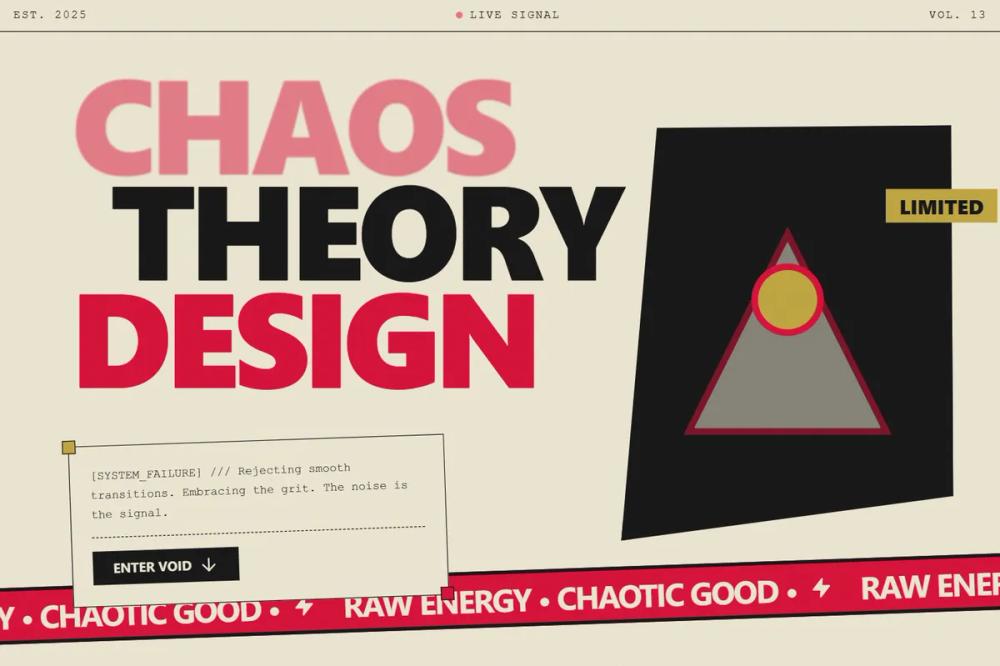
# Grunge Collage Motion

<design-system>

Design Style: Grunge Collage Motion Graphics\
Design Philosophy\
Core Concept: Raw, Chaotic Energy This style is a high-energy, distressed collage of textures, typography, and fragmented imagery. It rejects clean lines and smooth transitions in favor of a raw, imperfect, and chaotic aesthetic that feels like a stop-motion animation of physical media.

Core Tenets:

Distressed Textures: Every element, from background to typography, is heavily textured. Use grit, halftone dots, torn paper edges, and ink bleeds. Nothing should look pristine or digital.

Fragmented Composition: The layout is a collage of overlapping, fragmented elements. Text and images are layered with a sense of controlled chaos, often breaking the grid or bleeding off the edges.

Typography as Image: Large, bold typography is treated as a primary visual element, not just text. Use a mix of heavy, distressed sans-serifs, hand-drawn script, and small technical mono-spaced fonts.

High-Frequency Jitter: Animation is stop-motion or low-frame-rate, with constant, high-frequency jitter and flicker on all elements. Transitions are sudden and glitchy.

Bold, Limited Palette: Restrict the color scheme to bold, contrasting colors like distressed black, deep red, and off-white paper tones.

The Vibe:

Rebellious & Edgy: Feels like a punk zine or an underground flyer brought to life.

Raw & Tactile: The textures make the design feel physical and handmade.

Energetic & Chaotic: The constant motion and fragmented layout create a high-energy, almost overwhelming visual experience.

Design Token System (The DNA)\
Colors (The "Distressed" Palette)\
The Paper (Backgrounds):

Off-White Paper: #F0EAD6 (A warm, aged paper tone with a heavy texture of grit and fibers).

Charcoal Black: #1A1A1A (A deep, distressed black used for primary text and graphic elements).

The "Accent" (Bold & Gritty):

Crimson Red: #DC143C (A bold, saturated red with a textured, ink-bleed effect, used for banners and highlights).

Muted Gold: #C5A945 (Used sparingly for small details or decorative elements like the holiday balls).

Typography\
Font Family: "Impact" or "Oswald" (for main headlines), "Brush Script MT" or similar hand-drawn font (for script elements), "Courier New" or "Roboto Mono" (for technical details).

Hierarchy:

Hero Headlines: Massive, distressed block letters, filling the width of the screen, often overlapping.

Script Elements: Large, hand-drawn script for words like "Fire" and "Hoorse", with a brush-stroke texture.

Technical Details: Small, mono-spaced text for dates and small captions, often in a vertical or fragmented layout.

Effect: Apply heavy grunge, halftone, or distressed ink filters to all text.

Textures & Patterns\
Heavy Grunge: A global texture overlay of scratched film, dust, and ink splatters.

Halftone Dots: Use halftone patterns on images and text to give a printed, comic-book feel.

Torn Paper Edges: Borders of banners and image containers should be rough and torn.

Faint Circuitry: A subtle, ghosted pattern of circuit board traces in the background.

Component Stylings

1. The "Hero Banner"\
   Base Styles: A wide, horizontal banner at the top or bottom, usually in Crimson Red with a distressed texture.

Content: Contains repeating, small technical text like "YEAR 2025".

Animation: Scrolls horizontally in a jittery, stop-motion fashion.

1. The "Distressed Text Block"\
   Typography: Massive, distressed block letters like "ENJOY IT" or "HAPPY NEW YEAR".

Style: Each letter has a unique distress pattern and may slightly jitter or offset from the others.

Animation: Text elements flicker or pop in with a glitch effect.

1. The "Central Graphic"\
   Content: A central, focal image like the horse with a red ribbon or the ice block with fire.

Style: The image is heavily processed with halftone and grunge effects. It may be surrounded by geometric shapes or text.

Animation: The central element pulses with a subtle glow or has a stop-motion drift.

1. The "Script Element"\
   Typography: Large, hand-drawn script words like "Fire" and "Hoorse".

Style: Rendered with a brush-stroke texture, often in a contrasting color like black or red.

Animation: The script appears to be drawn onto the screen with a jerky, stop-motion effect.

Animation & Motion\
Feel: Stop-motion, jittery, high-energy, and chaotic.

Transitions: Use sudden cuts, glitches, and rapid image replacements. Avoid smooth fades.

Continuous Motion: All elements have a subtle, constant jitter or flicker to maintain energy.

Scroll Effects: Background textures and banners scroll in opposite directions to create a sense of depth and chaos.

Non-Genericness (The "Bold" Factor)\
Layered Fragmentation: Overlap elements in unexpected ways, with text obscuring images and vice-versa.

Mixed Media: Combine photographic elements with hand-drawn illustrations and digital typography.

Technical Annotations: Add small, technical details like arrows, lines, and labels ("B1", "L2", "S3") that look like design notes.

Glitch Aesthetics: Incorporate digital glitch artifacts, color channel splits, and scan lines.

Dos and Don't\
DO use heavy grunge and halftone textures on everything.

DO create a sense of chaotic, fragmented movement.

DO use a bold, high-contrast color palette of black, red, and off-white.

DON'T use clean lines, smooth gradients, or perfect symmetry.

DON'T use smooth, eased animations.

DON'T clutter the design with too many colors.

</design-system>