All Prompts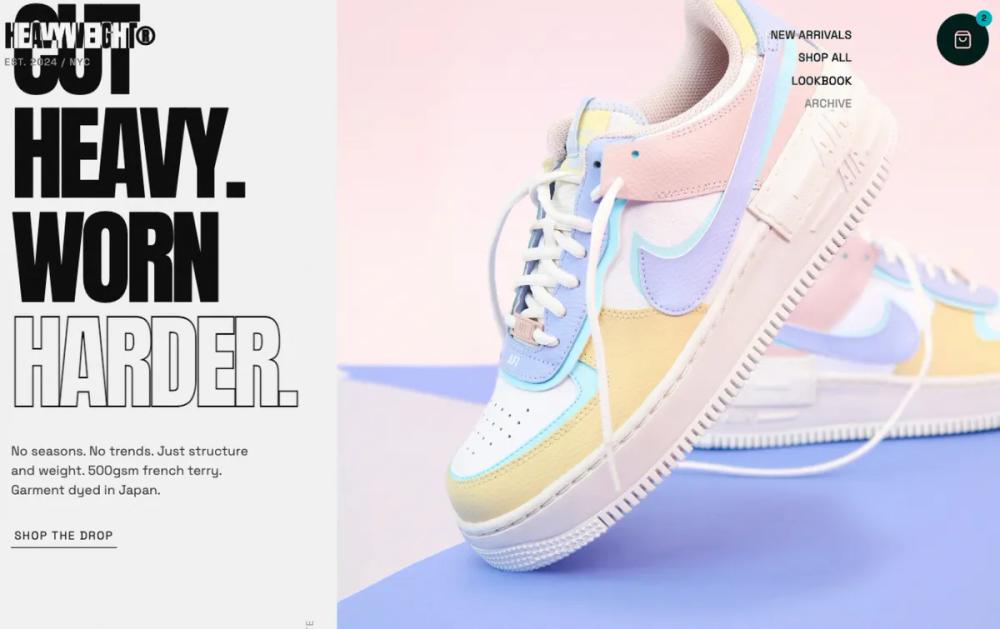 All Prompts
shopifylanding pageecommercelayout
Header & Hero Layout Refinement
Бруталистский дизайн для streetwear: типографика, нейтральная палитра, асимметричные сетки. Идеально для модных брендов, бутиков, студий.
by Shirley LouLive Preview
Prompt
# Header & Hero Layout Refinement

{
  "summary": "HEAVYWEIGHT is a minimalist yet high-impact design system built on brutalist principles. It utilizes massive uppercase display type, a monospace aesthetic for utility text, and an intentional use of negative space. The UI feels industrial and structural, mimicking the 'heavy' nature of the products it showcases.",
  "style": {
    "description": "The style is defined by a 'Concrete' (#f2f2f2) and 'Ink' (#0a0a0a) palette with high-contrast interactions. Typography pairs 'Anton' for massive, aggressive headlines with 'Space Grotesk' for technical, monospace-style metadata. Key characteristics include a persistent 4% opacity grain overlay, grayscale imagery that reveals color on hover, and the use of 'mix-blend-difference' to ensure text legibility across varying backgrounds.",
    "prompt": "Create a design with a background of #f2f2f2 (Concrete) and primary text in #0a0a0a (Ink). Apply a global grainy texture using a noise SVG at 0.04 opacity. For typography: use 'Anton' for H1-H3 headers (uppercase, tracking-tighter, leading-0.85) and 'Space Grotesk' for body and metadata (tracking-wide). Interactive links should use a 'hover:line-through' effect with a decoration thickness of 2px. Images should default to grayscale with a 700ms transition to full color and a slight 1.05x scale on hover. Use an accent color of #dc2626 (Red) sparingly for live status indicators or notifications. Shadows should be sharp and high-intensity, used only on floating elements like the cart icon (#000000 opacity 0.1)."
  },
  "layout_and_structure": {
    "description": "The layout is asymmetrical and intentionally 'unbalanced' to create visual interest. It utilizes a fixed header with elements pushed to extreme corners and a main content area that mixes large-scale hero imagery with dense, technical information blocks.",
    "prompts": [
      {
        "part": "Non-Standard Header",
        "prompt": "A fixed header (z-index 40) using `mix-blend-difference` to appear white on dark backgrounds and black on light. The logo (Anton font, 4XL) sits top-left with a sub-label (Est. 2024 / NYC) in 10px tracking-widest. Navigation is a vertical column of links shifted right (mr-32) to prevent overlap with central hero content. Links are uppercase, 12px, with line-through hover effects."
      },
      {
        "part": "Asymmetric Hero Section",
        "prompt": "A split layout. Left side (42% width) contains a massive headline (text-9xl) positioned low to avoid header elements. Include a sub-paragraph (max-width 320px) and a minimalist underline CTA. Right side (65% width) is an absolute-positioned image with a partial off-screen crop, grayscale, and object-left alignment. Include a vertical section label ('Collection 004') rotated -90 degrees at the bottom-left of the image."
      },
      {
        "part": "Horizontal Product Strip",
        "prompt": "A horizontal scroll section for 'Essentials'. Cards have an aspect ratio of 3:4 with a secondary image that fades in on hover (hover:opacity-100). Metadata sits below the image with a bold uppercase title and a monospace price ($140). Use `snap-x` and hide scrollbars."
      },
      {
        "part": "Technical Info Grid",
        "prompt": "A 12-column grid layout. The left 4 columns are sticky, containing massive headers and technical 'Architecture' descriptions with left-border accents (border-l-2). The right 8 columns feature a variety of image aspect ratios (4:5 and 1:1) showcasing macro details of product construction."
      },
      {
        "part": "Live Inventory Grid",
        "prompt": "An asymmetric 'broken' grid for products. Use varying column spans (col-span-6, col-span-3) and negative margins (mt-24) to create a staggered, editorial look. Each item includes size availability in a strike-through monospace font for out-of-stock items."
      },
      {
        "part": "Masonry Social Proof",
        "prompt": "A masonry column layout (columns-3). Cards are either solid background (#f2f2f2) or outlined (1px ink). Each card is slightly rotated (rotate-1 or rotate-2) to look like posters pasted on a wall. Use monospace font for quotes and a small dot icon for user handles."
      },
      {
        "part": "Utility Footer",
        "prompt": "A deep #0a0a0a background with #ffffff text. Organise links into a 6-column grid. The final footer element should be a massive, oversized 'HEAVY' display text (10vw) in low-opacity white (text-white/10) at the bottom, acting as a structural anchor."
      }
    ]
  },
  "special_ui_components": [
    {
      "component": "Floating Action Cart",
      "description": "An isolated, high-z-index cart button.",
      "prompt": "A circular button (64px x 64px) fixed at the top-right corner. Background is white, icon is ink. Features a notification badge in red (#dc2626) with white 10px text. Includes a hover:scale-110 transition and a sharp drop shadow."
    },
    {
      "component": "Detail Badge",
      "description": "Technical specs overlay on images.",
      "prompt": "A small, sharp-cornered white rectangle (padding: 4px 8px) placed at the top-right or bottom-left of product images. Contains technical data like '500gsm' or 'Garment Dyed' in bold, 10px uppercase font."
    }
  ]
}