All Prompts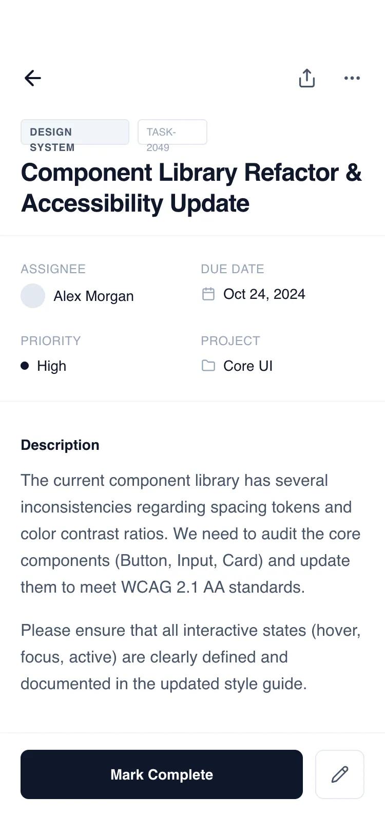 All Prompts
mobile appdetaillayout
Header-First Detail Page
Шапка-первый макет страницы деталей для SaaS, таск-менеджеров. Фиксированная шапка/подвал, независимый скролл контента. Современный UI.
by Shirley LouLive Preview
Prompt
# Header-First Detail Page

{
  "summary": "A clean, functional mobile detail wireframe with a fixed header and bottom action bar. The design uses a grayscale slate palette (#0F172A to #F8FAFC) and the 'General Sans' font family to create a clear information architecture. It supports complex data through a modular section-based layout including metadata grids, task checklists, and activity timelines.",
  "style": {
    "description": "The style is 'Minimalist Functional' using a monochrome slate color scale. Typography is centered around 'General Sans' with heavy use of font-weight variation and letter-spacing for hierarchy. UI elements use subtle borders (#F1F5F9) and soft background fills (#F8FAFC) instead of heavy shadows. Interactions are defined by smooth color transitions and discrete hover states.",
    "prompt": "Create a mobile UI using a minimalist grayscale aesthetic. Colors: Primary text #0F172A (Slate-900), secondary text #475569 (Slate-600), muted text #94A3B8 (Slate-400), background #FFFFFF, subtle backgrounds #F8FAFC, borders #E2E8F0. Typography: Use 'General Sans' sans-serif; H1 at 24px/font-weight:600/tracking-tight; Subheaders at 14px/font-weight:600; Metadata labels at 10px/font-weight:600/uppercase/tracking-wider. Spacing: 20px (px-5) horizontal page margins. Borders: 1px solid #F1F5F9 for dividers, 8px border-radius for buttons/cards. Components: Use Lucide-style icons (20px size), circular avatars (24px), and pill-shaped tags with 1px borders."
  },
  "layout_and_structure": {
    "description": "A classic mobile 'Detail View' structure with a 100vh container. It consists of a fixed top header, a middle flexible scrolling container, and a fixed bottom action bar to ensure primary triggers are always accessible.",
    "prompts": [
      {
        "part": "Fixed Header",
        "prompt": "Top-aligned header section (padding-top: 56px, px: 20px, pb: 16px). Include a top navigation row with a back arrow and a right-aligned action group (share, more-options). Below navigation, place a metadata tag row (pill shapes with 10px bold caps text) and a large 24px semi-bold page title. Add a 1px border-bottom (#F1F5F9) to separate from content."
      },
      {
        "part": "Content - Metadata Grid",
        "prompt": "Immediately below header, a 2-column grid section (py: 24px). Each cell contains a 10px uppercase label in Slate-400 and a 14px medium-weight value. Include small icons or 24px avatars next to values where appropriate (e.g., Assignee, Due Date)."
      },
      {
        "part": "Content - Description & Checklist",
        "prompt": "A long-form text section using prose-sm styles (14px, leading-relaxed). Follow with a 'Sub-tasks' section: vertical stack of items. Each item is a 1px bordered box with a 20px square checkbox. Completed items should show a check icon, strikethrough text, and Slate-400 color. Pending items use Slate-700 text and empty checkboxes."
      },
      {
        "part": "Content - Horizontal Gallery",
        "prompt": "An attachment section featuring a horizontal scrolling container. Items are 128px wide with a 4:3 aspect ratio placeholder box (Slate-100), followed by 12px filename and 10px file size. Include a dashed-border 'Add File' button at the end of the scroll."
      },
      {
        "part": "Content - Activity Timeline",
        "prompt": "A vertical timeline section. Use a 1px left border (Slate-100) as the spine. Timeline nodes are 10px circles with a 4px white ring. Entries include a sender name (14px bold), timestamp (10px), and either a boxed comment or a status change indicator showing 'From' and 'To' states with an arrow."
      },
      {
        "part": "Fixed Footer Action Bar",
        "prompt": "Bottom-aligned bar (pt: 16px, pb: 34px for safe area, px: 20px). Use a 2-column grid layout (1fr auto). Left column: Primary CTA button, 48px height, Slate-900 background, white text, 14px semi-bold. Right column: Secondary square icon button, 48px size, Slate-200 border."
      }
    ]
  },
  "special_ui_components": [
    {
      "component": "Status Change Badge",
      "description": "A compact UI element showing a transition between two states.",
      "prompt": "Create a status transition component: two rounded rectangles (padding: 2px 6px, text-size: 10px, font-weight: 500). The first state is Slate-100 background with Slate-500 text and a strikethrough. The second state is Slate-800 background with white text. Join them with a small Slate-300 right-arrow icon."
    },
    {
      "component": "Bento Metadata Item",
      "description": "Standardized data point for technical or project details.",
      "prompt": "Layout: Vertical flex container (gap: 6px). Top: 10px Slate-400 uppercase text with tracking-wide. Bottom: 14px Slate-900 medium text. If including an icon, use a 14px size in Slate-400 placed to the left of the value with a 8px gap."
    }
  ],
  "special_notes": "MUST maintain strict grayscale consistency; do not use brand colors. MUST use the safe area padding (pb-34px) for the footer to support modern mobile notch/home bars. MUST use 'General Sans' or a high-quality equivalent like Inter to maintain the editorial feel. MUST ensure all interactive buttons have a defined hover/active state (bg-slate-50 or opacity change). DO NOT use heavy drop shadows; rely on borders and subtle background fills for depth."
}