All Prompts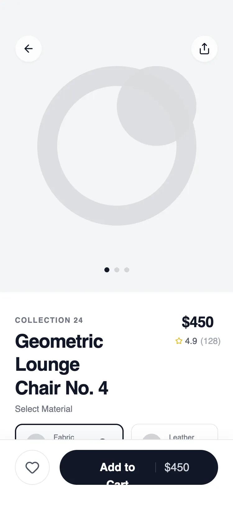 All Prompts
mobile appdetaillayout
Hero + Sticky Action Detail
UI компонент: Hero + Sticky Action Detail. Фиксированная панель действий, 4:5 визуалы. Для e-commerce, витрин, минималистичных приложений.
by Shirley LouLive Preview
Prompt
# Hero + Sticky Action Detail

{
  "summary": "A sophisticated mobile product detail wireframe using a clean, monochromatic design language. It utilizes strong typographic weights, architectural spacing, and a persistent bottom action bar to drive conversions while maintaining a premium, airy aesthetic.",
  "style": {
    "description": "The style is defined by its 'Satoshi' sans-serif typography, ranging from extra-bold headers to wide-tracked uppercase tags. The color palette is strictly grayscale (using Tailwind's gray-50 through gray-900) with a focus on tactile interaction through subtle scale transforms and backdrop blurs. Shadows are minimal, relying instead on 1px borders (#E5E7EB) and background shifts for depth.",
    "prompt": "Create a design system using the 'Satoshi' font family. Use a grayscale color palette: White (#FFFFFF), Ghost White (#F9FAFB), Platinum (#E5E7EB), Slate Gray (#71717A), and Onyx (#111827). Typography: Headers use 700-900 weight with tight tracking (-0.025em), labels use 500 weight with wide tracking (0.1em). Corners should be rounded with '2xl' (16px) or 'full' radius. Apply backdrop-filter: blur(12px) to fixed elements. Animations should use 'active:scale-95' for haptic feedback and cubic-bezier(0.4, 0, 0.2, 1) for transitions."
  },
  "layout_and_structure": {
    "description": "A vertical scrollable container with a fixed top navigation and a sticky bottom action bar. The content flows from a large visual hero into a structured information hierarchy.",
    "prompts": [
      {
        "part": "Fixed Navigation",
        "prompt": "An absolute positioned header (z-index 20) with 56px top padding (safe area). Contains two floating circular buttons (44px diameter) with #FFFFFF/80 background and 4px backdrop-blur. One left-aligned back arrow and one right-aligned share icon."
      },
      {
        "part": "Hero Section",
        "prompt": "A full-width 4:5 aspect ratio image container. Background color #F3F4F6. Include a centered pagination indicator at the bottom (32px from edge) consisting of 8px circular dots with one active (black) and two inactive (gray-300) states."
      },
      {
        "part": "Product Header Block",
        "prompt": "A flex-row layout with 32px top padding. Left side: uppercase 10px tracking-widest tag and a 30px bold H1. Right side: 24px bold price and a 14px rating row with a gold star icon (#EAB308)."
      },
      {
        "part": "Horizontal Variant Selector",
        "prompt": "A horizontal scrollable list of selection cards. Each card is 64px tall, min-width 140px, with 16px padding and a 12px border-radius. Active state: 2px solid #111827 border, #F9FAFB background, and a checkmark icon in a 16px black circle. Inactive state: 1px border #E5E7EB."
      },
      {
        "part": "Feature Grid",
        "prompt": "A 2-column grid with 16px gap. Each card features a 40px white circular icon container with a soft shadow, a 14px bold title, and 12px light gray description text, all housed within a #F9FAFB 16px rounded box."
      },
      {
        "part": "Sticky Action Bar",
        "prompt": "A fixed footer (z-index 30) with backdrop-blur-xl and white/90 background. 1px top border (#E5E7EB). Features a 56px circular secondary button (heart icon) and a primary 'Add to Cart' button (flex-1, 56px height, #111827 background, 18px bold white text). Must include bottom safe area padding (34px)."
      }
    ]
  },
  "special_ui_components": [
    {
      "component": "Haptic Button",
      "description": "A button that provides visual feedback on tap.",
      "prompt": "Design a button with CSS 'transition-transform duration-200' and 'active:scale-95'. This should be applied to all interactive elements including nav circles, variant cards, and the main CTA."
    },
    {
      "component": "Geometric Variant Card",
      "description": "A rich variant selector card with visual and text cues.",
      "prompt": "Create a 64px high card with a flex-row layout. Include a 32px circular swatch on the left, a two-line vertical text stack (10px label/14px value) in the center, and a checkmark status indicator that only appears in the active state."
    }
  ],
  "special_notes": "MUST use Satoshi or a similar high-quality geometric sans-serif. MUST ensure the bottom action bar includes the iOS/Android safe area padding to prevent overlap with home indicators. DO NOT use vibrant colors; stick to the grayscale palette except for very specific functional icons (rating stars, heart). MUST use backdrop blurs for all fixed overlays to maintain the 'glass' feel."
}