Загрузка...
Минималистичный дизайн лендинга в швейцарском стиле с высоким контрастом. Акцент на типографике, асимметричных сетках. Идеально для премиум-контента.
# High Contrast Landing Page
{
"summary": "A sophisticated, typography-first design system using heavy geometric sans-serifs, offset text layering (echoes), and a clean, high-contrast monochromatic color palette to create an editorial, luxury-brutalist aesthetic.",
"style": {
"description": "The style is defined by its Swiss minimalist roots: heavy use of 'Clash Display' for bold, oversized headlines and 'Satoshi' for clean, functional body text. Colors are strictly neutral (#f2f2f2 background, #111111 text) with a gradient of grays (#bfbfbf to #d9d9d9) used for depth-creating background layers. The aesthetic is devoid of traditional icons or illustrative fluff, relying instead on geometric shapes, sharp borders, and high-impact font pairing.",
"prompt": "Create a high-contrast minimalist UI using a Swiss-style aesthetic. \n- **Palette**: Backgrounds in off-white (#f2f2f2), primary text in deep black (#111111), and secondary elements in muted grays (#b6b5b5, #838282).\n- **Typography**: Headlines in 'Clash Display' (bold, weight 700), tracking -0.05em, leading 0.9. Body text in 'Satoshi' (medium, weight 500). \n- **The Echo Effect**: Primary hero text should be layered with 4-5 background repetitions. Each background layer is offset by -0.04em, -0.08em, -0.12em, and -0.16em respectively, with colors fading from #bfbfbf to #d9d9d9.\n- **Micro-interactions**: Use 700ms cubic-bezier(0.77, 0, 0.175, 1) for image reveals (clip-path: inset). Interactive elements should utilize grayscale-to-color transitions and subtle scale transforms (1.05x)."
},
"layout_and_structure": {
"description": "The structure follows a clean vertical flow with significant whitespace and an asymmetrical grid for showcase sections. It moves from a high-impact typographic hero to a structured three-column informational grid, followed by a dynamic masonry-style image layout.",
"prompts": [
{
"part": "Navigation",
"prompt": "Sticky header with a height of 80px. Background: #f2f2f2 with 90% opacity and backdrop-blur(12px). Links: 14px uppercase Satoshi with 120ms color transition to #b6b5b5. Include a pill-shaped contact button with a 1px solid #1e1e1e border that inverts on hover."
},
{
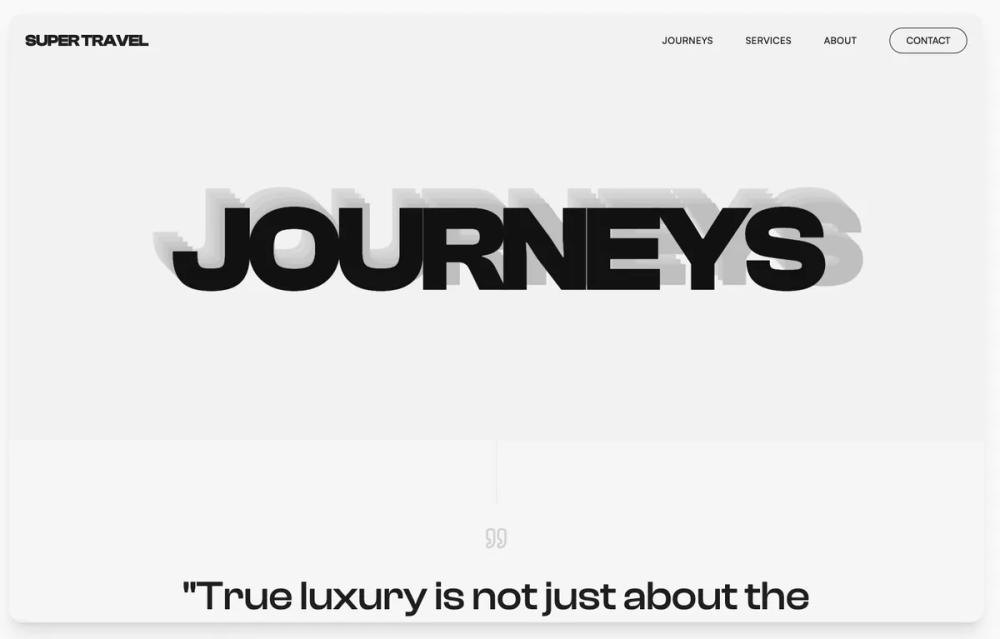
"part": "Hero Section",
"prompt": "Full-width section with a height of 70vh to 100vh. Center-align a massive text element (11vw or 180px). Implement the 'Echo Stack' with at least 4 layers of background text in varying light gray tones. Ensure the main foreground text is #111111. No imagery, just pure typographic weight."
},
{
"part": "Philosophy / Narrative Section",
"prompt": "Centered block with a vertical hairline divider (1px #1e1e1e/10) leading into the section. Large-scale quote (4xl to 6xl) using Clash Display, featuring a single keyword in a contrasting serif italic font for editorial flair. Beneath, a 3-column grid with 32px gaps, each column featuring a bold H3 and light-weight Satoshi body text."
},
{
"part": "Asymmetrical Showcase Grid",
"prompt": "A 12-column grid featuring mixed aspect ratios. Section include: 1. A large 8-column rectangular card with rounded-sm corners. 2. A vertical 4-column pill-shaped card (full border-radius). 3. A circular 5-column aspect-square image. 4. A wide 7-column rectangle. All images should start with a 20% grayscale filter, transitioning to 100% color and 1.05x scale on hover."
},
{
"part": "Bespoke Service Cards",
"prompt": "3-column grid of cards with #1e1e1e/10 borders. Backgrounds transition from transparent to #ffffff on hover. Each card contains a small geometric icon container (64x64px) that rotates 12 degrees on hover. Use arrow-right icons for CTAs with a tracking-wide bold Satoshi font."
},
{
"part": "Footer",
"prompt": "Deep dark theme (#1e1e1e) with 60% opacity off-white text (#f6f6f6). 4-column layout including brand summary, navigation, company links, and contact details with Lucide-style line icons. Include a thin 5% opacity white top border."
}
]
},
"special_ui_components": [
{
"component": "Typographic Echo Stack",
"description": "A rhythmic text layering technique using CSS absolute positioning.",
"prompt": "Layer 5 instances of the same word. The top layer is #111111. Layers 2-5 are positioned absolutely beneath it, each shifted left and up by increments of 0.04em. Background colors: #bfbfbf, #c9c9c9, #d1d1d1, #d9d9d9. Set pointer-events: none for all background layers."
},
{
"component": "Pill-Shaped Vertical Showcase",
"description": "A high-aspect ratio container with full border radius for editorial imagery.",
"prompt": "Container with height: 500px and border-radius: 9999px. Overflow: hidden. Inside, place an image that scales on hover. Center a circular overlay that only becomes visible (opacity 1) when the parent is hovered, containing secondary text in a thin border."
}
]
}