All Prompts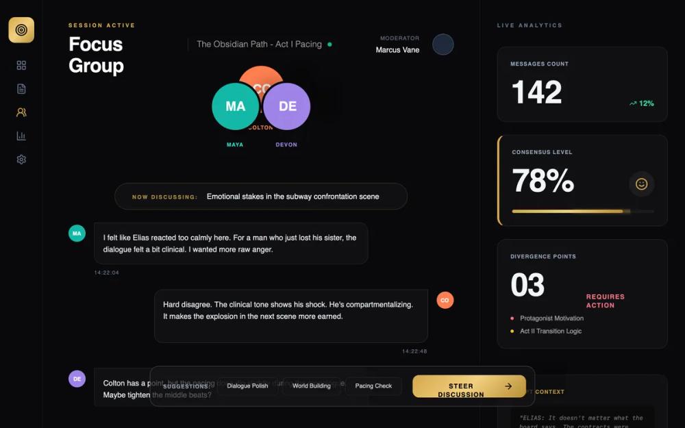 All Prompts
Hollywood Screenplay Focus Group Session
Кинематографическая UI система для инструментов Голливуда. Темная тема, стекломорфизм, золотой градиент. Идеально для аналитики, кино и люксовых брендов.
by AJ HartLive Preview
Prompt
# Hollywood Screenplay Focus Group Session

{
  "summary": "A sophisticated dark-themed Hollywood platform interface with glassmorphism panels, gold metallic accents, and massive geometric typography for live session monitoring and creative data analysis.",
  "style": {
    "description": "The design follows a 'Premium Neo-Noir' aesthetic. It features a high-contrast dark palette centered on #09090B with gold metallic gradients. Typography uses 'Plus Jakarta Sans' for body text and 'Space Grotesk' for high-impact headers and metrics. Elements are defined by semi-transparent glass panels, fine 1px white/gold borders, and high-tracking uppercase labels (text-[10px]). Micro-interactions include 'Springy' hover lifts (cubic-bezier) and emerald pulse indicators for live connectivity.",
    "prompt": "Create a UI with a dark theme (#09090B) using a glassmorphism style (background: rgba(19, 19, 22, 0.7); backdrop-filter: blur(12px); border: 1px solid rgba(255, 255, 255, 0.08)). Use a primary gold gradient for CTAs and progress bars: linear-gradient(135deg, #D4A84B 0%, #F3D081 50%, #B88E36 100%). Typography specs: Primary font 'Plus Jakarta Sans', Display font 'Space Grotesk'. Use text-[10px] uppercase with 0.3em tracking for all micro-labels. Key colors: Teal (#14B8A6), Coral (#FF7F50), Lavender (#A084E8), and Emerald (#10B981). Interactive elements must use a cubic-bezier transition (0.175, 0.885, 0.32, 1.275) with a hover effect that translates Y by -6px and scales to 1.01 with a gold glow (rgba(212, 168, 75, 0.3))."
  },
  "layout_and_structure": {
    "description": "A multi-column layout comprising a narrow 80px left navigation rail, a wide central workspace (max-w-5xl) for dynamic content, and a 384px (w-96) analytical sidebar. The interface uses fixed-position elements for controls and high vertical spacing (mb-12, py-10) to create a premium, uncrowded feel.",
    "prompts": [
      {
        "part": "Left Navigation Rail",
        "prompt": "An 80px wide vertical sidebar with a border-right of 1px white/5%. At the top, a 48x48px rounded-xl logo container with a gold-gradient background. Navigation icons (20px size) are centered vertically, using slate-500 colors with white or gold active states."
      },
      {
        "part": "Session Header",
        "prompt": "A wide header section with a title (text-4xl, font-bold, Space Grotesk). Include a status indicator featuring a live text label (10px uppercase gold) and an emerald-500 pulse dot. Display a vertical divider (1px white/10%) between the main title and secondary session details."
      },
      {
        "part": "Dynamic Avatar Arrangement",
        "prompt": "A semi-circle arrangement of reader avatars (96x96px each). Center avatar is elevated (translate-y-8), flanking avatars are slightly lower. Each avatar has a 4px border matching the page background and a distinct brand color (Teal, Coral, Lavender) with bold 2-letter initials (text-2xl)."
      },
      {
        "part": "Message Feed",
        "prompt": "A scrollable central column with timestamped messages. Use glass-card panels for message bubbles (p-4, rounded-2xl). Left-aligned messages use a 32x32px circular avatar; right-aligned messages signify personal or distinct responses. Include a 'Now Discussing' floating pill at the top (rounded-full, glass-card, gold border-20%)."
      },
      {
        "part": "Floating Moderator Controls",
        "prompt": "A fixed footer bar (max-w-3xl) centered at the bottom. The bar is a rounded-2xl glass-card. Left side contains horizontal pills for suggestions; right side features a large 'Steer Discussion' button (gold-gradient, black text, bold uppercase 12px) with a trailing icon."
      },
      {
        "part": "Analytical Sidebar",
        "prompt": "A 384px wide column containing stacked metric cards. Each card uses the 'card-hover' effect and glassmorphism. Headlines are 10px uppercase gold. Primary metrics are 60px+ (text-6xl) using 'Space Grotesk' font-black. Include linear progress bars with gold gradients and shadow glows."
      }
    ]
  },
  "special_ui_components": [
    {
      "component": "Consensus Progress Bar",
      "description": "A high-end data visualization bar for agreement levels.",
      "prompt": "A full-width 6px height container (bg-white/5, rounded-full). The inner progress bar uses the gold-gradient (#D4A84B to #B88E36) and a box-shadow (0 0 10px rgba(212,168,75,0.4)) to simulate a glow. Top labels must be text-6xl for the percentage value."
    },
    {
      "component": "Avatar initials Circle",
      "description": "Layered identity component for focus group participants.",
      "prompt": "A 96px circular container with a 4px solid border in the background color (#09090B). Inside, a solid color background (Teal #14B8A6, Coral #FF7F50, or Lavender #A084E8). Text is 'Space Grotesk' bold white. Underneath, a label in 10px uppercase tracking-widest text matching the avatar color."
    }
  ],
  "special_notes": "MUST: Use 'Space Grotesk' exclusively for numbers and major headings. MUST: Maintain a minimum of 48px padding between the central discussion and the sidebars. MUST: Use the specific cubic-bezier for all card interactions to ensure a 'springy' feel. DO NOT: Use standard solid background colors; every panel must be a glass-morphism variant. DO NOT: Use standard font-weight 400 for headers; prioritize font-bold or font-black for the Hollywood aesthetic."
}