All Prompts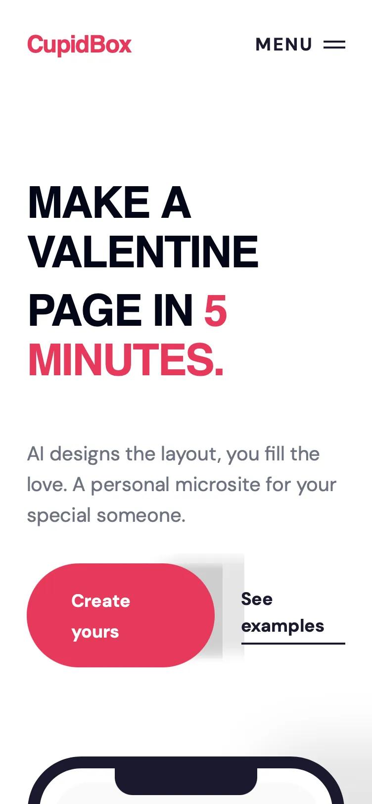 All Prompts
Horizontal Scroll Editorial Themes
Лендинг с горизонтальной прокруткой: крупная типографика, палитра розового и синего. Идеально для брендов SaaS, люкс. Включает карусели, сетки, полноэкранное меню.
by OetawLive Preview
Prompt
# Horizontal Scroll Editorial Themes

{
  "summary": "Create a bold, editorial-style landing page with high-contrast typography and interactive scrolling components. Use a palette of Rose Pink (#E8395B) and Deep Navy (#1A1A2E) on a clean white background. Implement a responsive layout featuring an oversized hero section, a masonry-style feature grid, and a dark-themed horizontal scroll container with scroll-snap behavior for showcasing visual templates.",
  "style": {
    "description": "The style is defined by its 'Brutalist-Light' editorial aesthetic. It pairs the heavy, tight-tracked 'Clash Display' font (uppercase, -0.04em tracking) with the modern 'DM Sans'. The color system uses a vibrant primary pink (#E8395B) for action elements and a deep navy (#1A1A2E) for primary text and structural components. Visual interest is created through soft background blobs (radial-gradients with 100px blur) and micro-interactions like expanding left-border lines on cards and rotating FAQ icons.",
    "prompt": "Apply a design system based on these specs: Colors: Primary #E8395B, Secondary/Text #1A1A2E, Background #FFFFFF, Surface #F8F8FA, Borders #E5E5EA. Typography: Headlines in 'Clash Display', bold or black, uppercase, tracking -0.04em, line-height 0.85-1.15. Body text in 'DM Sans', 16-20px, medium line height. Interactive effects: Hover states for cards should trigger an 'editorial line'—a 4px wide vertical bar (#E8395B) that transitions from 0 to full height on the card's left edge. Shadows: Use soft, large shadows for floating elements (e.g., shadow-[0_30px_100px_rgba(0,0,0,0.1)]). Animation: Use cubic-bezier(0.85, 0, 0.15, 1) for large UI transitions like full-screen menus. Borders: 1px solid #E5E5EA or #1A1A2E for structural emphasis."
  },
  "layout_and_structure": {
    "description": "A modular page structure starting with a fixed glassmorphism navigation, moving into a text-heavy hero section, and utilizing alternating white and dark-themed sections for visual rhythm.",
    "prompts": [
      {
        "part": "Navigation",
        "prompt": "Fixed top bar, height 80px. Background white/95 with backdrop-blur-md. Left: Bold logo in #E8395B. Right: A 'Menu' toggle button with a custom hamburger icon (two horizontal 2px lines) and a rounded-full CTA button in #E8395B. Include a hidden full-screen overlay menu that slides down using translateY(-100%) to 0."
      },
      {
        "part": "Hero Section",
        "prompt": "Split layout 55/45. Left side: Ultra-large headlines (120px) in Clash Display, uppercase, stacked with negative margin. Subtext 20px gray-500. Two buttons: one primary rounded-full pink, one text-link with a 2px bottom border navy. Right side: A 3D-styled mobile device mockup (dark border, rounded corners) floating over a soft pink radial-gradient blur blob (#E8395B at 15% opacity)."
      },
      {
        "part": "How It Works",
        "prompt": "Three-column grid. Each item features a large '01/02/03' counter in gray-200 Clash Display. Items are separated by 4px left-side accent borders in pink (#E8395B). Vertical padding: 128px."
      },
      {
        "part": "Interactive Feature Gallery",
        "prompt": "A masonry-style grid with two columns. Cards use varying heights and alternating backgrounds (White and #F8F8FA). Each card has 48px padding. On hover, a vertical pink accent line expands from the top-left corner to the bottom-left corner. Use Iconify icons in #E8395B as headers."
      },
      {
        "part": "Template Strip (Horizontal Scroll)",
        "prompt": "Full-width section with background #1A1A2E and white text. Container must have 'overflow-x: auto' with 'scroll-snap-type: x mandatory'. Hide scrollbars. Apply a 'mask-image' linear gradient on the left and right (10% fade) to indicate more content. Cards are fixed 300px width, 450px height, 24px border-radius, using 'scroll-snap-align: center'."
      },
      {
        "part": "FAQ Accordion",
        "prompt": "Centered 896px max-width container. Each item is a 'details' element with 32px vertical padding and a bottom border. Use a '+' icon that rotates 45 degrees when the summary is open. Text remains high-contrast with #1A1A2E."
      }
    ]
  },
  "special_ui_components": [
    {
      "component": "Full Screen Editorial Menu",
      "description": "A high-impact navigation overlay with large italicized typography transitions.",
      "prompt": "Create a fixed overlay (z-index 60) in #1A1A2E. Menu items use 60px Clash Display. Hover state: text becomes italic and changes to #E8395B. Transition: TranslateY slide from top with cubic-bezier(0.85, 0, 0.15, 1). Include a large 'X' close button in the top right."
    },
    {
      "component": "Scroll-Snap Card",
      "description": "Fixed dimension cards designed for a horizontal carousel.",
      "prompt": "Dimensions: 300px width, 450px height. Border-radius: 24px. Flexbox layout with 'justify-content: flex-end' to keep labels at the bottom. Backgrounds should vary (solid dark, soft pink, or bordered). Snap-align: center."
    }
  ],
  "special_notes": "MUST maintain the tight letter-spacing (-0.04em) on all Clash Display elements to preserve the editorial feel. MUST NOT use standard system fonts for headers. Horizontal scroll containers MUST use snap-centering to ensure cards don't stop mid-view. The gradient mask on the scroll container is critical for UX to indicate off-screen content."
}