All Prompts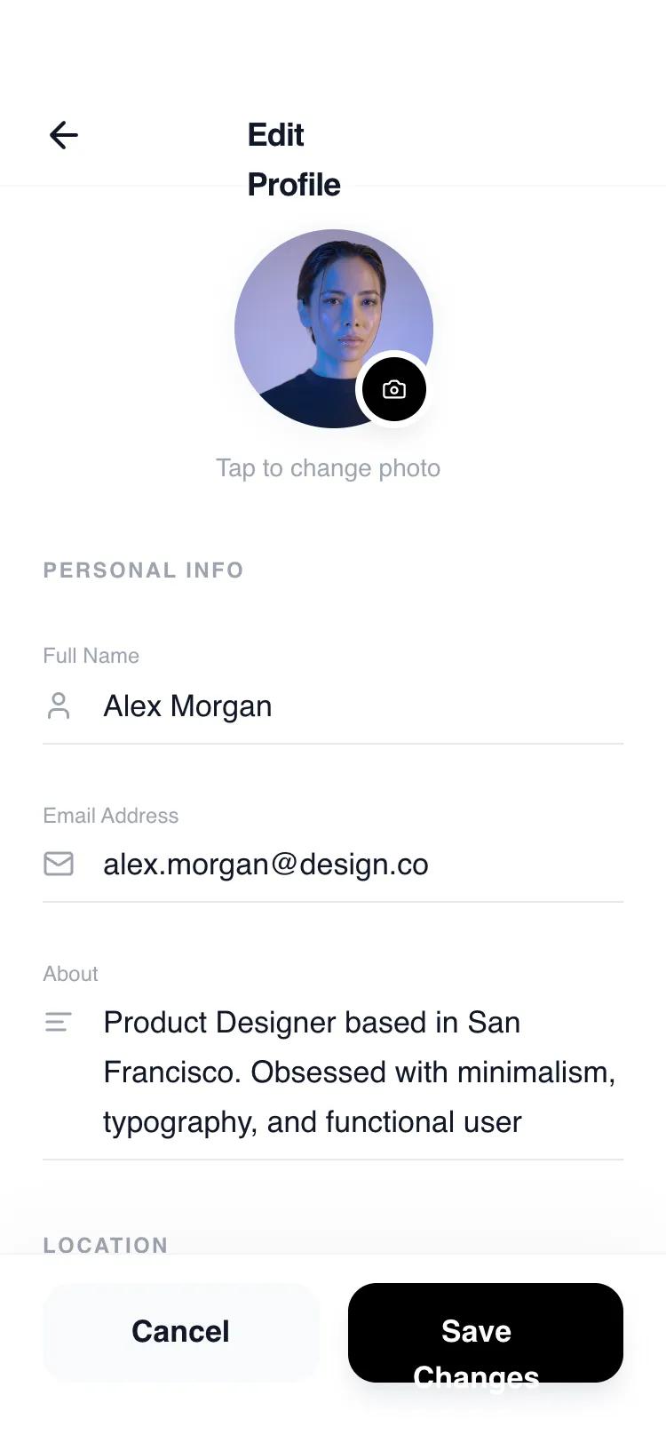 All Prompts
mobile appaccount setupinline editlayout
Inline Edit Profile
UI-компонент: мобильный интерфейс редактирования профиля с inline-редактированием. Минималистичный дизайн, удобен для SaaS, финтех, lifestyle.
by Shirley LouLive Preview
Prompt
# Inline Edit Profile

{
  "summary": "High-fidelity, monochromatic mobile edit profile screen featuring inline editing, custom form interactions, and a clean, spacious layout using the General Sans typeface.",
  "style": {
    "description": "The style is minimalist and editorial, relying on whitespace and typography rather than heavy borders or colors. It uses a base font of General Sans for a modern feel. Colors are strictly monochromatic: primary black (#000000), deep text (#111827), and varying levels of gray (#9CA3AF for labels, #F3F4F6 for secondary surfaces). Animations are smooth and purposeful, utilizing cubic-bezier curves for transitions.",
    "prompt": "Create a design system based on a monochromatic minimalist aesthetic. Typography: Use 'General Sans' as the primary font family. Titles at 18px (semi-bold, tracking-tight), section headers at 12px (bold, uppercase, tracking-widest), and body/input text at 17px (medium weight). Colors: Backgrounds are pure white (#FFFFFF), Primary buttons and active states are solid black (#000000), Text is primarily dark charcoal (#111827), Secondary text and labels use #9CA3AF. Borders: Use light gray #E5E7EB for static dividers and pure black #000000 for active input underlines. Shadows: 'soft' (0 4px 20px -2px rgba(0, 0, 0, 0.05)) and 'float' (0 10px 40px -10px rgba(0, 0, 0, 0.08)). Animation timings: Use 300ms duration with cubic-bezier(0.4, 0, 0.2, 1) for all transitions like toast entries and focus effects."
  },
  "layout_and_structure": {
    "description": "A fixed-width mobile-first layout (max-width: 448px) with a vertical stack structure. It features a sticky header for navigation, a scrollable main content area for form fields, and a fixed footer containing primary actions.",
    "prompts": [
      {
        "part": "Header",
        "prompt": "A sticky top header (pt-14, pb-2, px-6) with a white/90 backdrop-blur-xl background. Contains a left-aligned circular back button (40px x 40px) with a 'lucide:arrow-left' icon and a centered title 'Edit Profile' (18px, font-semibold). A bottom border of #F9FAFB separates it from content."
      },
      {
        "part": "Avatar Section",
        "prompt": "Centered profile picture container. The main image is 112px x 112px, rounded-full, with a grayscale(20%) filter and a 4px #F9FAFB ring. A black camera icon button (36px x 36px) is positioned at the bottom-right of the avatar with a 4px white ring. Below the avatar, include a small caption 'Tap to change photo' (14px, #9CA3AF, medium weight)."
      },
      {
        "part": "Form Sections",
        "prompt": "Group fields under headers (12px bold, uppercase, tracking-widest, #9CA3AF). Each field consists of a label (12px, font-medium) followed by an input area. Inputs have an icon (20px, #9CA3AF) on the left of the text. Instead of a box, inputs use a single bottom border (#E5E7EB) with a hidden black overlay that expands to 100% width on focus. Bio fields should use a 3-row textarea with a resize-none property."
      },
      {
        "part": "Preferences & Settings",
        "prompt": "Row-based toggles with a clean layout. Left side contains the setting title (17px medium) and a description (14px gray-500). Right side contains a sleek toggle switch: 44px x 24px, #E5E7EB background that turns solid black when active, with a white circular thumb that slides with a 300ms transition."
      },
      {
        "part": "Persistent Footer",
        "prompt": "Sticky bottom container with a subtle top shadow (0 -10px 40px rgba(0,0,0,0.03)) and backdrop-blur-xl. Contains two 56px height buttons side-by-side: a 'Cancel' button (light gray #F9FAFB, text #111827) and a 'Save Changes' button (solid black #000000, text white, with a 17px semi-bold font). Include a bottom padding of 34px for iOS home indicator compatibility."
      }
    ]
  },
  "special_ui_components": [
    {
      "component": "Interactive Inline Input",
      "description": "An input field that visualizes focus through icon color shifts and an expanding underline.",
      "prompt": "Design an input where the label and 'lucide' icon shift from #9CA3AF to #111827 on focus. The bottom border (#E5E7EB) must have a child div (h-full, w-0, bg-black) that transitions to w-full over 300ms ease-out when the input is active."
    },
    {
      "component": "Dynamic State Save Button",
      "description": "A button that handles loading and success states internally.",
      "prompt": "Primary action button (56px height, rounded-2xl). Normal state: Black background with white text. Loading state: Opacity 80% with an 'iconify-icon' loading spinner. Success state: Background color shifts to #16A34A (green-600) with a 'lucide:check' icon, before reverting to normal after a delay."
    },
    {
      "component": "Slide-in Toast Notification",
      "description": "A centered floating alert that enters from the top.",
      "prompt": "A fixed notification bar positioned 24px from top, centered horizontally. 90% width of the container. Styling: bg-gray-900, text-white, px-5, py-4, rounded-2xl, shadow-2xl. Includes a green 'lucide:check-circle' icon. Animation: slide-in from 'translateY(-100%)' to 'translateY(0)' with opacity."
    }
  ]
}