All Prompts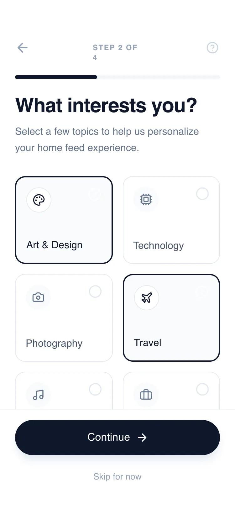 All Prompts
mobile appaccount setuplayout
Interactive Multi-Step Onboarding Flow
Минималистичный UI-компонент: интерактивный многошаговый онбординг для мобильных SaaS. Включает выбор интересов, переключатели, трекер прогресса. Идеален для регистрации.
by Shirley LouLive Preview
Prompt
# Interactive Multi-Step Onboarding Flow

{
  "summary": "An interactive, 4-step sliding onboarding flow with a clean, high-contrast aesthetic. It utilizes a fixed header for progress tracking and a fixed footer for primary actions, while the content area slides horizontally between steps using smooth cubic-bezier transitions.",
  "style": {
    "description": "The design follows a 'clean-tech' aesthetic using the Switzer font family (font-sizes ranging from 12px labels to 32px headers). It employs a neutral grayscale palette dominated by Slate (#0F172A) and off-whites (#F8FAFC). Animations are snappy yet smooth, using a custom cubic-bezier timing function for all state transitions and sliding effects.",
    "prompt": "Create a design system using the Switzer font family. Color Palette: Primary Slate-900 (#0F172A) for headings and primary buttons; Secondary Slate-500 (#64748B) for body text; Accents in Slate-400 (#94A3B8) and Slate-200 (#E2E8F0); Backgrounds in Slate-50 (#F8FAFC) and pure white (#FFFFFF). Typography: H1 headers at 32px, leading-tight (1.1), tracking-tight; Labels at 12px, bold, uppercase, tracking-widest. Spacing: Standardized 24px (6 units) padding for containers. Animation: Use 'cubic-bezier(0.16, 1, 0.3, 1)' for all sliding movements with a 600ms duration. Buttons should have a subtle active scale effect (0.98) and soft drop shadows (shadow-lg with slate-200 color)."
  },
  "layout_and_structure": {
    "description": "A vertical stack consisting of a fixed navigation header, a flex-1 sliding content viewport, and a fixed primary action footer. The content slides on a 400% width container divided into four 100vw sections.",
    "prompts": [
      {
        "part": "Header & Progress",
        "prompt": "Create a fixed top header with 56px top padding and 24px horizontal padding. Include a back button (arrow-left) that is hidden on Step 1, a centered 'Step X of Y' counter in 12px uppercase text, and a help icon on the right. Below the icons, place a full-width 6px tall progress bar with a background of #F1F5F9 and a fill of #0F172A that transitions width dynamically."
      },
      {
        "part": "Step 1: Welcome & Input",
        "prompt": "Layout a welcome section starting with a 64px square icon container with rounded-2xl corners in #F8FAFC. Display a 32px heading followed by an 16px body paragraph. Include two stacked input fields. Each input should have a 12px uppercase label and a 56px tall input area with 16px padding, a #F8FAFC background, and a 1px border (#E2E8F0) that turns #0F172A on focus."
      },
      {
        "part": "Step 2: Interest Selection",
        "prompt": "Design a 2-column grid for selection. Each card is 140px tall with a 1px border (#E2E8F0) and 16px rounded corners. Inside, place a 40px circular icon holder at the top left and a selection indicator (circle/check-circle) at the top right. When selected, the card should change to a 2px border of #0F172A and a #F8FAFC background."
      },
      {
        "part": "Step 3: Feature Toggles",
        "prompt": "Create a vertical stack of toggle rows. Each row is a 72px tall container with 24px padding. One style has a #F8FAFC background, the other has a 1px border (#E2E8F0). Each row includes an icon, a title, a subtitle, and a toggle switch. The toggle switch is a 48px wide pill that slides a 16px white circle between left (off, #E2E8F0) and right (on, #0F172A)."
      },
      {
        "part": "Footer Actions",
        "prompt": "Fixed footer with a border-top (#F1F5F9) and 34px bottom padding. Feature a primary 56px tall pill-shaped button in #0F172A with white text and an arrow icon. Below it, a 40px tall 'Skip for now' ghost button in #94A3B8 text."
      }
    ]
  },
  "special_ui_components": [
    {
      "component": "Interactive Selection Card",
      "description": "A card that combines visual icons with checkbox logic for multi-select preferences.",
      "prompt": "Construct a card with a 'sr-only' checkbox input. Use a peer-checked sibling selector to change the container border from 1px #E2E8F0 to 2px #0F172A. An iconify-icon representing 'check-circle' should appear only when checked. Animate the transition with 150ms ease-in-out."
    },
    {
      "component": "Sliding Viewport Container",
      "description": "The core navigation mechanic that handles step transitions.",
      "prompt": "The #flow-container must be 'display: flex' with a width of 400% (or 100% * number of steps). Use 'transform: translateX()' to move between steps. The parent viewport must have 'overflow: hidden'. Apply 'transition: transform 0.6s cubic-bezier(0.16, 1, 0.3, 1)' to the container for a high-end feel."
    }
  ],
  "special_notes": "Must maintain a strict whitespace-heavy layout to ensure a premium feel. Do not use bright colors outside of the grayscale/slate spectrum. The 'Continue' button text and icon must update on the final step to signal completion (e.g., 'Get Started' with a rocket icon). Ensure all interactive elements have hover/active states using transition-all with 200ms duration."
}