All Prompts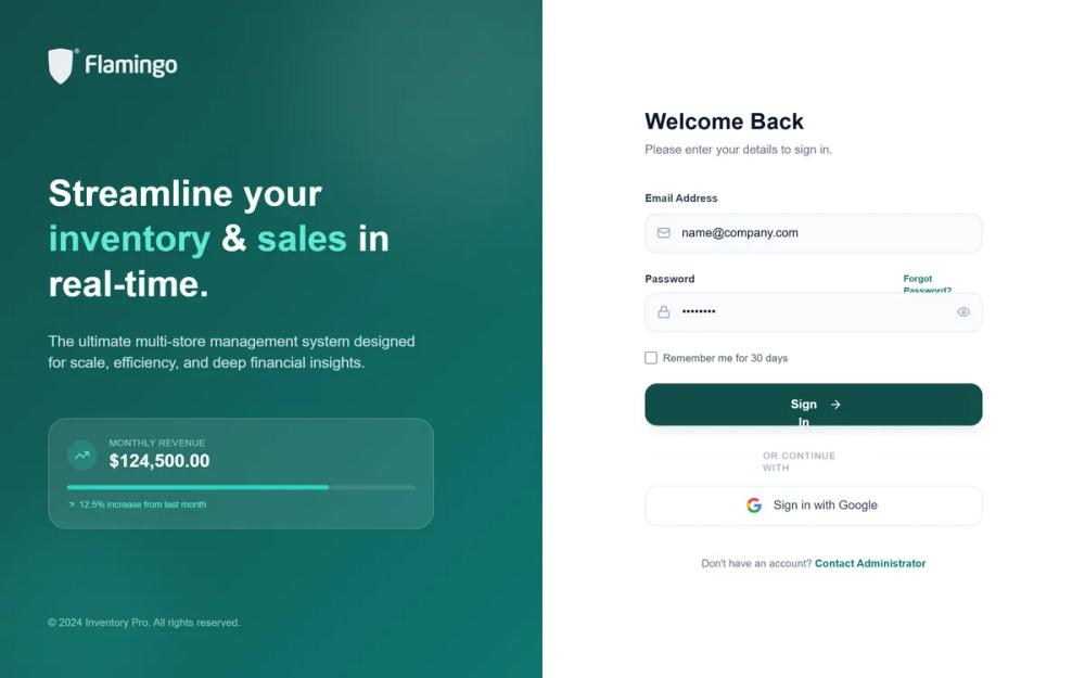 All Prompts
Inventory Pro | Sales Management
SaaS дашборд для управления продажами и запасами. Фирменный стиль с глубокими цветами, большими радиусами, стеклянными элементами. Идеально для ритейла, логистики, финтеха.
by Ebrahim JameLive Preview
Prompt
# Inventory Pro | Sales Management

{
  "summary": "A sophisticated, high-contrast dashboard system using a palette of deep maroons and soft grays. It prioritizes data hierarchy through bold typography and spacious card-based layouts, optimized for professional operations.",
  "style": {
    "description": "The style is 'Modern Professional' with a focus on 'Plus Jakarta Sans' typography. The color system uses a primary brand gradient from #4c0519 to #9f1239. Layouts use a light background (#F9F9FB) with pure white cards featuring 32px rounded corners. Shadows are soft (0 4px 20px -2px rgba(0,0,0,0.03)). Micro-interactions include scale-down effects on clicks (scale-98), smooth view transitions, and subtle hover brightness increases on charts.",
    "prompt": "### Typography\n- **Font Family**: 'Plus Jakarta Sans', sans-serif.\n- **Headings**: Semibold/Bold, tracking-tight. H1: 30px, H2: 24px.\n- **Labels**: 10px, Bold, Uppercase, tracking-[0.2em], color: #94a3b8.\n- **Body**: 14px, Medium/Regular, color: #1a1a1a.\n\n### Color Palette\n- **Primary (Deep Maroon)**: #4c0519 (Used for active states, primary buttons, and sidebar brand elements).\n- **Primary Light**: #9f1239.\n- **Background**: #F9F9FB.\n- **Surface/Cards**: #FFFFFF with border #f1f5f9.\n- **Success**: #10b981 (bg: #f0fdf4).\n- **Warning**: #d97706 (bg: #fffbeb).\n- **Danger/Alert**: #e11d48 (bg: #fff1f2).\n\n### Components Style\n- **Border Radius**: Cards: 32px, Buttons/Inputs: 16px, Small items: 8px.\n- **Shadows**: card-shadow: 0 4px 20px -2px rgba(0, 0, 0, 0.03), 0 2px 8px -2px rgba(0, 0, 0, 0.02).\n- **Buttons**: Primary buttons feature a subtle shadow-rose-900/20. Hover state: bg darkens by 10% and scale 0.98 on active.\n- **Animations**: Use cubic-bezier(0.4, 0, 0.2, 1) for transitions. View transitions should include a 0.25s fade-out/fade-in sequence."
  },
  "layout_and_structure": {
    "description": "The interface follows a classic sidebar-main layout with a fixed-height header and scrollable content area.",
    "prompts": [
      {
        "part": "Login Screen",
        "prompt": "Split-screen layout. Left side: Brand gradient (#4c0519 to #9f1239) with decorative blurred circles (white/5% opacity and rose-400/10%). Right side: Centered form on white background. Inputs use #f8fafc background, 16px radius, and focus-ring-rose-50."
      },
      {
        "part": "Sidebar Navigation",
        "prompt": "Width: 280px. Background: White with #f1f5f9 right border. Elements: 1. Logo area (40px icon). 2. Store Switcher: Card with icon and chevron. 3. Grouped Nav Links: 10px uppercase headers, links with 20px icons and 12px padding. Active state: #4c0519 background with white text."
      },
      {
        "part": "Main Header",
        "prompt": "Height: 80px. Flexbox layout. Left: Title and sub-text. Center: Search bar (320px width, rounded-full, #F9F9FB bg). Right: Notification bell with red dot and 40px circular avatar."
      },
      {
        "part": "KPI Grid",
        "prompt": "4-column grid for desktop. Cards: 24px radius. Includes: Value (H3 bold), Title (10px uppercase), and a footer trend indicator (e.g., +12% in #10b981). One 'Target' card should use the brand color (#4c0519) with a light progress bar."
      },
      {
        "part": "Data Tables",
        "prompt": "Wrapped in 32px radius white cards. Header: Grey bg (#f8fafc), 10px bold uppercase text. Rows: 20px vertical padding, hover:bg-slate-50/30. Columns should include high-contrast status pills (rounded-full, 10px bold)."
      }
    ]
  },
  "special_ui_components": [
    {
      "component": "Store Switcher Button",
      "description": "A complex button for switching between operational hubs.",
      "prompt": "Container: bg-slate-50, border-slate-100, p-3, rounded-2xl. Left: 40px maroon square with icon. Middle: Two-line text (Label: 10px uppercase, Value: 14px bold). Right: Chevrons-up-down icon."
    },
    {
      "component": "Status Pill",
      "description": "Standardized badges for transaction statuses.",
      "prompt": "Height: 24px. Padding: px-2.5. Font: 10px Bold. Variants: COMPLETED (Green), PARTIAL (Amber), FAILED (Rose). Backgrounds should be 5-10% opacity of the text color."
    }
  ]
}