All Prompts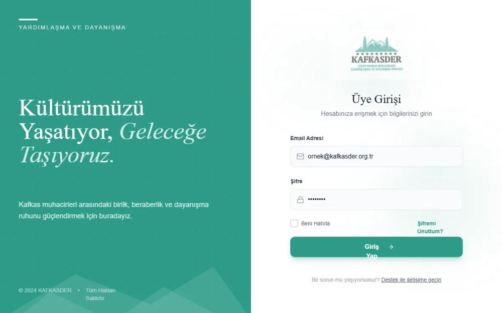 All Prompts
KAFKASDER Premium Animated Login
Премиальная страница входа с анимированными элементами, микро-взаимодействиями и уникальным дизайном. Идеально для сайтов, требующих доверия и современной эстетики.
by isa hamidLive Preview
Prompt
# KAFKASDER Premium Animated Login

{
  "summary": "A high-end, animated split-screen login interface that balances traditional serif elegance with modern interactive elements. It features a teal-branded side panel with abstract mountain silhouettes and a minimalist form area with glowing input fields and floating background particles.",
  "style": {
    "description": "The style combines the 'Zodiak' serif font for a traditional/premium feel with 'Plus Jakarta Sans' for modern readability. The color scheme is centered around a primary Teal (#2d9b88), supported by soft grays (#f4f4f5) and dark text (#1a1a1a). The visual language uses 'glassmorphism' hints, subtle glows (20px blur), and smooth organic animations (10s-15s durations) to create a calm yet dynamic atmosphere.",
    "prompt": "Create a design system using a primary Teal (#2d9b88), a Dark Charcoal (#1a1a1a), and Light Gray (#f4f4f5). Typography: Use 'Zodiak' for headings (700 weight for impact, italic for emphasis) and 'Plus Jakarta Sans' for body and form labels (400, 500, 600 weights). Implement a 'pattern-grid' using 1px radial-gradients spaced at 24px. Use shadow-based 'glow' effects for interactive states: `box-shadow: 0 0 20px rgba(45,155,136,0.25)`. Animations should include a floating keyframe (`translate(20px, -20px)` over 10-15s) and a subtle pulse for brand logos. Buttons should feature a hover lift (`-4px`) and an active state scale down (`0.95`)."
  },
  "layout_and_structure": {
    "description": "A responsive 5:7 split-screen layout. The left panel (visual) occupies 40-50% width on desktop and is hidden on mobile. The right panel (functional) centers the login form with ample white space and interactive background elements.",
    "prompts": [
      {
        "part": "Left Brand Panel",
        "prompt": "A full-height container with a teal background (#2d9b88). Include a subtle white 24px grid pattern. At the bottom, layer two white silhouettes with 10% opacity using clip-paths to create abstract mountain peaks (`polygon(0% 100%, 20% 60%, 45% 90%, 65% 55%, 100% 100%)`). Content should include a top-left brand accent (horizontal line + uppercase tracking text), a central heading in large serif typography (64px), and a copyright footer with 60% opacity."
      },
      {
        "part": "Right Form Panel",
        "prompt": "A clean white background containing three floating, blurred teal circles (#2d9b88) at 5-10% opacity, moving slowly in organic paths. The central form container (max-width 440px) should include: 1. A logo section with a spinning 12s background glow. 2. A form with vertically stacked inputs. 3. A support footer. Spacing between sections should be 40px (10 units)."
      },
      {
        "part": "Form Inputs",
        "prompt": "Input fields should have a background of #f9fafb, a border of #e5e7eb, and 12px padding. Add a left icon (20px size, gray #9ca3af). On focus, the border must change to Teal (#2d9b88) and trigger a glow shadow: `0 0 20px rgba(45,155,136,0.25)`. Transition duration: 300ms ease."
      },
      {
        "part": "Primary Action Button",
        "prompt": "Full-width teal button (#2d9b88) with 14px vertical padding and rounded-xl (12px) corners. Include a subtle shadow `shadow-lg shadow-teal/30`. On hover, translate -4px vertically and intensify shadow. On active/press, scale to 0.95. Include a trailing arrow icon that shifts 4px right on hover."
      }
    ]
  },
  "special_ui_components": [
    {
      "component": "Mountain Clip-Path Overlay",
      "description": "Layered CSS polygons creating decorative mountain silhouettes.",
      "prompt": "Create two absolute positioned divs at the bottom of the container. Use `clip-path: polygon(0% 100%, 20% 60%, 45% 90%, 65% 55%, 100% 100%)` for the first and a variant for the second. Style with `bg-white/10` and `blur-sm` to create atmospheric depth."
    },
    {
      "component": "Animated Logo Glow",
      "description": "A spinning, blurred radial gradient behind the logo to create a 'divine' or 'premium' spotlight effect.",
      "prompt": "Place a div behind the logo image with `bg-gradient-to-tr from-teal/15 to-transparent`, `blur-2xl`, and `rounded-full`. Apply a continuous 12s linear rotation animation. The logo itself should have a slow 4s ease-in-out pulse animation."
    }
  ],
  "special_notes": "MUST use the serif/sans font pairing consistently (Serif for emotions/titles, Sans for utility). MUST ensure all background animations are set to `pointer-events-none` to avoid blocking form interaction. DO NOT use harsh black; use the dark charcoal #1a1a1a for better premium feel. Clip-paths for mountain graphics must be fluid and layered for depth."
}