Загрузка...
UI-система Kahani: иммерсивный дизайн с акцентом на hero-секцию. Идеально для премиальных услуг, ресторанов, бутиков. Глубокий тил, дерево, редакционная типографика.
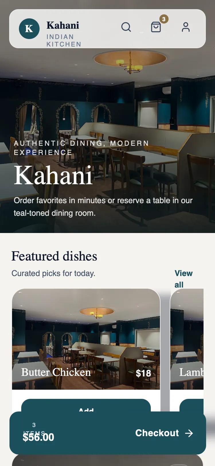
# Kahani — Hero-First Immersive (Production-Ready)

{
  "summary": "An elegant, immersive mobile-first design with a focus on high-quality imagery and sophisticated color palettes. It utilizes a prominent hero section with a floating glassmorphism navigation bar and a bento-grid inspired arrangement for information sections, finished with a persistent floating action bar.",
  "style": {
    "description": "The style is 'Sophisticated Editorial'. It uses a serif/sans-serif pairing (Zodiak for headlines, Satoshi for body) to create a balance between traditional luxury and modern clean-tech. The color palette centers on Deep Teal (#1B4F5C), Accent Teal (#2D7A8E), Warm Wood (#8B6F47), and an Off-white/Cream background (#F5F3F0). Animations focus on subtle 'soft-rise' entries (8px upward translation with 520ms ease-out) and smooth view transitions.",
    "prompt": "Create a design system using a palette of Deep Teal (#1B4F5C), Accent Teal (#2D7A8E), Warm Wood (#8B6F47), and a Cream background (#F5F3F0). Typography: Use an elegant serif (e.g., Zodiak) for headings (size 48px to 64px, leading 1.02) and a high-quality sans-serif (e.g., Satoshi) for body text and UI elements. Navigation should be a floating bar with 80% opacity and backdrop-blur-md. Buttons: Use rounded-2xl (16px) or rounded-full shapes; primary buttons in #1B4F5C with white text. Cards: Use rounded-3xl (24px) corners, subtle shadows (0 10px 24px -16px rgba(15,23,42,0.35)), and thin 1px borders (#0000000D). Animations: Implement a 'soft-in' rise effect (opacity 0 to 1, translateY 8px to 0) over 520ms with cubic-bezier(0.4, 0, 0.2, 1). Icons: Use 24px line icons with 1.5pt stroke weight."
  },
  "layout_and_structure": {
    "description": "A vertical-scrolling mobile layout with an immersive hero container and a floating sticky bottom CTA. Sections are spaced generously and use varied horizontal and grid-based internal layouts.",
    "prompts": [
      {
        "part": "Sticky Header Navigation",
        "prompt": "A floating navigation bar positioned 16px from the top. Style: Rounded-2xl (16px), background white/80, backdrop-blur (12px), border white/40. Left side: Circular brand logo and stacked title/subtitle. Right side: Icon set (Search, Cart with badge, Profile) with 16px horizontal spacing."
      },
      {
        "part": "Hero Section",
        "prompt": "Full-width container taking 45-50% of the viewport height. Background: High-resolution image with a bottom-heavy gradient overlay (from black/35 to #07161A/90). Content: Left-aligned at the bottom with a tracking-wide (0.22em) uppercase tagline, followed by a massive 5xl Serif heading and a short descriptive paragraph (max 34ch)."
      },
      {
        "part": "Horizontal Product Carousel",
        "prompt": "Heading and 'View All' link followed by a horizontal scrolling container. Cards: 260px minimum width, rounded-3xl. Top part: Image with gradient overlay and price/name text at the bottom. Bottom part: A full-width 'Add' button in deep teal (#1B4F5C). Spacing between cards: 16px."
      },
      {
        "part": "Feature/Booking Card",
        "prompt": "A large-format card with an image background and dark gradient overlay. Top: Uppercase label and serif title (2xl). Middle: Descriptive body text. Bottom: Horizontal flex row showing metadata (e.g., hours/status) and a high-contrast accent button (#2D7A8E) with an arrow icon."
      },
      {
        "part": "Information Grid",
        "prompt": "A container with a white background and rounded-3xl corners. Inside, use a vertical stack of info blocks. Each block: Icon in a nested rounded-2xl container, bold label, and descriptive text. Include secondary action links (e.g., 'Directions') on the far right."
      },
      {
        "part": "Floating Bottom CTA",
        "prompt": "A fixed action bar at the bottom. Style: 343px width, centered. Rounded-2xl background in deep teal (#1B4F5C). Left: Stacked text (item count, total price). Right: Text label ('Checkout') and arrow icon. Shadow: Large, soft shadow (0 18px 40px -24px rgba(15,23,42,0.55))."
      }
    ]
  },
  "special_ui_components": [
    {
      "component": "Glassmorphism Floating Nav",
      "description": "Semi-transparent navigation bar that floats over the hero image.",
      "prompt": "Construct a navigation component with 'bg-white/80' and 'backdrop-blur-md'. Apply 'rounded-2xl' corners and a thin 'border-white/40'. Use 'flex items-center justify-between' with internal padding of 'px-4 py-3'."
    },
    {
      "component": "Product Badge",
      "description": "Small notification badge for cart items.",
      "prompt": "A 16px circular badge using color #8B6F47 (Wood). Font: 10px bold white sans-serif. Position: Absolute top-right of the parent icon (-4px offset)."
    }
  ]
}