All Prompts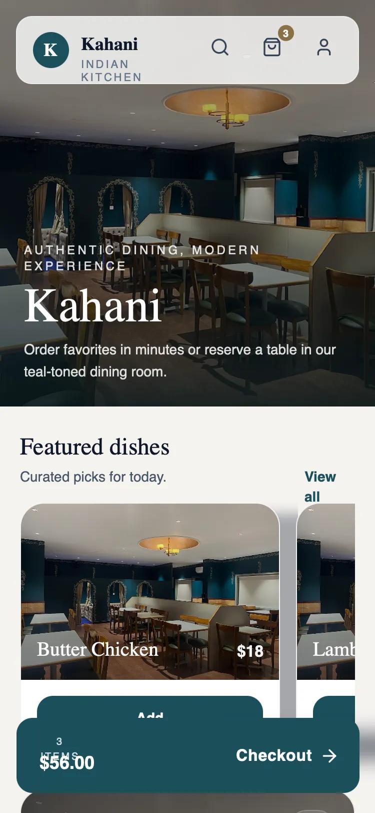 All Prompts
Kahani — Hero-First Immersive (Production-Ready)
Мобильный UI-дизайн в стиле editorial: иммерсивные hero-секции, премиальные шрифты, анимации. Для hospitality, ресторанов.
by Hari CharanLive Preview
Prompt
# Kahani — Hero-First Immersive (Production-Ready)

{
  "summary": "The 'Kahani' design system is a production-ready, hero-first immersive layout for premium hospitality apps. It uses a deep teal (#1B4F5C) and off-white (#F5F3F0) palette to evoke elegance. Key features include a large viewport-filling hero image, horizontal scrolling product cards with bottom-anchored text, and a persistent floating checkout bar. The design avoids playful elements in favor of refined, cinematic presentation with smooth view transitions and sophisticated spacing.",
  "style": {
    "description": "Typography pairings use 'Zodiak' (serif) for large headings to establish a heritage feel, and 'Satoshi' (sans-serif) for functional UI and body text. The color scheme is anchored by Deep Teal (#1B4F5C) for primary buttons and branding, Wood (#8B6F47) for badges, and Cream (#F5F3F0) for the background. Animations utilize cubic-bezier(0.4, 0, 0.2, 1) for a high-end, responsive feel.",
    "prompt": "Create a design with a palette of Deep Teal (#1B4F5C), Teal Accent (#2D7A8E), Wood Brown (#8B6F47), and an Off-White/Cream background (#F5F3F0). Typography: Headings in Zodiak Serif (weights: 400, 700), body in Satoshi Sans-serif (weights: 400, 500, 700). Implement a 'soft-rise' animation for all main sections: transform: translateY(8px) to 0, opacity: 0 to 1, duration: 520ms, curve: cubic-bezier(0.4, 0, 0.2, 1). Shadows should be soft and deep: shadow-[0_10px_24px_-16px_rgba(15,23,42,0.35)]. Borders should be minimal: 1px border-black/5 or border-white/40 for translucent elements. All buttons should have a border-radius of 16px to 24px (2xl to 3xl)."
  },
  "layout_and_structure": {
    "description": "A vertical mobile layout starting with a 45-50% viewport height hero section, followed by a dense scrollable body containing horizontal carousels, CTA cards, and information blocks. The experience is capped by a fixed bottom-floating action bar.",
    "prompts": [
      {
        "part": "Sticky Navigation",
        "prompt": "Design a floating navigation bar positioned 16px from the top. It should have a background of white/80 with a 12px backdrop-blur and a 1px border-white/40. Rounded corners set to 2xl (16px). Left side: circular logo (K) in Teal background, followed by brand name in Serif and a sub-label in 11px uppercase tracking-[0.18em]. Right side: search, cart (with Wood #8B6F47 notification badge), and profile icons using 20px line icons."
      },
      {
        "part": "Immersive Hero Section",
        "prompt": "A hero section occupying 45-50% of the viewport. Features a full-bleed high-quality background image with a vertical gradient overlay from black/35 at the top to #07161a/90 at the bottom. Text is white. Heading: 5xl (48px) Zodiak serif with leading-[1.02]. Tagline: 12px uppercase tracking-[0.22em]. Paragraph: 14px leading-relaxed with a max-width of 34ch."
      },
      {
        "part": "Featured Horizontal Scroll",
        "prompt": "A horizontal scrolling container for product cards. Each card: min-width 260px, rounded-3xl, white background. Top 60% of card is an image with a dark gradient bottom-overlay. Title (Serif, xl) and price (Sans, semi-bold) are white and positioned at the bottom of the image area. Bottom 40% of card contains a full-width Teal button with 'Add' text."
      },
      {
        "part": "Quick Book Reservation Card",
        "prompt": "A high-impact CTA card with a full-bleed image background and a dark gradient overlay (black/65 to #07161a/70). Padding of 20px. Includes a Serif heading 'A calm seat in the teal room' and a Teal-Accent (#2D7A8E) 'Reserve Now' button with a right arrow icon. Top-right contains a translucent 44x44px calendar icon box."
      },
      {
        "part": "Floating Bottom CTA",
        "prompt": "A persistent fixed-bottom bar, 20px from screen bottom, width 343px, centered. Background: Deep Teal (#1B4F5C). Padding: 16px horizontal, 20px vertical. Left side: 10px uppercase tracking label '3 items' above an 18px font-weight-600 total price. Right side: 'Checkout' text with a large arrow icon. Shadow: deep, dark, and wide spread."
      }
    ]
  },
  "special_ui_components": [
    {
      "component": "Glassmorphism Nav",
      "description": "A high-clarity floating header with translucent properties.",
      "prompt": "Implement a 16px rounded-2xl container with bg-white/80, backdrop-blur-md, and border-white/40. Use flex layout with items-center and justify-between. Internal icons should have a 12px padding area with hover:bg-slate-900/5 transition for interaction feedback."
    },
    {
      "component": "Info Grid Cards",
      "description": "Detailed information blocks for business metadata.",
      "prompt": "Rounded-3xl white background containers with 1px border-black/5. Inside, use inner cards with bg-slate-50 for specific data points like 'Hours' or 'Location'. Icons should be housed in 36x36px white rounded-2xl boxes with subtle 1px borders."
    }
  ],
  "special_notes": "MUST: Use a mix of Zodiak and Satoshi for a hierarchy between 'Art' and 'Utility'. MUST: Ensure all image overlays use high-contrast dark gradients to maintain white text readability. MUST: Keep scrollbars hidden on horizontal lists. DO NOT: Use gold or bright saturated colors other than the defined Teal. DO NOT: Use sharp corners; use a minimum radius of 12px for small items and 24px for large cards."
}