All Prompts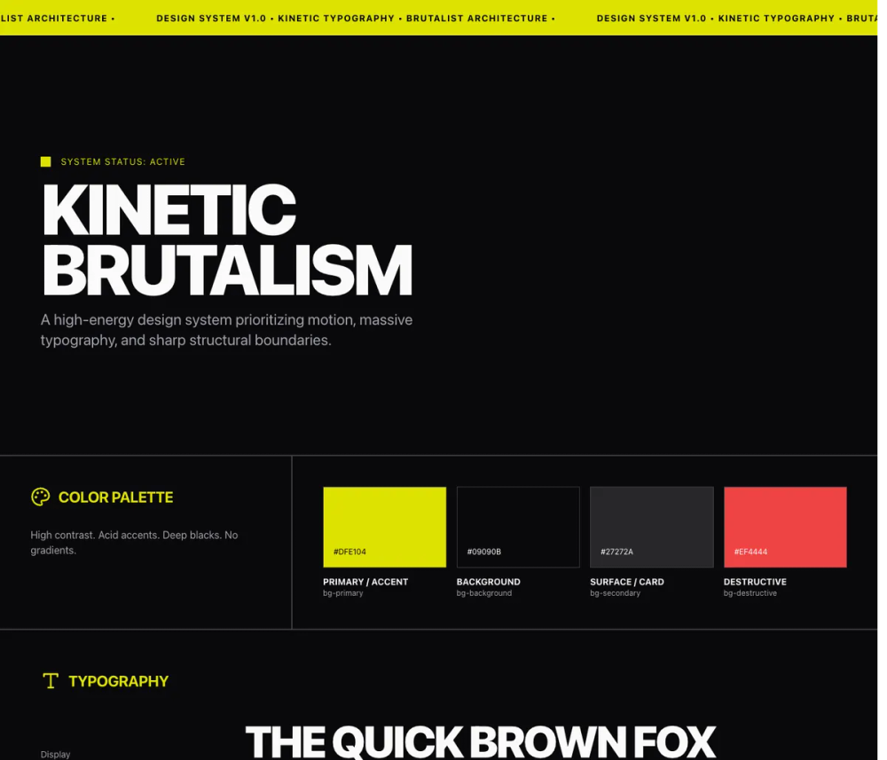 All Prompts
style
Kinetic
Стиль Kinetic: энергичный брутализм и кинетический дизайн постеров. Создавайте динамичные визуальные эффекты.
by Zhou JasonLive Preview
Prompt
# Kinetic

<design-system>

# Design Style: Kinetic Typography

## Design Philosophy

**Core Principle**: Typography is not decoration—it is the entire visual structure. Text becomes image, headline becomes hero, motion becomes rhythm. This style rejects static layouts completely. Every element should feel alive through constant motion (marquees), reactive motion (hover states), or scroll-triggered motion (parallax, scale transforms). The page pulses with kinetic energy—nothing is ever truly still.

**Aesthetic Vibe**: High-energy brutalism meets kinetic poster design. Confidence through scale. Urgency through motion. Clarity through contrast. The design screams rather than whispers—everything is uppercase, oversized, and in-your-face. It's a poster come to life, with the raw energy of street art and the precision of Swiss typography, but animated and interactive. Think music festival posters, protest graphics, and underground zines translated to the web.

**Visual DNA**: This style is instantly recognizable by its relentless motion and aggressive scale. Marquees scroll endlessly. Numbers tower at 8-12rem. Headlines use viewport units (clamp-based for control). Every hover state is dramatic—cards flood with color, text translates across the screen, borders glow with accent hues. The aesthetic is deliberately excessive: if traditional web design uses 2x scale difference between headline and body, this uses 10x. Where others add subtle shadows, this style stays brutally flat with sharp borders and hard edges.

**Signature Elements**:

- Infinite marquees that never stop moving (react-fast-marquee, no gradients)

- Viewport-responsive typography using clamp() for fluid scaling (clamp(3rem,12vw,14rem))

- Aggressive uppercase treatment on ALL display text (headings, buttons, labels)

- Massive numerical elements (6rem-12rem) used as decorative graphic shapes

- Hard color inversions on hover (background to accent yellow, text to black, instant transitions)

- Scroll-triggered scale and opacity transforms (Framer Motion useScroll hook)

- Sharp 2px borders with 0px border-radius (brutalist geometry)

- Hairline gap-px grid dividers creating connected card systems

## Design Token System (The DNA)

### Color Architecture

**Foundation Colors**:

- `background`: `#09090B` (Rich black, not pure black—softer on eyes)

- `foreground`: `#FAFAFA` (Off-white, not pure white—less harsh)

- `muted`: `#27272A` (Dark gray for secondary surfaces)

- `muted-foreground`: `#A1A1AA` (Zinc 400 for body text and descriptions)

**Accent Strategy**:

- `accent`: `#DFE104` (Acid yellow/lime—high energy, highly visible)

- `accent-foreground`: `#000000` (Pure black for contrast on accent)

- `border`: `#3F3F46` (Zinc 700—subtle structural lines)

**Color Usage Patterns**:

- Use acid yellow sparingly but boldly (hero text highlights, hover states, focus rings, marquee backgrounds)

- Muted foreground (Zinc 400) for all secondary text—never use plain gray

- Border color for ALL structural lines—never use foreground color for borders

- Background numbers and inactive elements in `muted` (#27272A) to create depth layers

- Selection highlight: Yellow background with black text

**Contrast Requirements**:

- Primary text to background: Minimum 15:1 ratio (off-white on rich black)

- Accent to background: Must be vibrant and eye-catching

- Never use mid-range grays—stay at the contrast extremes

### Typography System

**Font Selection**:

- Primary: "Space Grotesk" (preferred—strong geometric shapes, excellent at large sizes)

- Fallback: "Inter" (if Space Grotesk unavailable)

- Both should support variable font weights if possible (300-700 range)

**Scale Hierarchy** (using Tailwind classes with responsive scaling):

- **Hero/Display**: `text-[clamp(3rem,12vw,14rem)]` (fluid viewport-based scaling with safe minimums)

- **Section Headings**: `text-5xl md:text-7xl lg:text-8xl` or `text-[clamp(2.5rem,8vw,6rem)]` for ultra-massive headings

- **Card Titles**: `text-2xl md:text-3xl lg:text-6xl` (responsive scaling from mobile to desktop)

- **Body/Descriptions**: `text-lg md:text-xl lg:text-2xl` (18-24px—larger than typical web, responsive)

- **Small Labels**: `text-xs md:text-sm lg:text-lg` (12-18px, responsive)

- **Massive Numbers** (decorative): `text-[6rem] md:text-[8rem]` to `text-[8rem] md:text-[12rem]` (responsive massive scale)

- **Navigation/Micro**: `text-sm md:text-base` (14-16px)

**Type Treatment Rules**:

- ALL display text (headings, buttons, labels) must be uppercase

- Body text and descriptions stay in normal case for readability

- Tracking: Use `tracking-tighter` on large display text, `tracking-tight` on body, `tracking-wide` or `tracking-widest` on small labels

- Leading: `leading-[0.8]` or `leading-none` for display headlines to create tight, graphic lockups

- Leading: `leading-tight` for large body text (xl-2xl)

- Font weight: Bold (700) for all headings and buttons, Medium (500) for body, Regular (400) for secondary text

**Font Size Relationships**:

- Headlines are 3-5x larger than body text (not 1.5-2x like traditional web)

- Numbers as graphics are 4-8x larger than accompanying labels

- Decorative background text is 2-3x larger than foreground text in same context

### Spacing & Layout

**Base Unit**: 4px (Tailwind's default spacing scale)

**Vertical Rhythm**:

- Section padding: `py-32` (128px top/bottom) for major sections

- Card/Container padding: `p-8` to `p-12` (32-48px)

- Element gaps within containers: `gap-8` (32px)

- Tight element groups: `gap-4` (16px)

- Between large display elements: `mb-4` to `mb-8` (16-32px)

**Horizontal Containment**:

- Maximum width: `max-w-[95vw]` or `max-w-[90vw]`—push to the edges

- Never use standard `max-w-7xl` or similar—too conservative for this style

- Specific content widths: `max-w-2xl` (672px) for long-form text blocks

- Full bleed for marquees and dramatic sections

**Padding Relationships**:

- Cards: Equal padding all sides (p-8 or p-12) OR asymmetric with more top/bottom than left/right

- Buttons: Horizontal padding 2-3x vertical (e.g., px-8 py-4)

- Inputs: Minimal horizontal padding (px-0 or px-2), more vertical for touch targets

**Grid Patterns**:

- Three-column grids for step processes (md:grid-cols-3)

- Single column on mobile, maintain drama with large text

- Use `gap-px` with colored backgrounds to create hairline grid dividers

- Pricing typically uses three equal columns (lg:grid-cols-3)

### Shape Language

**Border Radius**:

- Default: `0px` (completely sharp corners)

- Exception: Rare use of `rounded-sm` (2px) for subtle softening on small elements

- Never use rounded-lg or higher—destroys the brutalist aesthetic

**Border Styling**:

- Width: `border-2` (2px) for structural emphasis, `border` (1px) for subtle dividers

- Style: Always solid, never dashed or dotted

- Color: Use `border-[#3F3F46]` consistently

- Border-only elements: Use `border-b-2` for input underlines, `border-l-4` for quote accents

**Shadows & Depth**:

- **NO drop shadows**—this style is completely flat

- Depth created through color layering (muted background elements behind foreground)

- Use massive background numbers in muted tones to create visual depth

- Overlapping elements instead of shadow for hierarchy

**Visual Dividers**:

- Prefer borders over shadows

- Use full-width border-top/border-bottom at section breaks

- Grid gap patterns: `gap-px` with colored container creates hairline dividers

### Texture & Overlay

**Noise Texture**:

- SVG-based feTurbulence filter (baseFrequency 0.8, numOctaves 4)

- Fixed position, full viewport coverage

- Opacity: `opacity-[0.03]` (barely visible)

- Blend mode: `mix-blend-overlay`

- Purpose: Adds subtle print/poster texture without affecting readability

**Background Treatments**:

- Solid colors only—no gradients

- Accent color used for full-section backgrounds (stats marquee, footer)

- Muted color for card hover backgrounds before accent flip

**Blend Modes**:

- Use `mix-blend-difference` or `mix-blend-exclusion` sparingly for text over images

- Apply to custom cursors or special text treatments

- Not part of the core style in current implementation but suggested for advanced implementations

## Component Styling Principles

### Buttons

**Base Styling**:

- Always uppercase text with tight tracking `uppercase tracking-tighter`)

- Font weight: Bold (700)

- Sharp corners (rounded-none)

- Height: Default 56px (h-14), Small 40px (h-10), Large 80px (h-20)

- Horizontal padding 2x height: Default px-8, Small px-4, Large px-12

**Variant Patterns**:

**Primary (Accent)**:

- Background: Acid yellow (#DFE104)

- Text: Black

- Hover: Scale up 1.05 `hover:scale-105`)

- Active: Scale down 0.95 `active:scale-95`)

- Transition: `transition-all` for smooth scale

**Outline**:

- Border: 2px solid zinc-700 (#3F3F46)

- Background: Transparent

- Text: Off-white

- Hover: Full fill with off-white background, text inverts to black

- Hard transition (instant color flip)

**Ghost**:

- No border, no background

- Text: Off-white

- Hover: Text color changes to accent yellow

- Minimal, subtle variant

**Advanced Interactions** (not implemented but suggested):

- Marquee effect: Text inside button scrolls horizontally on hover

- Character-by-character color fill on hover (left to right)

### Cards & Containers

**Base Structure**:

- Border: 2px solid zinc-700 `border-2 border-[#3F3F46]`)

- Background: Rich black (#09090B)

- Padding: Large and even (p-8 or p-12)

- No border-radius (sharp corners)

**Hover Behavior**:

- Background floods with accent color (#DFE104)

- Border color changes to accent

- All text inverts to black

- Transition: `duration-300` for smooth but noticeable shift

- Use group classes to coordinate text color changes

**Content Hierarchy Within Cards**:

- Large title at top (text-3xl) in foreground color → black on hover

- Description text in muted-foreground → black with reduced opacity on hover

- Decorative numbers or icons in muted tone → black on hover

**Sticky Card Pattern** (Features Section):

- Each card uses `sticky top-32` positioning

- Cards stack and overlap as user scrolls

- Later cards appear to slide over earlier ones

- Maintains visual rhythm through repetition

### Inputs & Forms

**Base Styling**:

- Height: Extra tall (h-24 / 96px) for dramatic scale

- Border: Bottom border only `border-b-2`)

- Border color: Zinc-700 default, accent on focus

- Background: Transparent

- Text: Extra large (text-4xl), bold, uppercase, tight tracking

- Padding: Minimal horizontal (px-0), standard vertical for alignment

**Focus States**:

- Border-bottom changes to accent yellow

- No outline ring—border serves as focus indicator

- Instant color change (no transition needed)

**Placeholder Styling**:

- Muted color (#27272A)—very subtle

- Same size and style as input text

- Uppercase to match input

- Low contrast ensures actual input stands out

**Form Layout**:

- Full width inputs (w-full)

- Generous vertical spacing between fields (space-y-8)

- Labels (if used) should be small, uppercase, tracked-wide, above input

### Interactive States

**Hover Transformations**:

- Scale: Buttons scale to 1.05, cards stay at scale 1.0

- Translation: Benefit titles translate horizontally `translate-x-8`)

- Color Floods: Cards completely invert color scheme

- Opacity Reveals: Hidden descriptions fade in (opacity-0 to opacity-100)

- All transitions use `duration-300` for consistent feel

**Focus States**:

- Inputs: Border color change to accent

- Buttons: Same as hover (scale) plus visible focus ring in accent color

- Links: Underline in accent color or text color change

**Active States**:

- Buttons: Scale down to 0.95 `active:scale-95`) for tactile feedback

- Links: Slight opacity reduction

**Disabled States**:

- Opacity: 50% `disabled:opacity-50`)

- Pointer events: None `disabled:pointer-events-none`)

- Maintain all other styling—just reduce visibility

## Animation & Motion System

### Marquee Motion

**Implementation**: Use `react-fast-marquee` library for smooth, GPU-accelerated marquees

**Stats Marquee** (High Energy):

- Speed: 80 (fast)

- Direction: Left to right

- Gradient: false (no edge fade)

- AutoFill: true (repeats content infinitely)

- Content: Large numbers paired with labels and decorative symbols

**Testimonials Marquee** (Slower Rhythm):

- Speed: 40 (medium)

- Direction: Left to right

- Gradient: false

- Content: Wide cards with quotes, generous spacing between items

**Timing Rules**:

- Never use gradients—raw edge is part of aesthetic

- Fast marquees (speed 60-100) for stats and high-energy content

- Slower marquees (speed 30-50) for reading content like testimonials

- All marquees use linear easing (no acceleration/deceleration)

### Scroll-Triggered Animations

**Hero Parallax** (Framer Motion):

- Track scroll progress: `useScroll()` hook

- Scale transform: 1.0 → 1.2 as user scrolls (0-20% of page)

- Opacity: 1.0 → 0 as user scrolls out

- Creates dramatic zoom-out effect as user enters content

**Sticky Scroll Cards**:

- Position: `sticky top-32`

- No transform animations—physical stacking creates effect

- Cards remain in place as subsequent cards slide over them

**Entrance Animations** (Suggested, not in current implementation):

- Elements scale from 0.8 to 1.0 as they enter viewport

- Text can "unmask" by animating from clipped to full visibility

- Use intersection observer or Framer Motion `whileInView`

### Micro-Interactions

**Button Interactions**:

- Hover: Scale 1.05 with all easing

- Active: Scale 0.95

- Transition timing: 200-300ms

- Easing: Default ease-in-out

**Card Hover**:

- Color transition: 300ms

- Hard flip, not gradual (suits the brutalist aesthetic)

- All child text coordinates color change via group classes

**Accordion Expansion** (FAQ):

- Height: Animate from 0 to auto

- Opacity: Fade in content (0 to 1)

- Timing: Smooth with slight bounce (framer motion spring)

- Initial: false (doesn't animate on mount)

**Text Reveals**:

- Benefit descriptions: Opacity 0 to 1, duration 300ms

- Benefit titles: Horizontal translate + duration 300ms

- Both triggered simultaneously on hover

### Easing & Timing

**Default Durations**:

- Micro-interactions (hovers, focus): 200-300ms

- Section animations: 500-800ms

- Marquees: Continuous linear (no easing)

**Easing Functions**:

- Buttons and scale effects: `ease-in-out` (default)

- Marquees: `linear` (constant speed)

- Accordion: Spring physics from Framer Motion

- Parallax: Linear mapping from scroll position

**Performance Notes**:

- Prefer transforms (scale, translate) over position changes

- Use opacity instead of visibility for reveals

- Marquees should use transform: translateX for GPU acceleration

- Keep animations at 60fps—avoid complex calculations in scroll handlers

## Layout Principles

### Grid Philosophy

**Break the Grid**: This style embraces asymmetry and overlap. Elements can:

- Extend beyond their containers

- Overlap previous elements (sticky scroll)

- Use uneven column widths

- Break alignment for dramatic effect

**Standard Patterns**:

- Single column mobile (always)

- Two column for benefits/features on tablet (md)

- Three column for pricing/steps on desktop (lg)

- Four column for footer navigation

**Grid Gaps**:

- Standard: `gap-8` (32px) between major elements

- Hairline: `gap-px` with colored container background for connected cards

- Wide: `gap-12` to `gap-24` for breathing room in dense sections

### Section Flow

**Vertical Rhythm**:

- Major sections: `py-32` (128px) top and bottom

- Subsections: `py-20` (80px)

- Dense content areas: `py-12` (48px)

**Section Dividers**:

- Full-width border-top or border-bottom in zinc-700

- Accent color background flips (black section → yellow section)

- Contrast creates natural breaks without needing extra space

**Content Width Strategy**:

- Hero: Max-w-[95vw]—push to edges

- Body content: Max-w-5xl or max-w-6xl

- Long-form text: Max-w-2xl or max-w-xl for readability

- Marquees: Full bleed (w-full, no max-width)

### Responsive Approach

**Mobile-First Strategy**:

- **Maintain drama**: Keep large text using clamp() values for safe scaling (e.g., `clamp(3rem,12vw,14rem)`)

- **Stack everything vertically**: Single column layouts with `flex-col` and `md:flex-row` patterns

- **Reduce padding progressively**: `p-8 md:p-12`, `py-20 md:py-32`, `px-4 md:px-8`

- **Marquees persist**: Essential to the style—keep them at all breakpoints

- **Touch targets**: Minimum 44x44px (h-10 w-10 for icon containers, h-14 for buttons)

- **Adapt hover effects**: Show descriptions always on mobile (opacity-100), hide on desktop (md:opacity-0) then reveal on hover

- **Sticky positioning**: Adjust top values `top-24 md:top-32`) to account for nav height

- **Grid simplification**: 1 column → `md:grid-cols-2` → `lg:grid-cols-3`

**Breakpoints** (Tailwind defaults):

- **Mobile**: Base styles (320px-767px) - Single column, reduced text sizes, full-width elements

- **Tablet (md)**: 768px+ - Two-column layouts, medium text scaling, increased padding

- **Desktop (lg)**: 1024px+ - Three-column layouts, full dramatic scale, all hover effects active

**Text Scaling Best Practices**:

- **Use clamp()** for hero and massive headings: `text-[clamp(3rem,12vw,14rem)]`

- **Use responsive utilities** for section headings: `text-5xl md:text-7xl lg:text-8xl`

- **Use responsive utilities** for body text: `text-lg md:text-xl lg:text-2xl`

- **Use responsive utilities** for massive numbers: `text-[6rem] md:text-[8rem]` or `text-[8rem] md:text-[12rem]`

- Always test at 320px, 768px, 1024px, and 1440px+ widths

## The "Bold Factor" (Non-Generic Signatures)

These elements MUST be present to achieve the Kinetic Typography aesthetic:

1. **Viewport-Width Typography**: At least one headline must use viewport-width units (10vw+). This creates immediate scale and drama.

2. **Active Marquees**: At least two sections should use infinite scrolling marquees. One fast (stats), one slower (testimonials). No gradient edges.

3. **Massive Background Numbers**: Use oversized numbers (8rem-12rem) in muted tones as decorative background elements. They become graphic shapes, not just text.

4. **Hard Color Inversions**: Cards or sections that completely flip color scheme on hover (black → yellow background, white → black text). The transition should be clean, not gradual.

5. **Uppercase Display Treatment**: All headings, buttons, and labels in uppercase with tight tracking. This creates the poster-like, bold aesthetic.

6. **Aggressive Scale Hierarchy**: The difference between largest and smallest text should be 8-10x, not the typical 2-3x. Body text at 20-24px, headlines at 160-200px+.

7. **Minimal Border Styling**: Sharp corners (0px radius) and 2px borders in subtle zinc tones. Flat, no shadows. Brutalist structure.

**What Makes it Instantly Recognizable**:

- The constant motion (marquees never stop)

- The screaming scale (text fills the screen)

- The high contrast (near-black and off-white with acid yellow)

- The uppercase lockup (everything yells)

If these elements are removed or softened, the design becomes generic modern dark mode.

## Anti-Patterns (What to Avoid)

**Color Mistakes**:

- Never use pure black (#000000) or pure white (#FFFFFF)—too harsh

- Don't use soft pastels or mid-tone colors—breaks the high-contrast system

- Avoid gradients on backgrounds—this style is flat

- Don't use multiple accent colors—acid yellow only

**Typography Errors**:

- Don't use serif fonts or script fonts—kills the brutalist vibe

- Never use small text for headings (<text-3xl)—loses the bold factor

- Avoid mixed case in display text—uppercase is mandatory

- Don't use normal or wide tracking on large text—always tighter

**Layout Mistakes**:

- Don't center-align body text—left-align for readability

- Avoid small max-widths (max-w-4xl)—content should feel wide

- Don't use standard section padding (py-16)—go bigger (py-32)

- Never nest containers with conflicting max-widths

**Animation Mistakes**:

- Don't add drop shadow animations—stay flat

- Avoid slow, gentle transitions (800ms+)—this style is snappy

- Never stop the marquees or add pause-on-hover—motion is constant

- Don't use bounce or elastic easing on everything—reserve for specific elements

**Shape & Style Errors**:

- Never add border-radius above 2px—sharp corners are essential

- Don't use subtle borders (<1px)—go for 2px or border-bottom only

- Avoid soft shadows—this style has no depth effects

- Don't use opacity for hierarchy—use color contrast

**Component Mistakes**:

- Don't make buttons small and subtle—they should be bold and large

- Avoid input fields that look traditional—oversized is key

- Don't use cards with heavy padding and rounded corners—minimal, sharp

- Never use subtle hover states—changes should be dramatic

**Accessibility Violations**:

- Don't ignore motion preferences—respect prefers-reduced-motion

- Avoid color as the only indicator—ensure sufficient contrast

- Don't make click targets too small—maintain 44px minimum

- Never sacrifice readability for style—body text should be large and clear

## Accessibility Considerations

**Color Contrast**:

- Off-white (#FAFAFA) on rich black (#09090B): ~15:1 ratio (exceeds WCAG AAA)

- Accent yellow (#DFE104) on rich black: ~12:1 ratio (exceeds WCAG AAA)

- Muted foreground (#A1A1AA) on rich black: ~6:1 ratio (meets WCAG AA for large text)

- Accent with black text: ~14:1 ratio (exceeds WCAG AAA)

**Motion Preferences**:

- Wrap all marquees in `@media (prefers-reduced-motion: no-preference)`

- Provide static fallback: show content without scrolling

- Disable scroll-triggered animations for users who prefer reduced motion

- Maintain layout and hierarchy without motion

**Focus Indicators**:

- Accent-colored border or ring on focus

- Minimum 2px visible indicator

- Never remove focus styles—make them obvious

- Scale changes on buttons provide additional tactile feedback

**Keyboard Navigation**:

- All interactive elements must be focusable

- Accordion items should expand/collapse with Enter or Space

- Marquee content should be navigable via keyboard if interactive

- Skip links to main content if navigation is complex

**Screen Reader Considerations**:

- Noise texture SVG includes `<title>` element

- Decorative background numbers should have `aria-hidden="true"`

- Marquees need `aria-live` attributes if content updates

- Accordion state (expanded/collapsed) should be announced

**Touch Targets**:

- Minimum 44x44px for all interactive elements

- Buttons exceed this (default 56px height)

- Adequate spacing between clickable items (16px+)

- Large input fields (96px height) easy to tap

**Readability**:

- Body text larger than standard web (20-24px vs 16px)

- High contrast throughout

- Left-aligned paragraphs for easier reading

- Generous line-height (leading-tight = 1.25) for large text

**Testing Checklist**:

- Test with screen reader (NVDA, JAWS, VoiceOver)

- Verify keyboard-only navigation

- Check with prefers-reduced-motion enabled

- Validate color contrast with tools (Stark, axe DevTools)

- Test at 200% zoom level

- Verify touch targets on mobile devices

</design-system>