All Prompts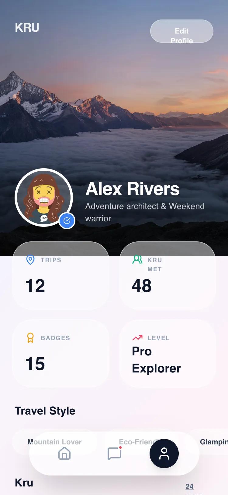 All Prompts
Kru Profile - Unified Glassmorphism
UI-компонент профиля в стиле Glassmorphism. Используется для мобильных приложений (лайфстайл, тревел, соцсети) для создания чистого и воздушного дизайна.
by Ben EnweLive Preview
Prompt
# Kru Profile - Unified Glassmorphism

{
  "summary": "A sophisticated mobile profile UI characterized by a 'Unified Glassmorphism' theme. It uses multi-layered transparency, a pastel tritone gradient background, and a combination of bold sans-serif headlines and functional body text. The layout is vertically structured with a hero image header and floating interactive elements.",
  "style": {
    "description": "The style essence is 'Modern Glass'. It utilizes two main levels of transparency: a high-opacity glass (65%) for primary controls and a low-opacity glass (25%) for decorative or secondary elements. Typography pairs Archivo (weights 700-800 for headings) with Manrope (weights 400-600 for body). The color palette is built on a pastel background gradient (#f0f4ff to #fdf2f8 to #f0fdf4) with high-contrast text (#0f172a) and vibrant accent colors (Blue-500, Emerald-500, Rose-500). Animations utilize a signature 'spring' curve: cubic-bezier(0.175, 0.885, 0.32, 1.275).",
    "prompt": "Create a design system with a background gradient: linear-gradient(135deg, #f0f4ff 0%, #fdf2f8 50%, #f0fdf4 100%). Use 'Archivo' for headings (Black/800 weight, tracking-tight) and 'Manrope' for body text. Implement two glass styles: 1. 'Glass-High' (Primary): background rgba(255, 255, 255, 0.65), backdrop-blur 20px, border 1px solid rgba(255, 255, 255, 0.4). 2. 'Glass-Low' (Secondary): background rgba(255, 255, 255, 0.25), backdrop-blur 24px, border 1px solid rgba(255, 255, 255, 0.3). Interactive elements must use transition: transform 0.3s cubic-bezier(0.175, 0.885, 0.32, 1.275). Accent colors: Primary Blue (#3b82f6), Success Emerald (#10b981), Alert Rose (#f43f5e). Text colors: Slate-900 (#0f172a) for titles, Slate-400 (#94a3b8) for labels."
  },
  "layout_and_structure": {
    "description": "A single-column mobile layout featuring a full-bleed hero banner with an overlapping content card system. The navigation is detached and floats at the bottom of the viewport.",
    "prompts": [
      {
        "part": "Hero Banner",
        "prompt": "Full-width section, 420px height. Background image with a dark gradient overlay (from-black/80 to transparent). Include a top-left brand title (Archivo Black, 20px) and a top-right floating 'Edit' button using 'Glass-Low' styling. At the bottom, place a profile avatar (96x96px) with a 4px white border and a check-circle verification badge. Profile text (Name: 30px Archivo, Bio: 14px Manrope) sits adjacent to the avatar."
      },
      {
        "part": "Insights Dashboard",
        "prompt": "A container with -24px top margin to overlap the hero. Uses 'Glass-High' styling, 32px border-radius, and 24px internal padding. Layout is a 3-column grid with subtle vertical dividers (slate-200/40). Each cell contains a 20px icon, a 9px uppercase tracking-widest label, and a 24px Archivo bold value."
      },
      {
        "part": "Horizontal Scroll Tags",
        "prompt": "Section title (18px Archivo Bold) followed by a flex row with 12px gaps. Tags use 'Glass-Low' styling, 100px border-radius (pill), 12px horizontal padding, 24px vertical padding, and 12px bold text. The row must allow horizontal overflow and hide the scrollbar."
      },
      {
        "part": "Settings Menu",
        "prompt": "A unified 'Glass-Low' card with 35px border-radius. Contains a vertical stack of buttons separated by 1px white/40 borders. Each row features a 40px square icon container (bg-white/80, 16px radius), 14px bold label, and a trailing chevron or toggle indicator. Include hover states that increase background opacity to 30%."
      },
      {
        "part": "Floating Bottom Nav",
        "prompt": "Fixed position, bottom: 32px, left: 50%, transform translateX(-50%). Dimensions: 280px wide, 72px high. 'Glass-High' styling with 100px border-radius. Flexbox distribution with icons. Active state icon should have a dark slate background (#0f172a), white icon, and shadow-lg. Secondary icons are Slate-400 and hover to Slate-900 with a subtle white/40 background circle."
      }
    ]
  },
  "special_ui_components": [
    {
      "component": "Spring-Loaded Stats Cards",
      "description": "High-transparency interactive stats grid",
      "prompt": "Construct a 3-column grid inside a Glass-High container. Each item must have a hover state that scales by 1.02 and an active state that scales to 0.95 using the cubic-bezier(0.175, 0.885, 0.32, 1.275) curve. Icons should use specific semantic colors: Blue-500 for activity, Emerald-500 for social/trust metrics."
    },
    {
      "component": "Glass Floating Navigation",
      "description": "Detached, high-blur navigation bar",
      "prompt": "Create a pill-shaped nav bar (h-72px) using rgba(255, 255, 255, 0.65) and 20px backdrop-blur. The active button must be a perfect circle (48x48px) with background #1e293b and white icon. Include a notification dot (Rose-500) on secondary icons with a 2px white border for visibility against the glass."
    }
  ]
}