All Prompts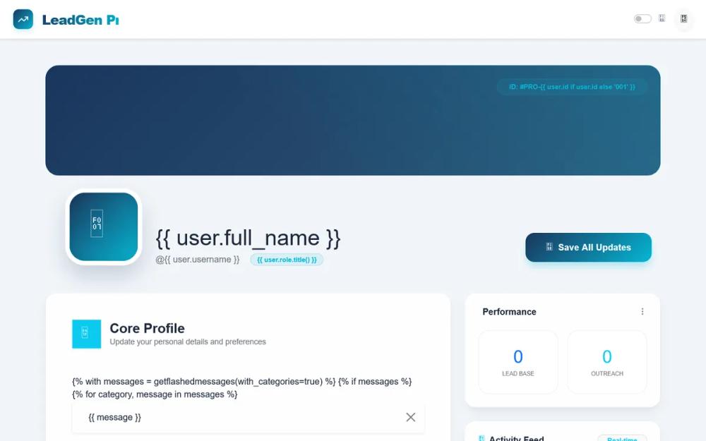 All Prompts
LeadGen Pro Dashboard - Simplified Layout
Современный SaaS-дашборд LeadGen Pro: темный фон, яркие акценты, 3D-карты, стекломорфизм. Идеально для финтеха, аналитики, портфолио.
Prompt
# LeadGen Pro Dashboard - Simplified Layout

{
  "summary": "A professional SaaS-style profile dashboard featuring a split hero layout with a dark navy-to-blue gradient (#0f172a to #1e3a8a), isometric floating UI elements, glassmorphic input containers, and bold high-contrast typography using Plus Jakarta Sans.",
  "style": {
    "description": "The style is defined by a primary navy palette (#0f172a), electric cyan highlights (#0ea5e9), and 'Plus Jakarta Sans' font. It employs extra-bold heading weights (800-900), large border radii (32px-40px), and isometric CSS transforms (rotateY -15deg, rotateX 10deg). Layouts use heavy backdrop-blur (XL) for forms and smooth floating keyframe animations for decorative UI cards.",
    "prompt": "Create a UI with a primary background of #0f172a and a linear gradient to #1e3a8a at 135 degrees. Use 'Plus Jakarta Sans' as the primary font. Headings should be font-weight: 900 with tracking-tighter and leading-[0.9]. Primary accent color is #0ea5e9 (Cyan). Forms should be housed in glassmorphic containers with background: rgba(255, 255, 255, 0.1), backdrop-filter: blur(24px), and border-radius: 32px. Buttons must be pill-shaped (9999px) or rounded-full, featuring font-weight: 800. Inputs use a white background with a 3px #0ea5e9 shadow on focus. Implement floating animations using translateY(-20px) with ease-in-out over 6s. Isometric cards should use transform: perspective(1000px) rotateY(-15deg) rotateX(10deg) with smooth transition on hover to translateY(-10px)."
  },
  "layout_and_structure": {
    "description": "A structured layout starting with a high-impact split hero section (form on left, visual graphics on right), followed by high-contrast secondary sections on solid white backgrounds, and a clean minimalist navy footer.",
    "prompts": [
      {
        "part": "Hero Section",
        "prompt": "A two-column grid layout on a dark navy background. Left column features a massive headline (8xl) followed by a 2xl subtext. Below this, a glassmorphic form card with 32px padding and 32px border radius. Right column contains absolute-positioned isometric UI elements: a profile card (380px wide), a smaller floating navy card rotated -12 degrees, and stat badges rotated at slight angles (6 degrees and -3 degrees)."
      },
      {
        "part": "Form Elements",
        "prompt": "Inputs should have a white background (#ffffff), 12px border radius, and high-contrast dark text (#1a1a1a). Labels are tiny (xs), bold, uppercase, and tracking-wider, positioned above the input. Action buttons are grouped at the bottom of forms using rounded-full padding and contrasting colors (e.g., white button with navy text)."
      },
      {
        "part": "Security Management Section",
        "prompt": "A full-width section with a solid white background (#ffffff) and 40px rounded corners. Includes a header with a large icon (4xl) and title. Content is organized in a 3-column grid for password fields (Current, New, Confirm), utilizing a light gray input background (#eff0ec) and 16px rounded corners for input fields."
      },
      {
        "part": "Footer",
        "prompt": "A minimalist footer with #0f172a background and a thin top border (rgba(255,255,255,0.05)). Layout is a flex-row (md:flex-row, col for mobile) containing a brand logo on the left, credit text in the center, and legal links on the right. Text colors use blue-200 at 50% opacity."
      }
    ]
  },
  "special_ui_components": [
    {
      "component": "Isometric Profile Card",
      "description": "A 3D-transformed floating card showing user details.",
      "prompt": "A 380px wide white card with 40px border radius. Apply CSS transform: perspective(1000px) rotateY(-15deg) rotateX(10deg). Inside, place a 24x24 navy circle for the avatar, centered bold text, and 3-4 light gray pill buttons (bg: #eff0ec) for social links. Add a 8px cyan (#0ea5e9) border-bottom strip for brand accent."
    },
    {
      "component": "Floating Stat Badges",
      "description": "Skewed badges displaying metrics.",
      "prompt": "Small 24px-rounded rectangles. One badge is #0ea5e9 (cyan) with white text, rotated 6 degrees. Second badge is white with #1a1a1a text, rotated -3 degrees. Both contain a large numeric value (4xl) and tiny uppercase labels."
    }
  ],
  "special_notes": "MUST use 'Plus Jakarta Sans' to maintain the tech-forward look. MUST keep heading weights at 800 or 900 for the 'LeadGen' brand feel. DO NOT use standard square corners; all containers must have at least 12px (inputs) to 40px (sections) radius. MUST ensure isometric elements have a z-index strategy to overlap correctly for a 3D effect."
}