All Prompts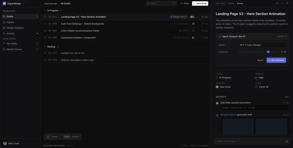 All Prompts
dark modelinear inspiredminimalisthigh contrastinternal toolstatus colour systedashboardtask driven
Linear inspired developer tool dashboard
Темная панель разработчика в стиле Linear. Консоль с навигацией, списком и деталями. Идеально для SaaS-дашбордов и платформ.
by Shirley LouLive Preview
Prompt
# Linear inspired developer tool dashboard

{
  "summary": "A sophisticated, high-density dark-mode dashboard with a layout optimized for productivity and high information density. It uses a core color of near-black with subtle elevation shifts between panels and a distinct focus on typography and micro-interactions.",
  "style": {
    "description": "Deep dark mode theme using #0e0e0e for background and #111113 for surfaces. Typography features Inter (Sans) for UI elements and JetBrains Mono for data/technical metadata. Primary accent color is #5e6ad2. Animations are crisp, using cubic-bezier(0.16, 1, 0.3, 1) for rapid yet smooth transitions.",
    "prompt": "### Visual Language & Style Guide\n\n**Color Palette:**\n- **Base Background:** `#0e0e0e` (main canvas).\n- **Surface Background:** `#111113` (sidebar, panels).\n- **Accent Color:** `#5e6ad2` (Indigo-blue) used for primary buttons, active states, and focus rings.\n- **Border Color:** `rgba(255, 255, 255, 0.05)` (highly subtle separation).\n- **Text Colors:** Primary: `#f3f4f6`, Secondary: `#9ca3af`, Tertiary: `#6b7280`, Muted/Mono: `#4b5563`.\n- **Status Colors:** In-progress: `#f97316` (Orange), Active/Success: `#10b981` (Emerald), Error: `#ef4444` (Red).\n\n**Typography:**\n- **Sans-Serif:** 'Inter', sans-serif. Use 14px (0.875rem) for main text, 13px (0.8125rem) for secondary UI, and 11px (0.6875rem) for uppercase category labels.\n- **Monospace:** 'JetBrains Mono', monospace. Use for IDs, version numbers, and system logs at 10px-12px.\n- **Font Weights:** Medium (500) for headers/buttons, Regular (400) for body, Semi-bold (600) for page titles.\n\n**Shadows & Depth:**\n- **Panel Shadow:** `0 4px 20px rgba(0,0,0,0.4)`.\n- **Glass Effect:** `backdrop-filter: blur(8px); background: rgba(30, 30, 30, 0.8)` for floating elements.\n\n**Micro-Interactions:**\n- **Focus States:** 2px solid outline/box-shadow of `#5e6ad2`.\n- **Hover Transitions:** 150ms-200ms ease-in-out on backgrounds and text colors.\n- **Slide-in Animation:** 0.2s duration using `cubic-bezier(0.16, 1, 0.3, 1)` for panels entering from the right."
  },
  "layout_and_structure": {
    "description": "Triple-column layout with fixed-width navigation and contextual panels, flanking a flexible main content area.",
    "prompts": [
      {
        "part": "Sidebar Navigation",
        "prompt": "Fixed width of 240px. Background `#111113`, border-right `1px solid rgba(255,255,255,0.05)`. Includes a 48px height workspace switcher at top, a scrollable nav area with category headers (11px uppercase, letter-spacing: wide), and a 48px user profile footer with a 20px circular avatar."
      },
      {
        "part": "Main Content Header",
        "prompt": "48px height. Background `#0e0e0e`, border-bottom `1px solid rgba(255,255,255,0.05)`. Left side contains breadcrumbs (slash separators). Right side contains a 128px width search bar with a shortcut key hint ('F') and a primary 'New' button (white background, black text, 13px font weight)."
      },
      {
        "part": "Item List View",
        "prompt": "Scrollable area. Items are 44px high rows. Active row has background `rgba(94, 106, 210, 0.05)`. Each row contains: status icon (14px), Mono ID (12px), title (14px), metadata tags (small bordered badges), and a right-aligned timestamp (12px muted text)."
      },
      {
        "part": "Contextual Detail Panel",
        "prompt": "Fixed width of 480px. Background `#111113`. Slides in from right. Header matches main header height (48px). Content section features 24px padding, divided into: Title/Description block, AI control widgets (enclosed card with 10% white border), property grid (2-column key-value pairs), and a chronological activity feed with vertical connectors."
      },
      {
        "part": "Global Status Bar",
        "prompt": "Fixed height 32px at the extreme bottom. Font: 10px Monospace. Displays system status with a pulsing 6px circle, version numbers, and latency stats. Background `#0e0e0e`."
      }
    ]
  },
  "special_ui_components": [
    {
      "component": "AI Agent Control Card",
      "description": "A specialized block for adjusting AI parameters within the detail view.",
      "prompt": "Rectangle with 8px border-radius, border `1px solid rgba(255,255,255,0.1)`. Header includes a bot icon and a pulsing 'Active' status light. Body contains grid rows with 100px fixed-width labels. Includes a custom-styled `<input type=\"range\">` with `#5e6ad2` accent color and small monospace value readouts."
    },
    {
      "component": "Keyboard Shortcut Toast",
      "description": "Floating hint for keyboard-driven users.",
      "prompt": "Positioned absolute bottom-12. Background `#1a1a1a`, 6px border-radius, thin border. Uses `display: flex` with 16px gap. Shortcut keys wrapped in small `#888` background boxes with mono text. Includes a subtle slide-in animation with 0.5s delay."
    },
    {
      "component": "Status Metadata Badge",
      "description": "Small technical tags for categorizing items.",
      "prompt": "Padding 2px 6px. Background `rgba(255,255,255,0.05)`, border `1px solid rgba(255,255,255,0.1)`. Border-radius 4px. Font: 10px JetBrains Mono. Icons inside are 10px."
    }
  ]
}