All Prompts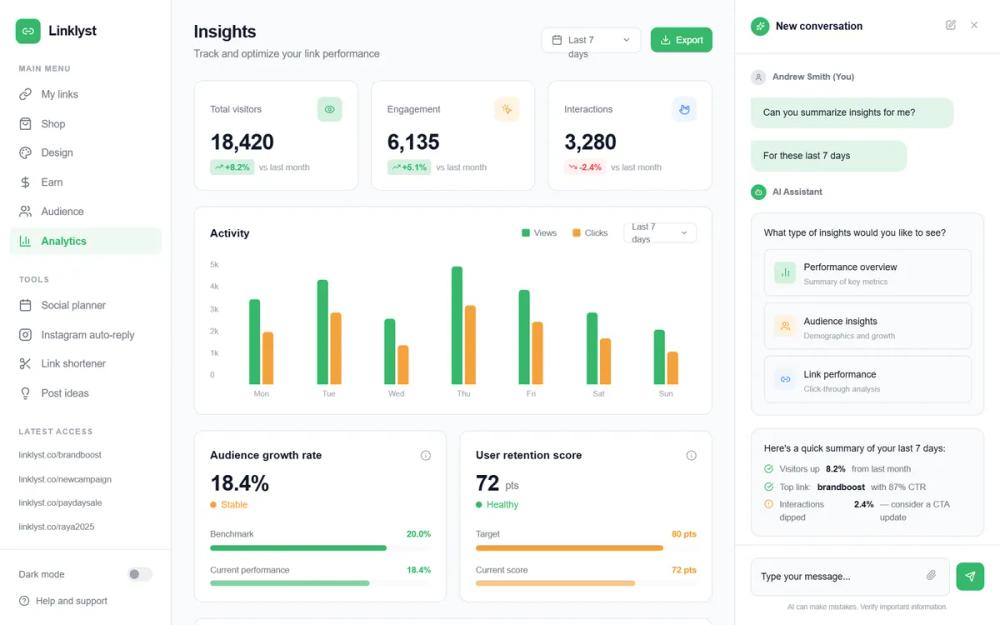 All Prompts
Linklyst Analytics Dashboard
Современный дашборд аналитики: SaaS, финтех, маркетинг. Трёхколоночный UI с bento-кард, чатами и анимацией. Оптимизирован для высокой производительности.
by Pi TechLive Preview
Prompt
# Linklyst Analytics Dashboard

{
  "summary": "Build a comprehensive analytics dashboard with a 220px left navigation sidebar, an 860px max-width central content area, and a 340px right-side AI assistant panel. The design focuses on data density without clutter, using staggered 'fade-up' and 'slide-in' animations to create a polished, interactive experience.",
  "style": {
    "description": "The visual style is defined by the 'Inter' font family, emphasizing hierarchy through weights (400 to 700) and small font sizes (9px to 28px). The color system uses #36B76B as the primary action color and #F4A13A for secondary alerts/stability. Borders are consistently #E5E7EB with 12px border-radius on cards. Animations use smooth 0.4s to 0.6s durations with ease-out timing functions.",
    "prompt": "### Design System: Modern SaaS Professional\n\n**Color Palette:**\n- Primary: #36B76B (Action/Success)\n- Primary Light: #D4F1E0 (8% - 15% opacity for backgrounds)\n- Secondary: #F4A13A (Warning/Alt metrics)\n- Backgrounds: Base white (#FFFFFF), App background (#F9FAFB), Hover state (#F3F4F6)\n- Typography: #111827 (Heading), #6B7280 (Muted Body), #9CA3AF (Subtle/Captions)\n- Border: #E5E7EB (Standard), #F0F0F0 (Light)\n\n**Typography (Inter):**\n- Dashboard Titles: 22px, Bold, tracking -0.025em\n- Metric Headlines: 28px, Bold, tracking -0.05em\n- Card Headings: 14px, Semibold\n- Body/Label: 12px-13px, Medium\n- Micro/Captions: 9px-11px, Regular\n\n**Shadows & Borders:**\n- Card Radius: 12px\n- Card Shadow: Subtle 0px 1px 2px rgba(0,0,0,0.05)\n- Borders: 1px solid #E5E7EB\n\n**Animations:**\n- `fadeInUp`: transform: translateY(12px), opacity: 0 -> 1 (0.5s ease-out)\n- `slideIn`: transform: translateX(±16px), opacity: 0 -> 1 (0.4s ease-out)\n- `growUp`: scaleY(0) -> 1 from bottom (0.6s ease-out)\n- `progressFill`: width: 0 -> target% (0.8s ease-out)"
  },
  "layout_and_structure": {
    "description": "A fixed-height (100vh) three-column layout with independent scrolling for the main content and right sidebar. The left sidebar is a static navigation anchor.",
    "prompts": [
      {
        "part": "Left Sidebar",
        "prompt": "Width: 220px. Background: #FFFFFF. Border-right: 1px #E5E7EB. Top section: 32x32px primary green logo with brand name 'Linklyst' (17px Bold). Navigation groups: 'Main Menu', 'Tools', and 'Latest Access'. Nav items: 13px text, flex icons, 8px border-radius hover state (#F3F4F6). Active state: #36B76B text and 8% opacity green background. Bottom section: Dark mode toggle and Help/Support links separated by a border-top."
      },
      {
        "part": "Header Section",
        "prompt": "Margin-bottom: 24px. Displays title (22px Bold) and subtitle (13px Muted). Right side includes a Date Range Selector (Calendar icon, 'Last 7 days', Chevron-down) and an 'Export' button (#36B76B, white text, 12px Medium font)."
      },
      {
        "part": "Metric Grid",
        "prompt": "Three-column grid. Cards: 12px radius, 20px padding. Elements: Title (12px Muted), 32x32px icon placeholder (colored based on metric type), Large Value (28px Bold), and Trend Badge (pill-shaped, 4px radius, contains arrow icon and % change). Trend Badge colors: Success green or Danger red based on delta."
      },
      {
        "part": "Activity Chart Section",
        "prompt": "Card layout. Header: 'Activity' title with legend (color dots + labels). Y-axis: 0 to 5k scale (10px gray text). X-axis: Days of week. Visuals: Dual bars per day (Primary green and Secondary orange). Bars: 14px width, top-rounded, animated with `growUp` transform. Height: 180px chart area."
      },
      {
        "part": "Progress Performance Row",
        "prompt": "Two-column grid for 'Growth' and 'Retention'. Card structure: Header with info icon. Main metric: Big number + status dot (e.g., green 'Healthy' or orange 'Stable'). Footer: Two progress bars per card (Benchmark vs Current). Progress bars: 7px height, rounded, using secondary background color for the track and primary/secondary colors for the fill."
      },
      {
        "part": "Data Table Section",
        "prompt": "Full-width table for 'Most Clicked'. Columns: Link (with small icon), Views, Clicks, Conversion Rate, Date. Rows: 1px light border separator, hover highlights. Typography: Link names in 12px Medium, numeric data in 12px Semibold. Conversion rates highlighted in #36B76B or #F4A13A."
      },
      {
        "part": "Right AI Sidebar",
        "prompt": "Width: 340px. Background: #FFFFFF. Fixed-height. Header: 'New conversation' with sparkles icon and close/edit buttons. Content: Chat feed with User labels (gray circles) and AI labels (primary green circles). Message bubbles: User messages are primary-light (#D4F1E0 70%), AI messages are bordered white cards. Interactive components: Nested 'Option buttons' within AI responses with icons and description text. Input area: 1px bordered text field with paperclip icon and a circular primary-colored send button."
      }
    ]
  },
  "special_ui_components": [
    {
      "component": "AI Response Card",
      "description": "An interactive AI message bubble containing nested action buttons.",
      "prompt": "Create a card with #F9FAFB background. Inside, place a list of buttons. Each button: 1px solid #E5E7EB border, 8px radius. On hover: change border to #36B76B and background to primary-light. Left side of button: 28x28px rounded-md icon container with background matching the metric type. Right side: Title (12px Medium) and Caption (10px Subtle)."
    },
    {
      "component": "Animated Bar Group",
      "description": "Clustered bars for comparing two datasets over a 7-day period.",
      "prompt": "Group two vertical bars side-by-side with a 3px gap. Bar 1: #36B76B. Bar 2: #F4A13A. Both bars have a 14px width and rounded tops. Implement a CSS animation `growUp` that scales the Y-axis from 0 to 1 with a duration of 0.6s. Stagger the animation across 7 groups using 0.1s increments."
    },
    {
      "component": "Layered Trend Badge",
      "description": "Compact indicators for positive/negative growth.",
      "prompt": "A pill-shaped badge with 4px border-radius. Padding: 2px 6px. For positive: background #D4F1E0, text #36B76B, icon 'trending-up'. For negative: background #FEF2F2, text #EF4444, icon 'trending-down'. Font-size: 11px, weight: 600."
    }
  ],
  "special_notes": "MUST: Ensure all animations are staggered using 0.05s increments for a 'wave' effect. MUST: Use 'Inter' font specifically for the technical dashboard feel. MUST: Maintain a strict 20px padding (p-5) for all internal card content. MUST NOT: Use heavy drop shadows; stick to 1px borders for depth. MUST NOT: Allow the sidebars to collapse on desktop; maintain fixed 220px/340px widths."
}