All Prompts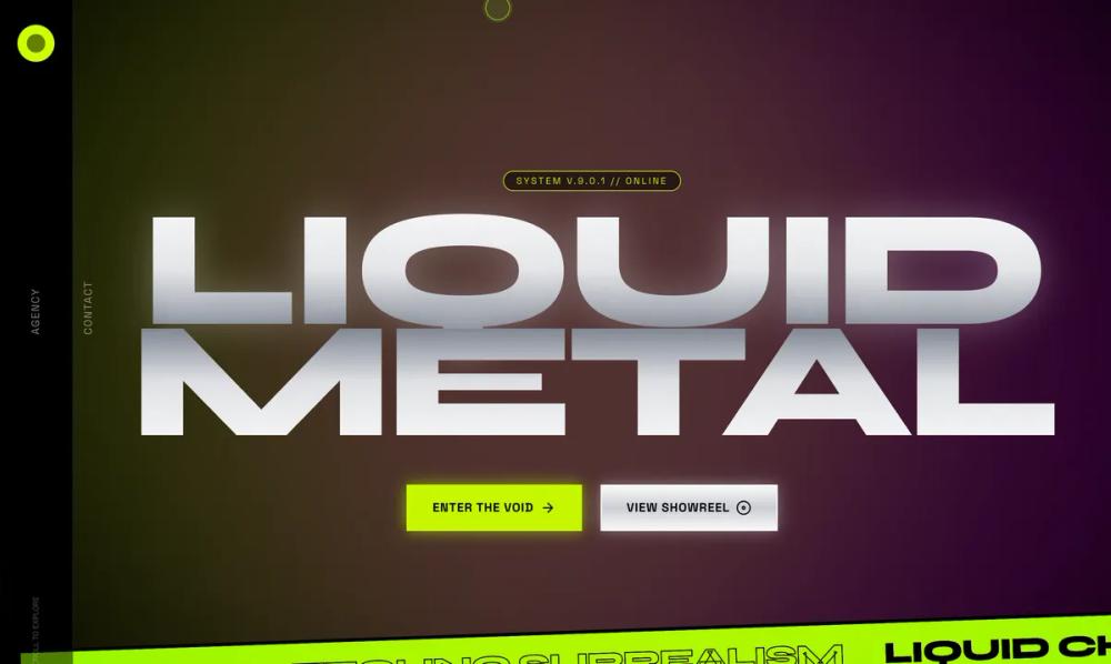 All Prompts
style
Liquid Metal style
Стиль 'Liquid Metal' для 3D-графики и дизайна. Создает эффект жидкого металла, хрома и техно-сюрреализма. Идеален для футуристических визуализаций.
by Zhou JasonLive Preview
Prompt
# Liquid Metal style

<design-system>

Design Style: Acid Graphic (Liquid Chrome & Techno-Surrealism)

Design Philosophy

Core Concept: Digital Psychadelia

Acid Graphic is about the tension between high-tech "liquid" materials and raw, distorted "anti-design." It rejects the traditional grid in favor of fluid, melting shapes and high-contrast, clashing energy. It feels like a high-end streetwear brand from the year 2099 or an underground techno label.

Core Tenets:

Liquid Metal Architecture: Surfaces should look like liquid mercury, chrome, or iridescent oil slicks. Use complex gradients and "metal-reflectance" shadows to create a sense of warped depth.

Distorted Typography: Type isn't just for reading; it’s a living texture. We use "melted" fonts, extreme italics, and "stretched" characters that look like they’ve been dragged across a scanner.

High-Vibration Color: The palette is "Acidic." We pair pitch black with high-frequency neon (Volt Green, Electric Pink, Chrome Silver).

Organic Chaos: Instead of rectangles, use "blobs," "spikes," and "thorns." The UI should feel sharp, dangerous, and organic all at once.

The "Glitch" in the Lens: Use heavy distortion effects like chromatic aberration (color splitting), grain, and fish-eye warping on images and containers.

The Vibe:

Aggressive & Experimental: It dares the user to keep up.

Liquid & Ethereal: Elements feel like they are flowing or melting off the screen.

Underground Luxury: High-end fashion meets digital noise.

Design Token System (The DNA)

Colors (The "Acid" Palette)

The Void (Backgrounds):

Primary: #000000 (Pure Black). Everything must pop against total darkness.

Secondary: #0A0A0A (Deep Onyx). Used for subtle panel layering.

The "High-Frequency" Accents:

Acid Green: #CCFF00 (The signature "Volt" color).

Liquid Chrome: A multi-stop gradient from #FFFFFF to #888888 to #E0E0E0.

Hyper-Pink: #FF00FF (Electric Magenta).

Iridescent Blue: #00F0FF (Cyan Glow).

Typography

Primary Heading: "Syne" (Extra Bold) or "Clash Display". Use scale-x-150 or italic to distort the letterforms.

Body Text: "Plus Jakarta Sans" or "Space Grotesk". Keep body text clean to maintain some readability amidst the chaos.

Rules:

Headings: text-7xl to text-[12rem], font-black, uppercase, tracking-[-0.05em].

Decorative Text: Rotated 90 degrees or marquee-scrolling.

Textures & Patterns

The Chrome Filter: Use CSS backdrop-filter: contrast(200%) brightness(150%) combined with silver gradients.

Chromatic Aberration: 1px red and blue offset shadows on text to create a "splitting" visual effect.

Noise Overlay: A subtle, high-contrast grain filter (5-10% opacity) to simulate old film or digital interference.

Component Stylings

1. The "Liquid" Container (Card)

Base Styles: bg-black/40 with backdrop-blur-3xl.

The Border: Instead of a solid line, use a 2px iridescent gradient border (from-acid-green via-white to-hyper-pink).

Shape: Apply rounded-[20%_80%_30%_70%/50%_20%_80%_50%] to create a "blob" or "amoeba" shape rather than a rectangle.

2. The "Chrome" Button

Default: bg-gradient-to-b from-white via-gray-400 to-white (Simulating a metallic cylinder).

Hover: scale-110 + rotate-2 + shadow-[0_0_30px_rgba(204,255,0,0.6)].

The Text: mix-blend-difference so the text color flips based on the chrome background.

3. "Acid" Marquee

A continuous scrolling line of text at the top and bottom of the screen using animate-marquee. This adds a sense of constant motion and "data-overload."

Animation & Motion

Fluid Distortion: Elements should "breathe" using animate-pulse or custom SVG filters that make borders look like they are rippling.

Glitch Transitions: On hover, icons should "flicker" or split into RGB components.

Liquid Drift: Background elements (chrome blobs) should drift slowly using a 20-second float animation.

Timing: Use cubic-bezier(0.19, 1, 0.22, 1) (the "Expo-Out" curve) for snappy, high-energy movement.

Non-Genericness (The "Bold" Factor)

Warped Images: Apply filter: url(#wavy) to photos to make them look like they are under water or melting.

Spiky Accents: Use "Thorn" or "Star" shapes (SVG) as bullet points or decorative corner pieces.

Oversized Outlines: Use massive, transparent text with a 1px neon stroke (text-transparent stroke-acid-green).

Vertical Sliders: Navigation that moves horizontally while the text stays vertical.

Dos and Don'ts

DO use clashing, vibrant colors.

DO distort typography until it's on the edge of unreadable.

DO use chrome and metallic textures everywhere.

DON'T use standard "safe" spacing (let things overlap!).

DON'T use soft, natural shadows. Use hard, neon glows or metallic reflections.

DON'T use centered, balanced layouts. Keep it heavy, asymmetrical, and chaotic.

</design-system>